> ## Documentation Index
> Fetch the complete documentation index at: https://docs.prophecy.ai/llms.txt
> Use this file to discover all available pages before exploring further.
# Charts
> View charts of data samples between gems
Charts let you visualize your data at different stages of the pipeline.
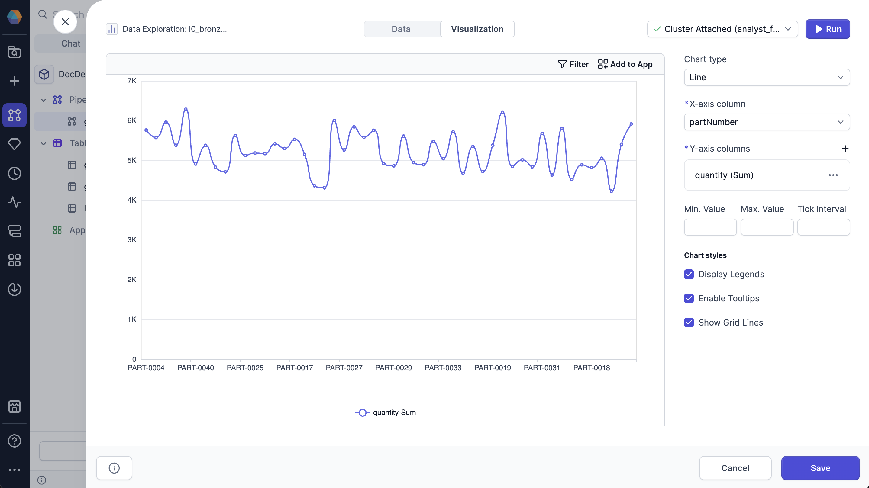
To view a chart, open a data sample and navigate to the **Visualization** tab of the [Data Explorer](/data-analysis/development/runs/data-explorer/data-explorer). Charts are based on the data currently loaded in the sample.
 ## Chart types
You can create the following charts in the **Visualization** tab.
| Chart Type | Description |
| ------------------------------------------------------------------------------------- | --------------------------------------------------------------------------------------------------------------------------- |
| [Bar](/data-analysis/development/runs/data-explorer/charts/bar-chart) | Group your data by categories with rectangular bars with heights or lengths proportional to the values that they represent. |
| [Line](/data-analysis/development/runs/data-explorer/charts/line-chart) | Visually represent your data over time or along a continuous range. |
| [Area](/data-analysis/development/runs/data-explorer/charts/area-chart) | Line chart with filled areas under the lines to represent quantitative data over time or categories. |
| [Pie](/data-analysis/development/runs/data-explorer/charts/pie-chart) | Circular graph that divides into slices, where the arc length of each slice is proportional to the quantity it represents. |
| [Candlestick](/data-analysis/development/runs/data-explorer/charts/candlestick-chart) | Financial chart that displays how prices change for an asset over time, such as stocks and currency. |
| [Map](/data-analysis/development/runs/data-explorer/charts/map-chart) | Uses a map to show how data is distributed across a geographic region. |
| [Scatter](/data-analysis/development/runs/data-explorer/charts/scatter-chart) | Uses dots to show the relationship between two variables. |
## Filter conditions
You can apply or remove filters to focus on specific parts of the visualized data. Filtering helps you explore subsets of the dataset without modifying or rerunning your pipeline. Filters apply only to the data currently loaded in the Data Explorer sample.
## Chart types
You can create the following charts in the **Visualization** tab.
| Chart Type | Description |
| ------------------------------------------------------------------------------------- | --------------------------------------------------------------------------------------------------------------------------- |
| [Bar](/data-analysis/development/runs/data-explorer/charts/bar-chart) | Group your data by categories with rectangular bars with heights or lengths proportional to the values that they represent. |
| [Line](/data-analysis/development/runs/data-explorer/charts/line-chart) | Visually represent your data over time or along a continuous range. |
| [Area](/data-analysis/development/runs/data-explorer/charts/area-chart) | Line chart with filled areas under the lines to represent quantitative data over time or categories. |
| [Pie](/data-analysis/development/runs/data-explorer/charts/pie-chart) | Circular graph that divides into slices, where the arc length of each slice is proportional to the quantity it represents. |
| [Candlestick](/data-analysis/development/runs/data-explorer/charts/candlestick-chart) | Financial chart that displays how prices change for an asset over time, such as stocks and currency. |
| [Map](/data-analysis/development/runs/data-explorer/charts/map-chart) | Uses a map to show how data is distributed across a geographic region. |
| [Scatter](/data-analysis/development/runs/data-explorer/charts/scatter-chart) | Uses dots to show the relationship between two variables. |
## Filter conditions
You can apply or remove filters to focus on specific parts of the visualized data. Filtering helps you explore subsets of the dataset without modifying or rerunning your pipeline. Filters apply only to the data currently loaded in the Data Explorer sample.
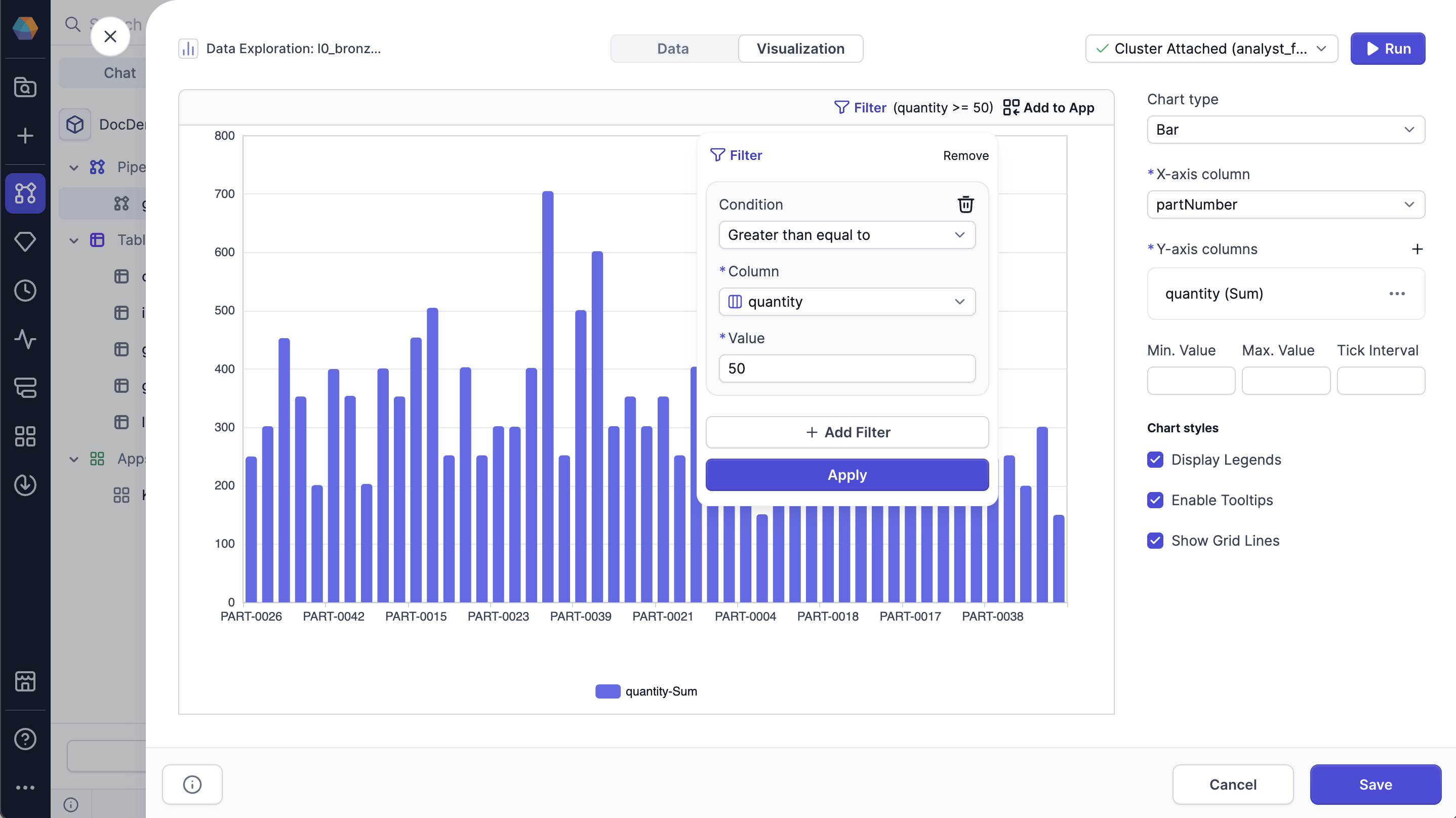 To apply a filter to your data:
1. Click **Filter** at the top of the chart.
2. Click **Add Filter**.
3. Configure your filter.
Select the **Condition**, **Column**, and **Value** to filter for.
4. Click **Apply**.
Click the trashcan icon at the top right corner of the filter to remove it.
To apply a filter to your data:
1. Click **Filter** at the top of the chart.
2. Click **Add Filter**.
3. Configure your filter.
Select the **Condition**, **Column**, and **Value** to filter for.
4. Click **Apply**.
Click the trashcan icon at the top right corner of the filter to remove it.