

dialog() function defines the visual configuration interface for your gem. This is what users see and interact with when setting up or editing a gem in the UI.
To build an effective dialog, you’ll use layout containers, UI controls (like checkboxes, text boxes, expression editors), and bindings to connect UI elements to your gem’s configuration. All of these elements are imported into your custom gem from uispec.py.
By examining uispec.py, you can:
- Discover the full library of UI elements.
- Understand what each component does and what methods it supports.
- See how to configure visual behavior, bind properties, add hints/tooltips, and more.
To see an example
dialog() function, visit Gem Builder
reference.To reference the complete code of a certain gem, search for the gem using the left sidebar of the
project editor. Click the gem to open its code, then look for the
dialog() function. This
function contains the code that determines how UI components are configured.Atoms
Atoms are basic UI components defined inuispec.py that you can use in the gem dialog configuration. Below are the most commonly used atoms, with example code and images for reference.
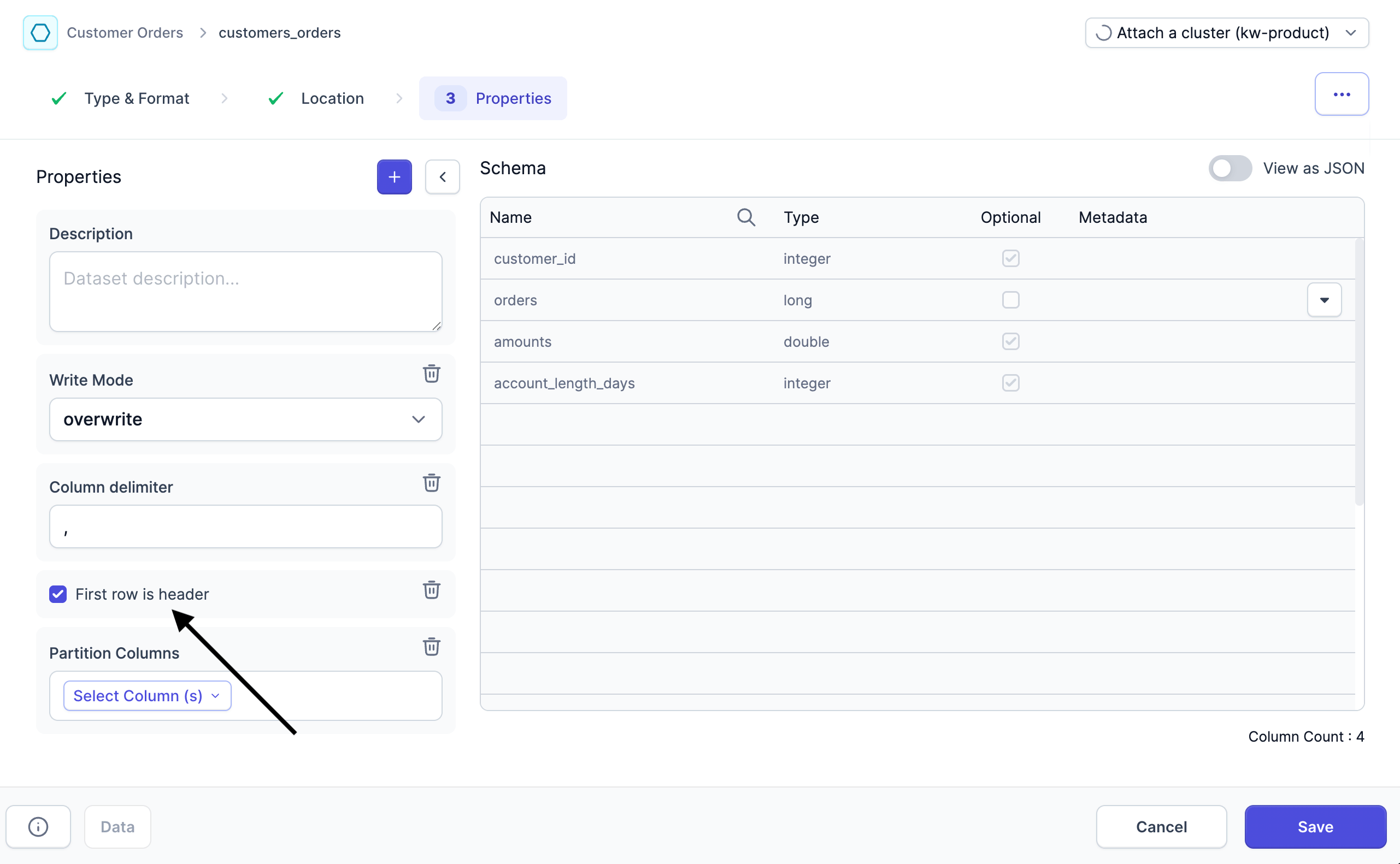
Checkbox
Boolean checkbox element that a user can select or unselect.Checkbox("First row is header")
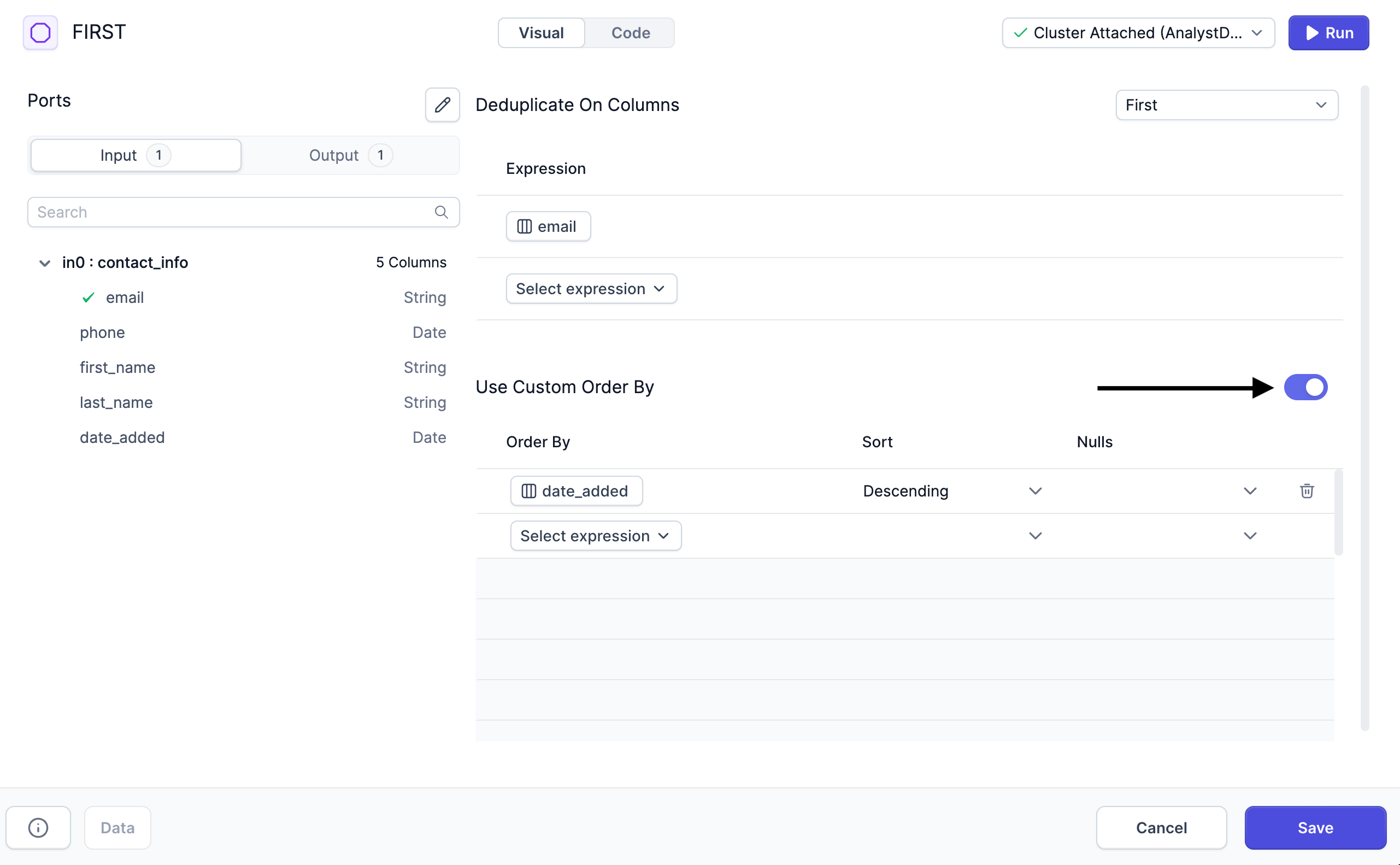
Switch
Boolean toggle that a user can enable or disable.Switch("")
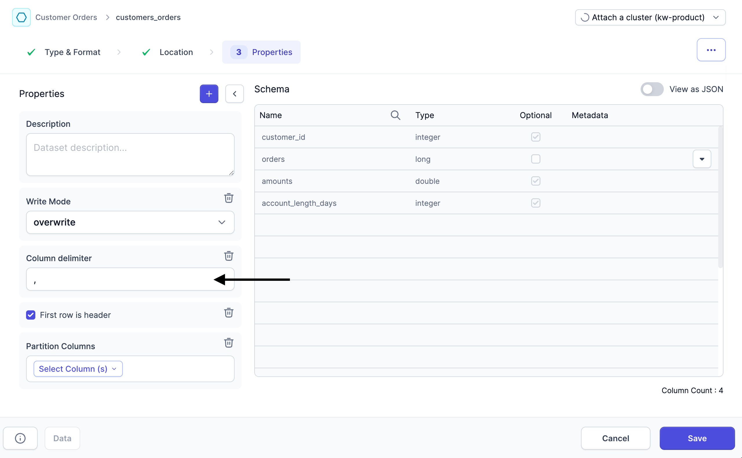
TextBox
Allows the user to type a single line of input.TextBox("Column delimiter")
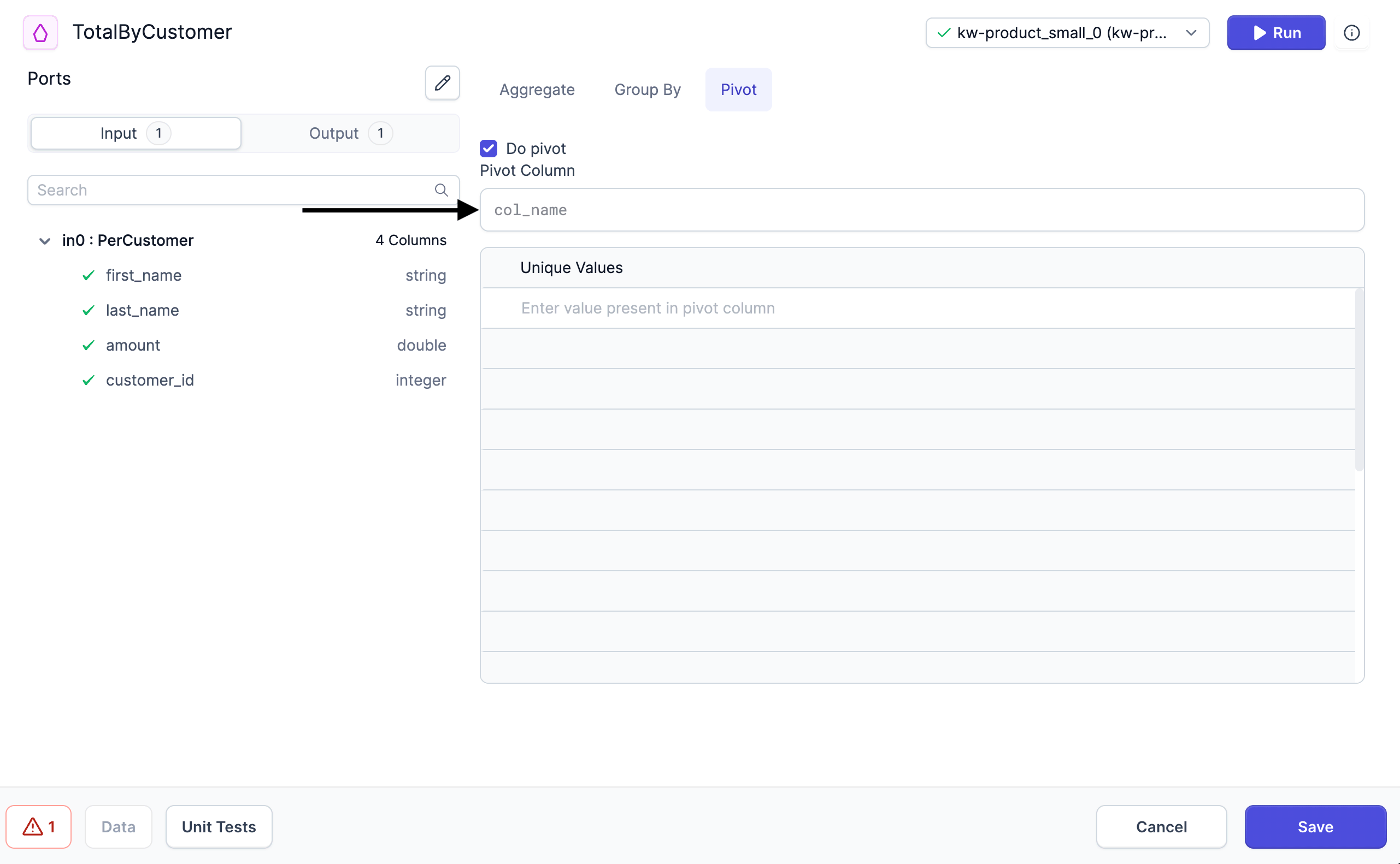
ExpressionBox
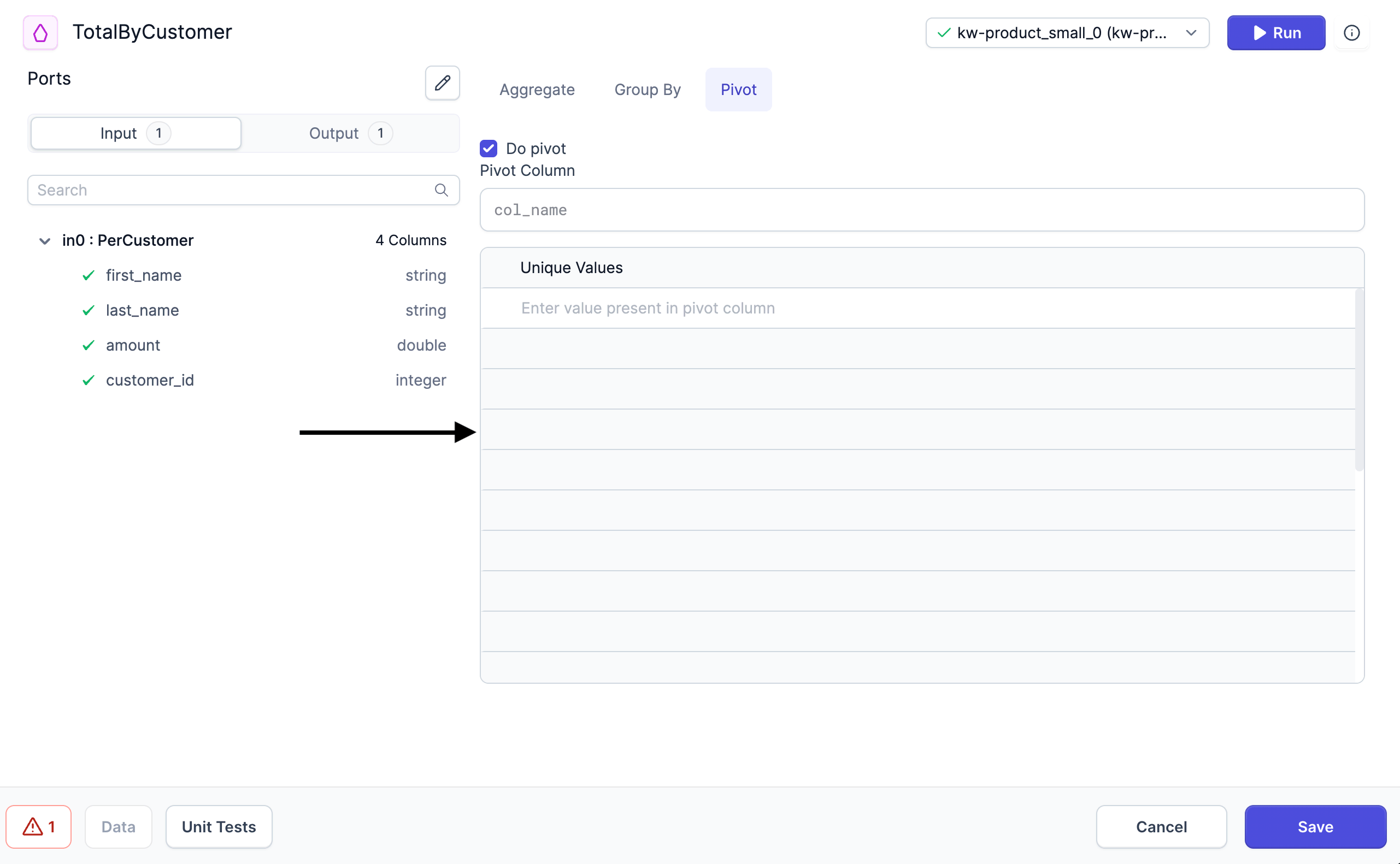
Input for code expressions.ExpressionBox("Pivot Column")
.makeFieldOptional()
.withSchemaSuggestions()
.bindPlaceholders(
{{
"scala": "col(\"col_name\")",
"python": "col(\"col_name\")",
"sql": "col_name"
}}
)
.bindProperty("pivotColumn")
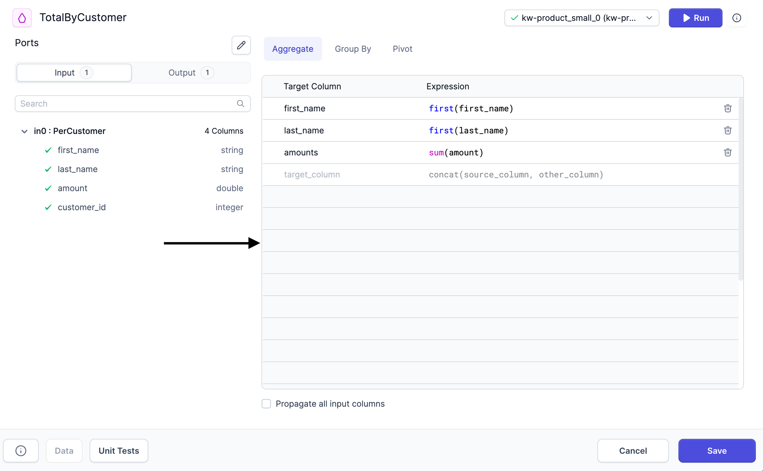
ExpTable
Dynamic table with target and expression columns.ExpTable("Aggregate Expressions").bindProperty("aggregate").withCopilotEnabledExpressions().allowCopilotExpressionsFix()
BasicTable
Configurable table with editable cells and optional footers.BasicTable(
"Unique Values",
height="400px",
columns=[
Column(
"Unique Values",
"colName",
(
TextBox("").bindPlaceholder(
"Enter value present in pivot column"
)
),
)
],
).bindProperty("pivotValues")
TitleElement
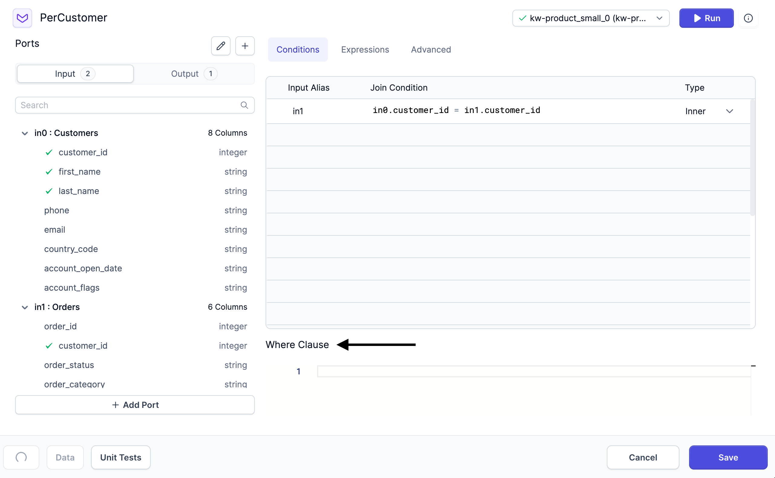
Static heading element, rendered as title text with optional heading level.TitleElement("Where Clause")
TextArea
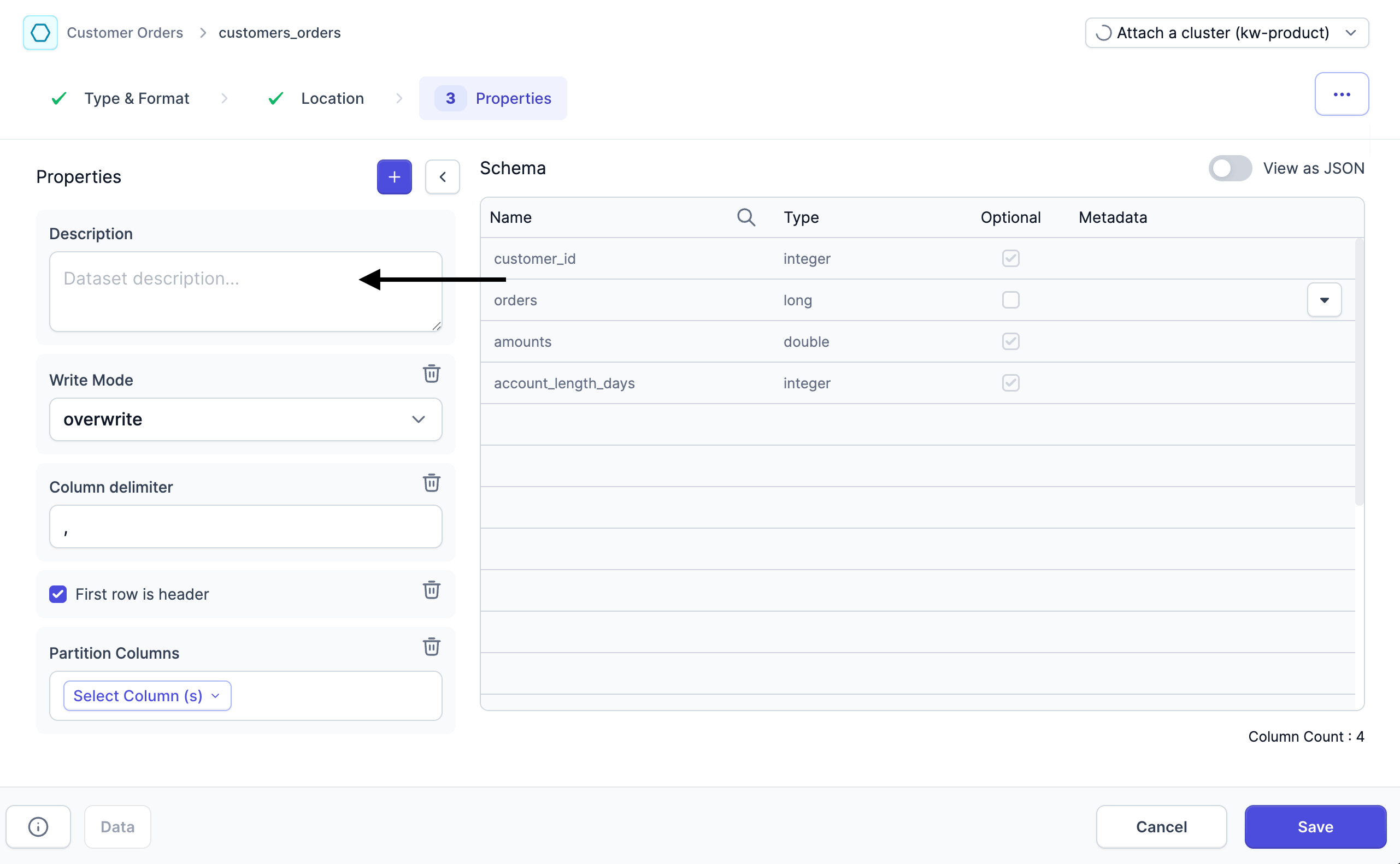
Multi-line text input area for longer descriptions.TextArea("Description", 2, placeholder="Dataset description...")
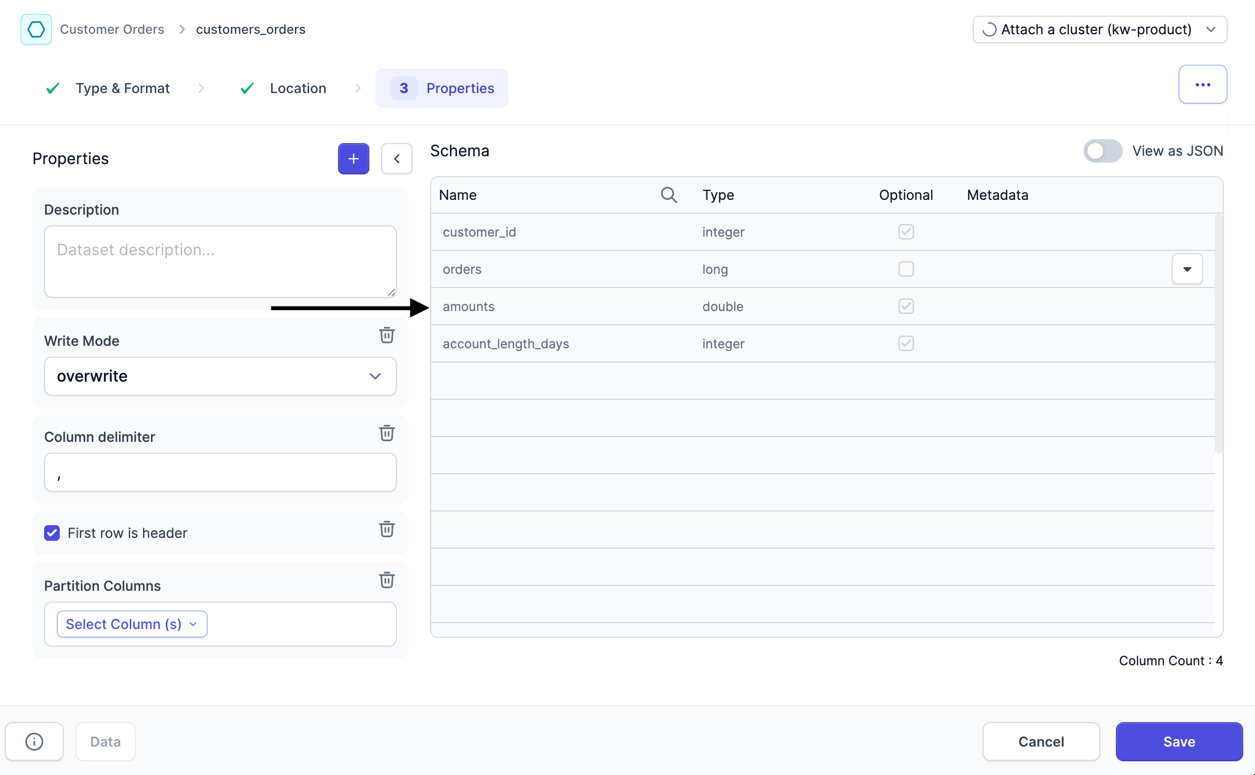
SchemaTable
Information about the dataset schema, including column names, data type, and metadata.SchemaTable("").bindProperty("schema")
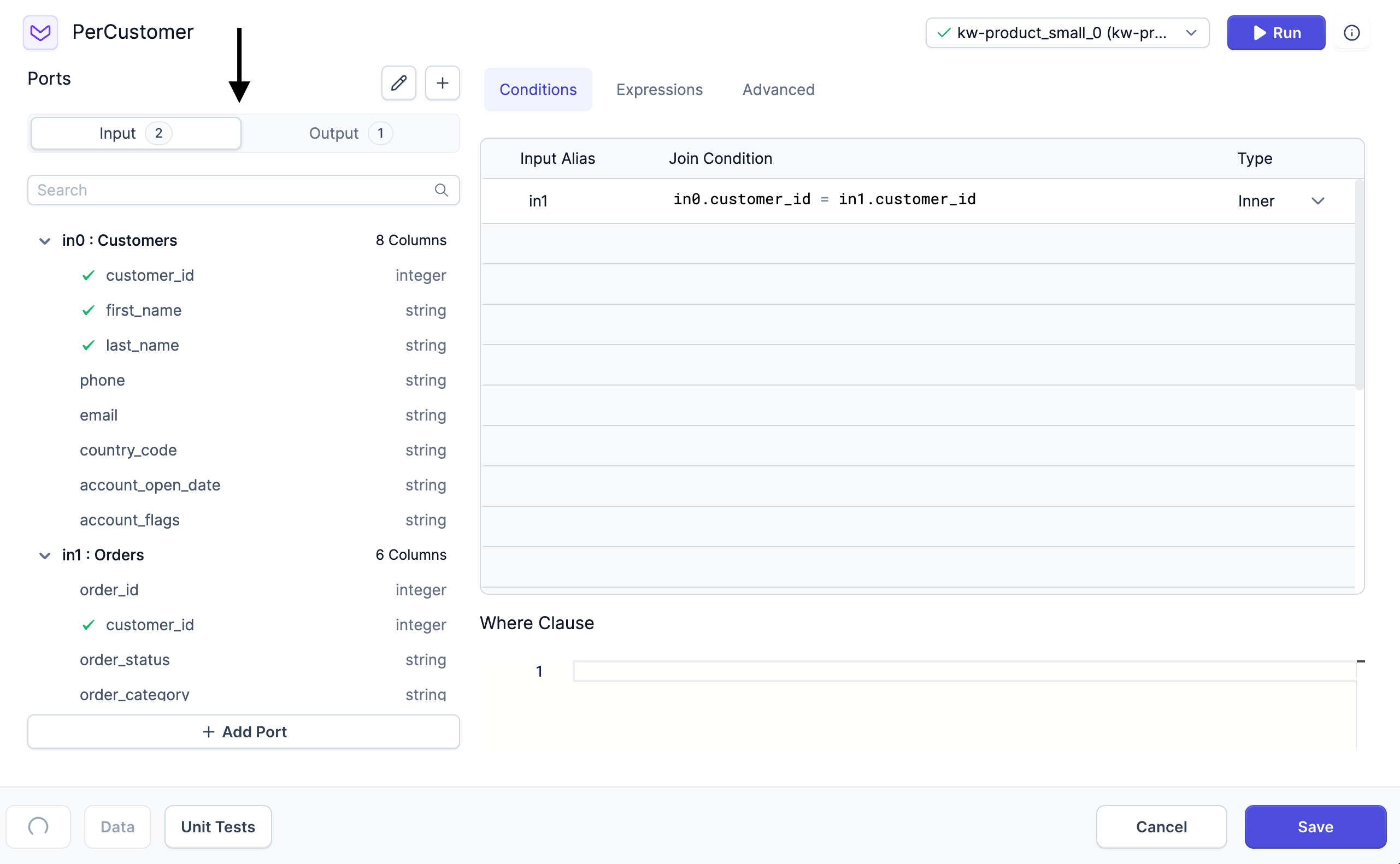
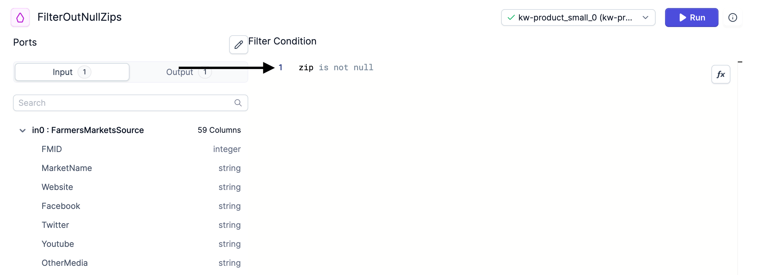
Ports
Component for displaying and editing gem input or output ports.Ports(minInputPorts=2,
selectedFieldsProperty=("columnsSelector"),
singleColumnClickCallback=self.onClickFunc,
allColumnsSelectionCallback=self.allColumnsSelectionFunc).editableInput(True)
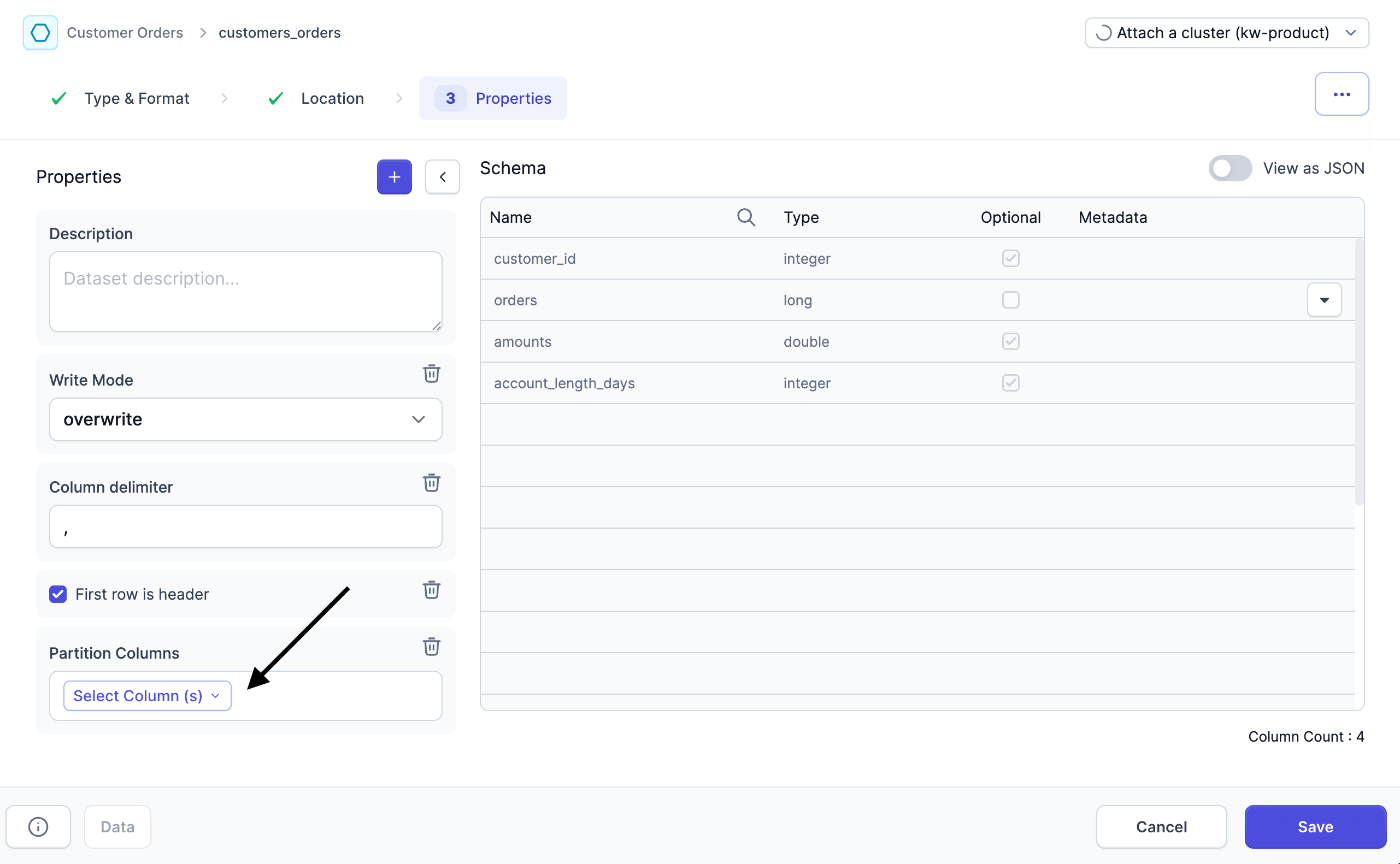
SchemaColumnsDropdown
Dropdown that lets the user select columns defined in the dataset schema.SchemaColumnsDropdown("Partition Columns")
.withMultipleSelection()
.bindSchema("schema")
.bindProperty("partitionColumns")
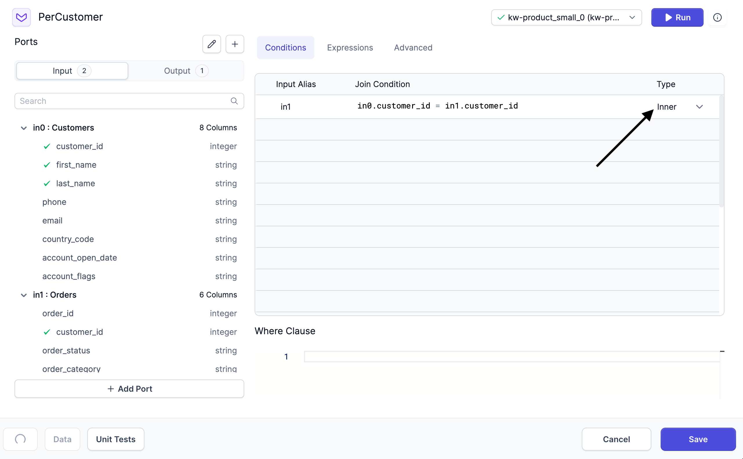
SelectBox
Dropdown menu with search and other configuration options.SelectBox("")
.addOption("Inner", "inner")
.addOption("Outer", "outer")
.addOption("Left Outer", "left_outer")
.addOption("Right Outer", "right_outer")
.addOption("Left Semi", "left_semi")
.addOption("Left Anti", "left_anti")
.addOption("Cross Join", "cross")
AlertBox
Message box for alerts/info/warnings.AlertBox(
variant="success",
_children=[
Markdown(
...
)
]
)
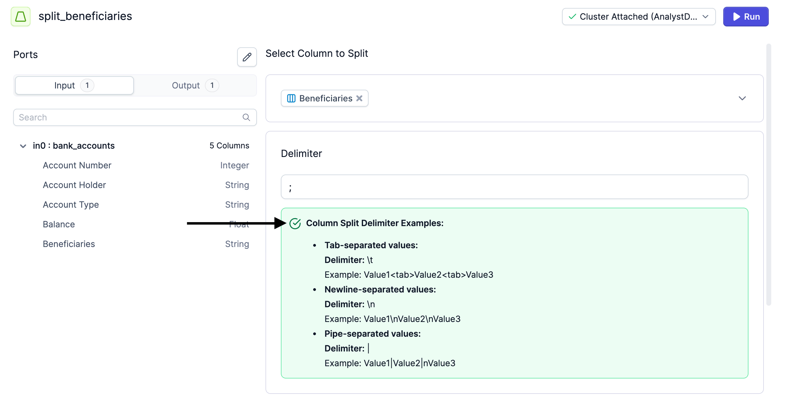
NumberBox
Allows the user to input an integer. Does not support floats.NumberBox("Label for Number Box", placeholder="0")
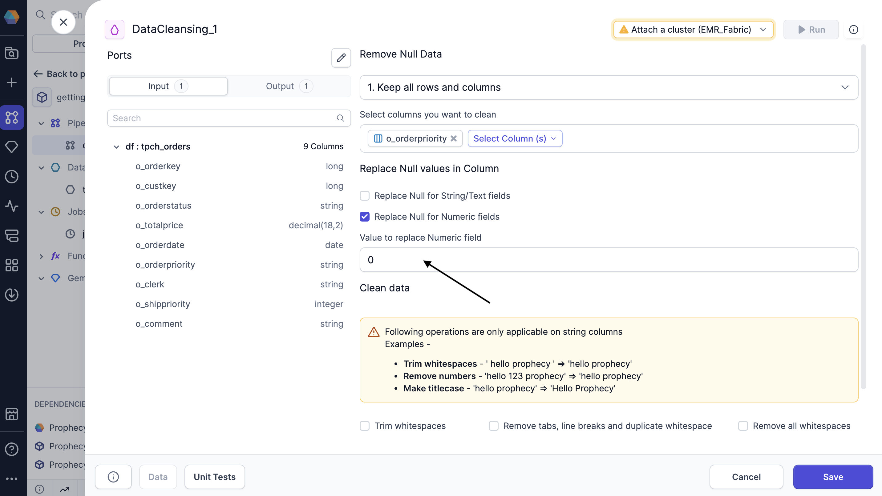
Markdown
Displays static Markdown-formatted content.Markdown(
"**Column Split Delimiter Examples:**"
"\n"
"- **Tab-separated values:**"
"\n"
" **Delimiter:** \\t"
"\n"
" Example: Value1<tab>Value2<tab>Value3"
"\n"
"- **Newline-separated values:**"
"\n"
" **Delimiter:** \\n"
"\n"
" Example: Value1\\nValue2\\nValue3"
"\n"
"- **Pipe-separated values:**"
"\n"
" **Delimiter:** |"
"\n"
" Example: Value1|Value2|nValue3"
)
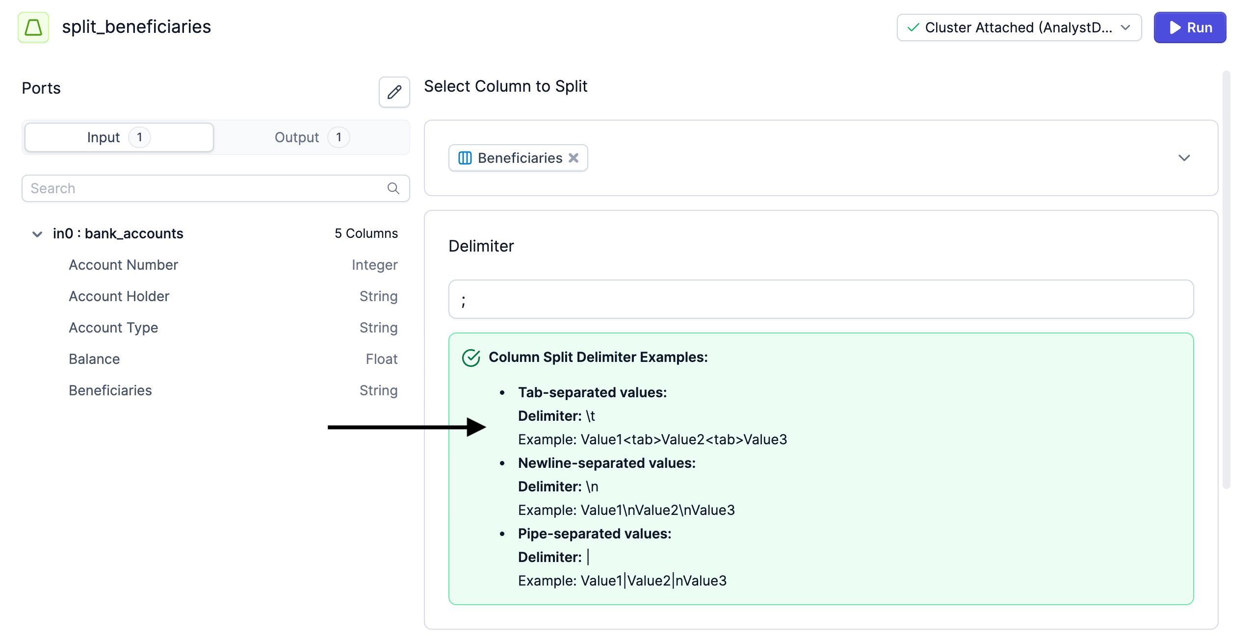
RadioGroup
A group of radio buttons that can have labels, values, icons, and descriptions.RadioGroup("Operation Type")
.addOption(
"Union",
"unionAll",
("UnionAll"),
("Returns a dataset containing rows in any one of the input Datasets, while preserving duplicates.")
)
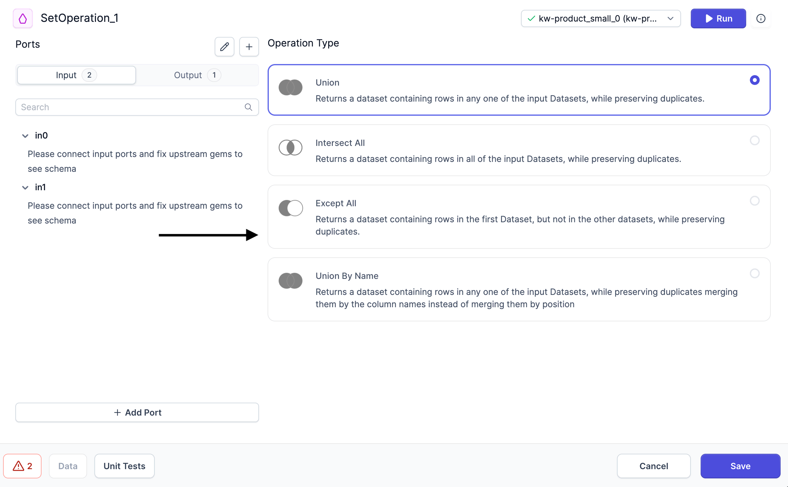
Editor
Code editor with expression builder support and schema suggestions.Editor(height=("100%")).withSchemaSuggestions().bindProperty("condition.expression")
Layout
The layout components let you organize your gems with columns, tabs, and more.StackLayout
This arranges its child elements in a vertical stack to place elements one below the other.ColumnLayout
This component arranges its child elements in horizontal columns, allowing for a side-by-side layout.FieldPicker
This is a form-like component that contains labeled input fields. Each field you add calls a new form control (like text box, checkbox, select box) associated with a specific property.Explore uispec.py
import copy
import enum
from abc import ABC, abstractmethod
from dataclasses import dataclass, field, replace
from typing import TypeVar, Generic, Optional, List, Any, Dict
from typing import Union
from pyspark.sql.column import Column as sparkColumn
from pyspark.sql.functions import col
from prophecy.cb.decorator import singleton
from prophecy.cb.util.StringUtils import isBlank
from enum import Enum
''' ---------------------------- BASE ----------------------------'''
@singleton
class UISpec:
currentId: int = 0
def defaultLanguages(self) -> set:
return {'scala', 'python', 'sql'}
def getId(self) -> int:
self.currentId = self.currentId + 1
return self.currentId
@dataclass(frozen=True)
class PropertyContext:
contextName: str
prefix: str
def propertyPath(property: str) -> str:
if property.startswith("$.metadata"):
return f"${{{property}}}"
elif property.startswith("record."):
return f"${{{property}}}"
elif not property.startswith("component."):
return f'${{{".".join([prop for prop in ["component", "properties", property] if prop])}}}'
else:
return f"${{{property}}}"
class Element(ABC):
id: str = f"{UISpec().getId()}"
def __post_init__(self):
self.id = f"{UISpec().getId()}"
@abstractmethod
def kind(self) -> str:
pass
@abstractmethod
def json(self) -> dict:
pass
def propertyPath(self, property: str) -> str:
return propertyPath(property)
class Atom(Element, ABC):
@abstractmethod
def title(self) -> str:
pass
@abstractmethod
def property(self) -> Optional[str]:
pass
@abstractmethod
def bindProperty(self, property: str):
pass
def propertyKey(self) -> str:
return "value"
def getTemplateElements(self) -> List[Element]:
return []
def jsonProperties(self) -> dict:
return {"title": self.title()}
def json(self) -> dict:
properties = self.jsonProperties()
localProperty = self.property()
if localProperty is not None:
properties[self.propertyKey()] = self.propertyPath(localProperty)
return {"id": self.id, "kind": self.kind(), "properties": properties}
ElementType = TypeVar("ElementType", bound=Element)
class Container(Generic[ElementType], Element, ABC):
@abstractmethod
def children(self) -> list:
pass
def jsonProperties(self) -> dict:
return {}
def json(self) -> dict:
tmpList = []
childs = self.children()
if childs is not None:
reversedChilds = reversed(childs)
for child in reversedChilds:
tmpList.append(child.json())
return {
"id": self.id,
"kind": self.kind(),
"properties": self.jsonProperties(),
"contains": tmpList
}
@enum.unique
class CopilotType(enum.Enum):
button = "button"
prompt = "prompt"
@staticmethod
def get_enum(value):
if value == "button":
return CopilotType.button
elif value == "prompt":
return CopilotType.prompt
def to_json(self):
return self.value
@enum.unique
class AutoSuggestType(enum.Enum):
none = "none"
update = "update"
placeholder = "placeholder"
@staticmethod
def get_enum(value):
if value == "none":
return AutoSuggestType.none
elif value == "update":
return AutoSuggestType.update
elif value == "placeholder":
return AutoSuggestType.placeholder
def to_json(self):
return self.value
@dataclass
class CopilotSpecProps:
"""
The copilot spec props
..........
Attributes
----------
buttonLabel : str
The button label for the copilot button
align : str
Left (start) or right (end) alignment of the copilot button
alignOffset : int
Horizontal difference between the start points of the atom and copilot button
gap : int
Vertical difference between copilot button and atom
"""
buttonLabel: str = ""
align: str = "start" # or end
alignOffset: int = 0
gap: int = 0
@abstractmethod
def json(self) -> dict:
pass
@abstractmethod
def copilot_type(self) -> CopilotType:
pass
class CopilotButtonTypeProps(CopilotSpecProps):
"""
Properties for the copilot button type
"""
def json(self) -> dict:
props: dict = {
"buttonLabel": self.buttonLabel,
"align": self.align,
"alignOffset": self.alignOffset,
"gap": self.gap
}
return props
def copilot_type(self) -> CopilotType:
return CopilotType.button
class CopilotPromptTypeProps(CopilotSpecProps):
"""
Properties for the copilot prompt type
..........
Attributes
----------
promptPlaceholder : Optional[str]
Placeholder text inside the prompt input box
"""
promptPlaceholder: Optional[str] = None
def json(self) -> dict:
props: dict = {
"buttonLabel": self.buttonLabel,
"align": self.align,
"alignOffset": self.alignOffset,
"gap": self.gap
}
if self.promptPlaceholder is not None:
props["promptPlaceholder"] = self.promptPlaceholder
return props
def copilot_type(self) -> CopilotType:
return CopilotType.prompt
@dataclass
class CopilotSpec:
"""
The copilot properties for various atoms inside gems
..........
Attributes
----------
copilotProps: CopilotSpecProps
The copilot spec properties - button, prompt etc.
method : str
The websocket method to call
methodType : Optional[str]
The type of the message body (optional) (see usages for examples)
"""
copilotProps: CopilotSpecProps
method: str
methodType: Optional[str] = None
autoSuggest: Optional[str] = None
loadingMessage: Optional[str] = None
# Copilot type is inferred from copilot props
def json(self):
props = dict()
props["method"] = self.method
if self.methodType is not None:
props["methodType"] = self.methodType
props["copilotType"] = self.copilotProps.copilot_type().to_json()
props["copilotProps"] = self.copilotProps.json()
return props
def withDescribeColumn(self):
self.method = "copilot/describe"
self.methodType = "CopilotDescribeColumnRequest"
self.copilotProps = CopilotButtonTypeProps(buttonLabel="Auto-description", align="end", gap=4)
return self
def withDescribeDataSource(self):
self.method = "copilot/describe"
self.methodType = "CopilotDescribeDataSourceRequest"
self.copilotProps = CopilotButtonTypeProps(buttonLabel="Auto-description", align="end", gap=4)
return self
def withGetScript(self):
self.method = "copilot/getScript"
self.copilotProps = CopilotPromptTypeProps(buttonLabel="Ask AI", align="end", alignOffset=10)
return self
def withGetExpression(self):
self.method = "copilot/getExpression"
self.methodType = "CopilotProjectionExpressionRequest"
self.copilotProps = CopilotPromptTypeProps(buttonLabel="Ask AI")
return self
def withSuggestGemProperties(self):
self.method = "copilot/suggestGemProperties"
self.copilotProps = CopilotButtonTypeProps(buttonLabel="Ask-AI")
self.loadingMessage = "Writing Transformations..."
return self
def withAutoSuggestUpdate(self):
self.autoSuggest = "update"
return self
def withAutoSuggestPlaceholder(self):
self.autoSuggest = "placeholder"
return self
class ExpressionBuilderType(Enum):
VALUE_EXPRESSION = "ValueExpression"
COLUMN_EXPRESSION = "ColumnExpression"
FUNCTION_EXPRESSION = "FunctionExpression"
CASE_EXPRESSION = "CaseExpression"
CONFIG_EXPRESSION = "ConfigExpression"
INCREMENTAL_EXPRESSION = "IncrementalExpression"
SQL_FUNCTION = "SQLFunction"
MACRO_FUNCTION = "MacroFunction"
CUSTOM_EXPRESSION = "CustomExpression"
JINJA_CONCAT_EXPRESSION = "JinjaConcatExpression"
CAST_AS_EXPRESSION = "CastAsExpression"
class ExpressionBlockType(Enum):
INSIDE_JINJA = "insideJinja"
INSIDE_CONFIG_UI = "insideConfigUI"
class ExpressionValueType(Enum):
NUMBER = "number"
STRING = "string"
BOOLEAN = "boolean"
class ExpressionFunctionType(Enum):
SQL_FUNCTION = "SQLFunction"
MACRO_FUNCTION = "MacroFunction"
class ExpressionConfigType(Enum):
PIPELINE = "pipeline"
SQL_PROJECT = "sql_project"
MODEL = "model"
class GroupBuilderType(Enum):
GROUP = "group"
EXPRESSION = "expression"
CONDITIONAL = "conditional"
class RowLabel(Enum):
Column = "Column"
class SelectMode(Enum):
toggle = "toggle"
always = "always"
never = "never"
@dataclass
class VisualBuilderSpec:
supportedTypes: List[ExpressionBuilderType] = field(default_factory=list)
builderType: GroupBuilderType = GroupBuilderType.EXPRESSION
unsupportedTypes: List[ExpressionBuilderType] = field(default_factory=list)
supportedBlockType: Optional[ExpressionBlockType] = None
supportedValueType: Optional[ExpressionValueType] = None
supportedFunctionTypes: List[ExpressionFunctionType] = field(default_factory=list)
supportedConfigTypes: List[ExpressionConfigType] = field(default_factory=list)
border: Optional[bool] = None
placeholder: Optional[str] = None
def json(self) -> Dict[str, Any]:
props: Dict[str, Any] = {}
if self.unsupportedTypes is not None:
props["unsupportedTypes"] = [t.value for t in self.unsupportedTypes]
else:
props["supportedTypes"] = [t.value for t in self.supportedTypes]
props["builderType"] = self.builderType.value
if self.supportedBlockType is not None:
props["blockType"] = self.supportedBlockType.value
if self.supportedValueType is not None:
props["supportedValueType"] = self.supportedValueType.value
if self.supportedFunctionTypes is not None:
props["supportedFunctionTypes"] = [t.value for t in self.supportedFunctionTypes]
if self.supportedConfigTypes is not None:
props["supportedConfigTypes"] = [t.value for t in self.supportedConfigTypes]
if self.border is not None:
props["border"] = self.border
if self.placeholder is not None:
props["placeholder"] = self.placeholder
return props
''' ------------------------------------ ATOMS ----------------------------'''
@dataclass
class AlertBox(Container[Element]):
variant: str
banner: Optional[bool] = False
propertyVar: Optional[str] = None
_children: list = None
def title(self) -> str:
return "Alert"
def children(self) -> list:
if self._children is None:
return []
else:
return self._children
def addElement(self, element: Element):
if self._children is None:
return replace(self, _children=[element])
else:
self._children.insert(0, element)
return replace(self, _children=self._children)
def property(self) -> Optional[str]:
return self.propertyVar
def kind(self) -> str:
return "Atoms.Alert"
def bindProperty(self, property: str):
return replace(self, propertyVar=property)
def jsonProperties(self) -> dict:
properties = super(AlertBox, self).jsonProperties()
if not isBlank(self.variant):
properties['variant'] = self.variant
if self.banner is not None:
properties['banner'] = self.banner
return properties
@dataclass
class Checkbox(Atom):
titleVar: str
propertyVar: Optional[str] = None
hint: Optional[str] = None
isChecked: Optional[bool] = False
helpText: Optional[str] = None
def title(self) -> str:
return self.titleVar
def withIsChecked(self, isChecked: bool):
return replace(self, isChecked=isChecked)
def withHint(self, hint: str):
return replace(self, hint=hint)
def withHelpText(self, helpText: str):
return replace(self, helpText=helpText)
def property(self) -> Optional[str]:
return self.propertyVar
def propertyKey(self) -> str:
return "checked"
def kind(self) -> str:
return "Atoms.CheckBox"
def bindProperty(self, property: str):
return replace(self, propertyVar=property)
def jsonProperties(self) -> dict:
properties = super(Checkbox, self).jsonProperties()
properties["label"] = self.title()
if self.hint is not None:
properties["hint"] = self.hint
if self.isChecked is not None:
properties["checked"] = self.isChecked
if self.helpText is not None:
properties["helpText"] = self.helpText
return properties
@dataclass
class Switch(Atom):
titleVar: str
propertyVar: Optional[str] = None
hint: Optional[str] = None
disabled: Optional[bool] = False
checked: Optional[bool] = False
def title(self) -> str:
return self.titleVar
def property(self) -> Optional[str]:
return self.propertyVar
def withChecked(self, checked: bool):
return replace(self, checked=checked)
def propertyKey(self) -> str:
return "checked"
def withDisabled(self, disabled: bool):
return replace(self, disabled=disabled)
def withHint(self, hint: str):
return replace(self, hint=hint)
def kind(self) -> str:
return "Atoms.Switch"
def bindProperty(self, property: str):
return replace(self, propertyVar=property)
def jsonProperties(self) -> dict:
properties = super(Switch, self).jsonProperties()
properties["label"] = self.title()
if self.hint is not None:
properties["hint"] = self.hint
if self.disabled is not None:
properties["disabled"] = self.disabled
if self.checked is not None:
properties["checked"] = self.checked
return properties
@dataclass
class ExpressionBox(Atom):
title: str = ""
language: Optional[str] = "${record.expression.format}"
placeholder: dict = dict(),
propertyVar: Optional[str] = None
selectedFields: Optional[str] = None
ports: Optional[str] = None
ignoreTitle: bool = False
readOnly: Optional[bool] = None
_kind: str = "ExpressionBox"
fieldType: Optional[str] = None
copilot: Optional[CopilotSpec] = None
fixWithCopilot: Optional[bool] = None
visualBuilder: Optional[VisualBuilderSpec] = None
def property(self) -> Optional[str]:
return self.propertyVar
def kind(self) -> str:
return self._kind
def bindProperty(self, property: str):
return replace(self, propertyVar=property)
def bindLanguage(self, language: str):
return replace(self, language=language)
def bindSelectedFieldProperty(self, selectedFields: str):
return replace(self, selectedFields=selectedFields)
def bindPlaceholders(self, languagePlaceholders=None):
if languagePlaceholders is None:
languagePlaceholders = {
"scala": """concat(col("source_column"), col("other_column"))""",
"python": """concat(col("source_column"), col("other_column"))""",
"sql": """concat(source_column, other_column)"""}
return replace(self, placeholder=languagePlaceholders.copy())
def bindPlaceholder(self, placeHolder: str):
languagePlaceholders = {
"scala": placeHolder,
"python": placeHolder,
"sql": placeHolder}
return replace(self, placeholder=languagePlaceholders.copy())
def withFrontEndLanguage(self):
return replace(self, language="${$.workflow.metainfo.frontEndLanguage}")
def bindPorts(self, ports: str):
return replace(self, ports=ports)
def withSchemaSuggestions(self):
return self.bindPorts("component.ports.inputs")
def makeFieldOptional(self):
return replace(self, _kind="SColumn", fieldType="ExpressionBox")
def disabled(self):
return replace(self, readOnly=True)
# TODO: This is a temporary backup method. Will be removed later
def withCopilot(self, copilot: CopilotSpec):
return replace(self, copilot=copilot)
def withCopilotEnabledExpression(self):
copilot = CopilotSpec(method="copilot/getExpression", copilotProps=CopilotSpecProps()).withGetExpression()
return replace(self, copilot=copilot)
def allowFixWithCopilot(self):
return replace(self, fixWithCopilot=True)
def withVisualBuilderSpec(self, visualBuilder: VisualBuilderSpec):
return replace(self, visualBuilder=visualBuilder)
def withExpressionBuilder(self, visualBuilderType: List[ExpressionBuilderType]):
return replace(self, visualBuilder=replace(self.visualBuilder or VisualBuilderSpec(),
supportedTypes=visualBuilderType))
def withUnsupportedExpressionBuilderTypes(self, unsupportedTypes: List[ExpressionBuilderType]):
return replace(self, visualBuilder=replace(self.visualBuilder or VisualBuilderSpec(),
unsupportedTypes=unsupportedTypes))
def withGroupBuilder(self, groupBuilderType: GroupBuilderType):
return replace(self,
visualBuilder=replace(self.visualBuilder or VisualBuilderSpec(), builderType=groupBuilderType))
def withBlockType(self, expressionBlockType: ExpressionBlockType):
return replace(self, visualBuilder=replace(self.visualBuilder or VisualBuilderSpec(),
supportedBlockType=expressionBlockType))
def withValueType(self, valueType: ExpressionValueType):
return replace(self,
visualBuilder=replace(self.visualBuilder or VisualBuilderSpec(), supportedValueType=valueType))
def withFunctionTypes(self, functionTypes: List[ExpressionFunctionType]):
return replace(self, visualBuilder=replace(self.visualBuilder or VisualBuilderSpec(),
supportedFunctionTypes=functionTypes))
def withConfigTypes(self, configTypes: List[ExpressionConfigType]):
return replace(self, visualBuilder=replace(self.visualBuilder or VisualBuilderSpec(),
supportedConfigTypes=configTypes))
def withBorder(self, border: bool):
return replace(self, visualBuilder=replace(self.visualBuilder or VisualBuilderSpec(), border=border))
def withVisualPlaceholder(self, placeholder: str):
return replace(self, visualBuilder=replace(self.visualBuilder or VisualBuilderSpec(), placeholder=placeholder))
def jsonProperties(self) -> dict:
props = dict()
if not self.ignoreTitle:
props["title"] = self.title
if self.language is not None:
props["language"] = self.language
if self.selectedFields is not None:
props["selectedFields"] = self.propertyPath(self.selectedFields)
if self.ports is not None:
props["ports"] = self.propertyPath(self.ports)
props["placeholder"] = self.placeholder
if self.readOnly is not None:
props["readOnly"] = self.readOnly
if self.fieldType is not None:
props["fieldType"] = self.fieldType
if self.copilot is not None:
props["copilot"] = self.copilot.json()
if self.fixWithCopilot is not None:
props["fixWithCopilot"] = self.fixWithCopilot
if self.visualBuilder is not None:
props["visualBuilder"] = self.visualBuilder.json()
return props
@dataclass
class BusinessRuleBox(Atom):
title: str = ""
language: Optional[str] = "${record.expression.format}"
placeholder: dict = dict(),
propertyVar: Optional[str] = None
selectedFields: Optional[str] = None
ports: Optional[str] = None
ignoreTitle: bool = False
readOnly: Optional[bool] = None
_kind: str = "BusinessRule"
fieldType: Optional[str] = None
copilot: Optional[CopilotSpec] = None
fixWithCopilot: Optional[bool] = None
options: Optional[str] = None
paramErrors: Optional[str] = None
def property(self) -> Optional[str]:
return self.propertyVar
def kind(self) -> str:
return self._kind
def bindProperty(self, property: str):
return replace(self, propertyVar=property)
def bindLanguage(self, language: str):
return replace(self, language=language)
def bindOptions(self, options: str):
return replace(self, options=options)
def bindParamErrors(self, paramErrors: str):
return replace(self, paramErrors=paramErrors)
def bindSelectedFieldProperty(self, selectedFields: str):
return replace(self, selectedFields=selectedFields)
def bindPlaceholders(self, languagePlaceholders=None):
if languagePlaceholders is None:
languagePlaceholders = {
"scala": """concat(col("source_column"), col("other_column"))""",
"python": """concat(col("source_column"), col("other_column"))""",
"sql": """concat(source_column, other_column)"""}
return replace(self, placeholder=languagePlaceholders.copy())
def bindPlaceholder(self, placeHolder: str):
languagePlaceholders = {
"scala": placeHolder,
"python": placeHolder,
"sql": placeHolder}
return replace(self, placeholder=languagePlaceholders.copy())
def withFrontEndLanguage(self):
return replace(self, language="${$.workflow.metainfo.frontEndLanguage}")
def bindPorts(self, ports: str):
return replace(self, ports=ports)
def withSchemaSuggestions(self):
return self.bindPorts("component.ports.inputs")
def makeFieldOptional(self):
return replace(self, _kind="SColumn", fieldType="ExpressionBox")
def disabled(self):
return replace(self, readOnly=True)
# TODO: This is a temporary backup method. Will be removed later
def withCopilot(self, copilot: CopilotSpec):
return replace(self, copilot=copilot)
def withCopilotEnabledExpression(self):
copilotSpec = CopilotSpec(method="copilot/getExpression", copilotProps=CopilotSpecProps()).withGetExpression()
return replace(self, copilot=copilotSpec)
def allowFixWithCopilot(self):
return replace(self, fixWithCopilot=True)
def jsonProperties(self) -> dict:
props = dict()
if not self.ignoreTitle:
props["title"] = self.title
if self.language is not None:
props["language"] = self.language
if self.selectedFields is not None:
props["selectedFields"] = self.propertyPath(self.selectedFields)
if self.ports is not None:
props["ports"] = self.propertyPath(self.ports)
props["placeholder"] = self.placeholder
if self.readOnly is not None:
props["readOnly"] = self.readOnly
if self.fieldType is not None:
props["fieldType"] = self.fieldType
if self.copilot is not None:
props["copilot"] = self.copilot.json()
if self.fixWithCopilot is not None:
props["fixWithCopilot"] = self.fixWithCopilot
if self.options is not None:
props["options"] = self.options
if self.paramErrors is not None:
props["paramErrors"] = self.paramErrors
return props
@dataclass
class SelectBoxOption:
label: str
value: str
@dataclass
class SelectBox(Atom):
titleVar: str
creatable: Optional[bool] = None
propertyVar: Optional[str] = None
options: list = None
optionProperty: Optional[str] = None
disabled: Optional[bool] = None
placeholder: Optional[str] = None
mode: Optional[str] = None
notFoundContent: Optional[str] = None
showSearch: Optional[bool] = None
footer: List[Element] = field(default_factory=list)
allowConfig: Optional[bool] = None
style: Optional[dict] = None
optionFilterProp: Optional[str] = None
_identifier: Optional[str] = None
valueKey: Optional[str] = None
labelKey: Optional[str] = None
optionCTA: Optional[Element] = None
helpText: Optional[str] = None
defaultValue: Optional[str] = None
def kind(self) -> str:
return "Atoms.SelectBox"
def bindProperty(self, property: str):
return replace(self, propertyVar=property)
def title(self) -> str:
return self.titleVar
def property(self) -> Optional[str]:
return self.propertyVar
def withCreatable(self, key:bool):
return replace(self, creatable=key)
def withDefault(self, value: str):
return replace(self, defaultValue=value)
def withValueKey(self, key:str):
return replace(self, valueKey=key)
def withOptionCTA(self, cta: Element):
return replace(self, optionCTA=cta)
def withLabelKey(self, key:str):
return replace(self, labelKey=key)
def withDisabled(self):
return replace(self, disabled=True)
def withStyle(self, style: dict):
return replace(self, style=style)
def withAllowConfig(self):
return replace(self, allowConfig=True)
def identifier(self) -> Optional[str]:
return self._identifier
def withIdentifier(self, identifier: str):
return replace(self, _identifier=identifier)
def withFilterProp(self, filterProp: str):
return replace(self, optionFilterProp=filterProp)
def withNoContentMessage(self, msg: str):
return replace(self, notFoundContent=msg)
def bindOptionProperty(self, property: str):
return replace(self, optionProperty=property)
def withSearchEnabled(self):
return replace(self, showSearch=True)
def addFooter(self, element: Element):
if len(self.footer) == 0:
return replace(self, footer=[element])
else:
self.footer.append(element)
return replace(self, footer=self.footer)
def getTemplateElements(self):
return self.footer
def addOption(self, label: str, value: str):
if self.options is not None:
self.options.append(SelectBoxOption(label, value))
return replace(self, options=self.options)
else:
return replace(self, options=[SelectBoxOption(label, value)])
def withHelpText(self, helpText: str):
return replace(self, helpText=helpText)
def jsonProperties(self) -> dict:
properties = super(SelectBox, self).jsonProperties()
optionsJsonArray = []
if self.identifier() is not None:
properties["identifier"] = self.identifier()
if self.disabled is not None:
properties["disabled"] = self.disabled
if self.placeholder is not None:
properties["placeholder"] = self.placeholder
if self.mode is not None:
properties["mode"] = self.mode
if self.notFoundContent is not None:
properties["notFoundContent"] = self.notFoundContent
if self.style is not None:
properties["style"] = self.style
if self.allowConfig is not None:
properties["allowConfig"] = self.allowConfig
if self.showSearch is not None:
properties["showSearch"] = self.showSearch
if self.optionFilterProp is not None:
properties["optionFilterProp"] = self.optionFilterProp
if self.helpText is not None:
properties["helpText"] = self.helpText
if self.optionProperty is not None:
properties["options"] = self.optionProperty
if self.creatable is not None:
properties["creatable"] = self.creatable
elif self.options is not None:
for curOpt in self.options:
optionsJsonArray.append({"label": curOpt.label, "value": curOpt.value})
properties["options"] = optionsJsonArray
if self.valueKey is not None:
properties["valueKey"] = self.valueKey
if self.labelKey is not None:
properties["labelKey"] = self.labelKey
footerJsons = []
for footer in self.footer:
footerJsons.append(footer.json())
if self.optionCTA is not None:
properties["optionCTA"] = self.optionCTA.json()
if self.defaultValue is not None:
properties["defaultValue"] = self.defaultValue
properties["footer"] = footerJsons
return properties
@dataclass
class NumberBox(Atom):
titleVar: str
propertyVar: Optional[str] = None
minValueVar: Optional[int] = None
maxValueVar: Optional[int] = None
ignoreTitle: bool = False
placeholder: str = ""
disabledView: Optional[bool] = None
textType: Optional[str] = None
allowEscapeSequence: Optional[bool] = None
_kind: str = "Atoms.NumberBox"
fieldType: Optional[str] = None
helpText: Optional[str] = None
requiredMin: bool = True
min: int = 0
def title(self) -> str:
return self.titleVar
def property(self) -> Optional[str]:
return self.propertyVar
def minValue(self) -> Optional[int]:
return self.minValueVar
def maxValue(self) -> Optional[int]:
return self.maxValueVar
def kind(self) -> str:
return self._kind
def bindProperty(self, property_input: str):
return replace(self, propertyVar=property_input)
def bindPlaceholder(self, placeholder_input: str):
return replace(self, placeholder=placeholder_input)
def disabled(self):
return replace(self, disabledView=True)
def enableEscapeSequence(self):
return replace(self, allowEscapeSequence=True)
def makeFieldOptional(self):
return replace(self, _kind="SColumn", fieldType="Atoms.NumberBox")
def withHelpText(self, helpText: str):
return replace(self, helpText=helpText)
def withRequiredMin(self, requiredMin: int):
return replace(self, requiredMin=requiredMin)
def withMin(self, min: int):
return replace(self, min=min)
def jsonProperties(self) -> dict:
props = super(NumberBox, self).jsonProperties()
if not self.ignoreTitle:
props["title"] = self.title()
if self.minValue is not None:
props["min"] = self.minValue()
if self.maxValue is not None:
props["max"] = self.maxValue()
if self.disabledView is not None:
props["disabled"] = self.disabledView
if self.fieldType is not None:
props["fieldType"] = self.fieldType
if self.textType is not None:
props["type"] = self.textType
if self.allowEscapeSequence is not None:
props["allowEscapeSequence"] = self.allowEscapeSequence
if self.helpText is not None:
props["helpText"] = self.helpText
props["requiredMin"] = self.requiredMin
props["min"] = self.min
props["placeholder"] = self.placeholder
return props
@dataclass
class Markdown(Atom):
valueVar: str
propertyVar: Optional[str] = None
_kind: str = "Atoms.Markdown"
def title(self) -> str:
return ""
def value(self) -> str:
return self.valueVar
def property(self) -> Optional[str]:
return self.propertyVar
def kind(self) -> str:
return self._kind
def bindProperty(self, property: str):
return replace(self, propertyVar=property)
def jsonProperties(self) -> dict:
props = super(Markdown, self).jsonProperties()
if self.valueVar is not None:
props["value"] = self.value()
return props
@dataclass
class FileUploadBox(Atom):
titleVar: str
_kind: str = "Atoms.FileUploadBox"
placeholder: str = "Upload file"
ignoreTitle: bool = False
propertyVar: Optional[str] = None
def title(self) -> str:
return self.titleVar
def kind(self) -> str:
return self._kind
def bindProperty(self, property: str):
return replace(self, propertyVar=property)
def bindPlaceholder(self, placeHolder: str):
return replace(self, placeholder=placeHolder)
def property(self) -> Optional[str]:
return self.propertyVar
def jsonProperties(self) -> dict:
props = super(FileUploadBox, self).jsonProperties()
if not self.ignoreTitle:
props["title"] = self.title()
props["placeholder"] = self.placeholder
return props
@dataclass
class ConfigText(Atom):
titleVar: str
propertyVar: Optional[str] = None
ignoreTitle: bool = False
_kind: str = "Atoms.ConfigText"
placeholder: str = "target_column"
disabledView: Optional[Union[list, bool]] = None
textType: Optional[str] = None
allowEscapeSequence: Optional[bool] = None
allowConfig: Optional[bool] = None
fieldType: Optional[str] = None
allowComposite: Optional[bool] = None
rows: Optional[int] = None
resetTrigger: Optional[str] = None
width: Optional[str] = None
helpText: Optional[str] = None
def title(self) -> str:
return self.titleVar
def property(self) -> Optional[str]:
return self.propertyVar
def kind(self) -> str:
return self._kind
def bindProperty(self, property: str):
return replace(self, propertyVar=property)
def withWidth(self, width: str):
return replace(self, width=width)
def withResetTrigger(self, property: str):
return replace(self, resetTrigger=property)
def bindPlaceholder(self, placeHolder: str):
return replace(self, placeholder=placeHolder)
def disabled(self):
return replace(self, disabledView=True)
def enableEscapeSequence(self):
return replace(self, allowEscapeSequence=True)
def isPassword(self):
return replace(self, textType="password")
def withRows(self, rows: int):
return replace(self, rows=rows)
def makeFieldOptional(self):
return replace(self, _kind="SColumn", fieldType="Atoms.ConfigText")
def withAllowConfig(self):
return replace(self, allowConfig=True)
def withAllowComposite(self, flag: bool = True):
return replace(self, allowComposite=flag)
def withHelpText(self, helpText: str):
return replace(self, helpText=helpText)
def jsonProperties(self) -> dict:
props = super(ConfigText, self).jsonProperties()
if not self.ignoreTitle:
props["title"] = self.title()
if self.disabledView is not None:
props["disabled"] = self.disabledView
if self.fieldType is not None:
props["fieldType"] = self.fieldType
if self.textType is not None:
props["type"] = self.textType
if self.allowEscapeSequence is not None:
props["allowEscapeSequence"] = self.allowEscapeSequence
if self.allowConfig is not None:
props["allowConfig"] = self.allowConfig
if self.allowComposite is not None:
props["allowComposite"] = self.allowComposite
if self.rows is not None:
props["rows"] = self.rows
if self.helpText is not None:
props["helpText"] = self.helpText
if self.resetTrigger is not None:
props["resetTrigger"] = self.resetTrigger
if self.width is not None:
props["width"] = self.width
props["placeholder"] = self.placeholder
return props
@dataclass
class SqlSecretSelector(Atom):
titleVar: str
_kind: str = "Atoms.SqlSecretSelector"
placeholder: str = "Upload file"
ignoreTitle: bool = False
propertyVar: Optional[str] = None
def title(self) -> str:
return self.titleVar
def kind(self) -> str:
return self._kind
def bindProperty(self, property: str):
return replace(self, propertyVar=property)
def bindPlaceholder(self, placeHolder: str):
return replace(self, placeholder=placeHolder)
def property(self) -> Optional[str]:
return self.propertyVar
def jsonProperties(self) -> dict:
props = super(SqlSecretSelector, self).jsonProperties()
if not self.ignoreTitle:
props["title"] = self.title()
props["placeholder"] = self.placeholder
return props
@dataclass
class SqlFileSystemUpload(Atom):
titleVar: str
_kind: str = "Atoms.SqlFileSystemUpload"
formats: list = ("xlsx")
placeholder: str = "Upload formatted XLSX"
ignoreTitle: bool = False
propertyVar: Optional[str] = None
def title(self) -> str:
return self.titleVar
def kind(self) -> str:
return self._kind
def propertyKey(self) -> str:
return "path"
def bindProperty(self, property: str):
return replace(self, propertyVar=property)
def bindPlaceholder(self, placeHolder: str):
return replace(self, placeholder=placeHolder)
def property(self) -> Optional[str]:
return self.propertyVar
def jsonProperties(self) -> dict:
props = super(SqlFileSystemUpload, self).jsonProperties()
if not self.ignoreTitle:
props["title"] = self.title()
props["placeholder"] = self.placeholder
props["formats"] = self.formats
return props
@dataclass
class ConnectionDropdown(Atom):
connectionKind: str
titleVar: str
_kind: str = "Atoms.ConnectionDropdown"
placeholder: str = "Select Connection"
ignoreTitle: bool = False
propertyVar: Optional[str] = None
def title(self) -> str:
return self.titleVar
def kind(self) -> str:
return self._kind
def bindProperty(self, property: str):
return replace(self, propertyVar=property)
def bindPlaceholder(self, placeHolder: str):
return replace(self, placeholder=placeHolder)
def bindConnectionKind(self, connectionKind: str):
return replace(self, connectionKind=connectionKind)
def property(self) -> Optional[str]:
return self.propertyVar
def jsonProperties(self) -> dict:
props = super(ConnectionDropdown, self).jsonProperties()
if not self.ignoreTitle:
props["title"] = self.title()
props["placeholder"] = self.placeholder
props["connectionKind"] = self.connectionKind
return props
@enum.unique
class AddOnPlacement(enum.Enum):
left = "left"
right = "right"
def getEnum(value):
if value == "left":
return AddOnPlacement.left
elif value == "right":
return AddOnPlacement.right
else:
return AddOnPlacement.left
@dataclass
class TextBox(Atom):
titleVar: str
propertyVar: Optional[str] = None
ignoreTitle: bool = False
_kind: str = "Atoms.TextBox"
placeholder: str = "target_column"
disabledView: Optional[Union[list, bool]] = None
textType: Optional[str] = None
allowEscapeSequence: Optional[bool] = None
allowConfig: Optional[bool] = None
fieldType: Optional[str] = None
allowComposite: Optional[bool] = None
rows: Optional[int] = None
resetTrigger: Optional[str] = None
width: Optional[str] = None
helpText: Optional[str] = None
addOn: Optional[str] = None
addOnPlacement: Optional[AddOnPlacement] = None
required: Optional[bool] = None
def title(self) -> str:
return self.titleVar
def property(self) -> Optional[str]:
return self.propertyVar
def kind(self) -> str:
return self._kind
def bindProperty(self, property: str):
return replace(self, propertyVar=property)
def withWidth(self, width: str):
return replace(self, width=width)
def withResetTrigger(self, property: str):
return replace(self, resetTrigger=property)
def bindPlaceholder(self, placeHolder: str):
return replace(self, placeholder=placeHolder)
def disabled(self):
return replace(self, disabledView=True)
def enableEscapeSequence(self):
return replace(self, allowEscapeSequence=True)
def isPassword(self):
return replace(self, textType="password")
def withRows(self, rows: int):
return replace(self, rows=rows)
def makeFieldOptional(self):
return replace(self, _kind="SColumn", fieldType="Atoms.TextBox")
def withAllowConfig(self):
return replace(self, allowConfig=True)
def withAllowComposite(self, flag: bool = True):
return replace(self, allowComposite=flag)
def withHelpText(self, helpText: str):
return replace(self, helpText=helpText)
def withAddOn(self, addOn: str):
return replace(self, addOn=addOn)
# must be either 'left' or 'right'
def withAddOnPlacement(self, addOnPlacement: AddOnPlacement):
return replace(self, addOnPlacement=addOnPlacement.value)
def withRequired(self, required: bool):
return replace(self, required=required)
def jsonProperties(self) -> dict:
props = super(TextBox, self).jsonProperties()
if not self.ignoreTitle:
props["title"] = self.title()
if self.disabledView is not None:
props["disabled"] = self.disabledView
if self.fieldType is not None:
props["fieldType"] = self.fieldType
if self.textType is not None:
props["type"] = self.textType
if self.allowEscapeSequence is not None:
props["allowEscapeSequence"] = self.allowEscapeSequence
if self.allowConfig is not None:
props["allowConfig"] = self.allowConfig
if self.allowComposite is not None:
props["allowComposite"] = self.allowComposite
if self.rows is not None:
props["rows"] = self.rows
if self.helpText is not None:
props["helpText"] = self.helpText
if self.resetTrigger is not None:
props["resetTrigger"] = self.resetTrigger
if self.width is not None:
props["width"] = self.width
if self.addOn is not None:
props["addOn"] = self.addOn
if self.addOnPlacement is not None:
props["addOnPlacement"] = self.addOnPlacement
if self.required is not None:
props["required"] = self.required
props["placeholder"] = self.placeholder
return props
@dataclass
class TextArea(Atom):
titleVar: str
rows: int
propertyVar: Optional[str] = None
_kind: str = "Atoms.TextArea"
placeholder: str = ""
allowEscapeSequence: Optional[bool] = None
readOnly: bool = False
copilot: Optional[CopilotSpec] = None
def title(self) -> str:
return self.titleVar
def property(self) -> Optional[str]:
return self.propertyVar
def kind(self) -> str:
return self._kind
def bindProperty(self, property: str):
return replace(self, propertyVar=property)
def bindPlaceholder(self, placeHolder: str):
return replace(self, placeholder=placeHolder)
def enableEscapeSequence(self):
return replace(self, allowEscapeSequence=True)
# TODO: This is a temporary backup method. Will be removed later
def withCopilot(self, copilot: CopilotSpec):
return replace(self, copilot=copilot)
def withCopilotEnabledDescribeColumn(self):
copilotSpec = CopilotSpec(method="", copilotProps=CopilotSpecProps()).withDescribeColumn()
return replace(self, copilot=copilotSpec)
def withCopilotEnabledDescribeDataSource(self):
copilotSpec = CopilotSpec(method="", copilotProps=CopilotSpecProps()).withDescribeDataSource()
return replace(self, copilot=copilotSpec)
def jsonProperties(self) -> dict:
props = super(TextArea, self).jsonProperties()
props["title"] = self.title()
props["rows"] = self.rows
if self.allowEscapeSequence is not None:
props["allowEscapeSequence"] = self.allowEscapeSequence
props["placeholder"] = self.placeholder
if self.readOnly:
props["readOnly"] = self.readOnly
if self.copilot is not None:
props["copilot"] = self.copilot.json()
return props
@dataclass(frozen=True)
class RadioOption:
label: str
value: str
icon: Optional[str] = None
description: Optional[str] = None
@dataclass
class RadioGroup(Atom):
_title: str
propertyVar: Optional[str] = None
optionProperty: Optional[str] = None
optionType: Optional[str] = None
options: list = None
gap: Optional[str] = "1rem"
variant: Optional[str] = None
buttonStyle: Optional[str] = None
buttonSize: Optional[str] = None
iconSize: Optional[str] = None
style: Optional[dict] = None
defaultValue: Optional[str] = None
orientation: Optional[str] = None
def kind(self) -> str:
return "Atoms.RadioGroup"
def title(self) -> str:
return self._title
def property(self) -> Optional[str]:
return self.propertyVar
def bindProperty(self, property: str):
return replace(self, propertyVar=property)
def bindOptionProperty(self, property: str):
return replace(self, optionProperty=property)
def addOption(self, label: str, value: str, icon: Optional[str] = None, description: Optional[str] = None
):
if self.options is not None:
self.options.append(RadioOption(label, value, icon, description))
return replace(self, options=self.options)
else:
return replace(self, options=[RadioOption(label, value, icon, description)])
def setOptionType(self, optionType: str):
return replace(self, optionType=optionType)
def setVariant(self, variant: str):
return replace(self, variant=variant)
def setButtonStyle(self, buttonStyle: str):
return replace(self, buttonStyle=buttonStyle)
def setButtonSize(self, buttonSize: str):
return replace(self, buttonSize=buttonSize)
def jsonProperties(self) -> dict:
properties = super(RadioGroup, self).jsonProperties()
if self.optionProperty is not None:
properties["options"] = self.optionProperty
elif self.options is not None:
optionsJsonArray = []
for opt in self.options:
optionsJsonArray.append({
"label": opt.label, "value": opt.value, "icon": opt.icon, "description": opt.description
})
properties["options"] = optionsJsonArray
if self.gap is not None:
properties["gap"] = self.gap
if self.variant is not None:
properties["variant"] = self.variant
if self.optionType is not None:
properties["optionType"] = self.optionType
if self.buttonStyle is not None:
properties["buttonStyle"] = self.buttonStyle
if self.buttonSize is not None:
properties["buttonSize"] = self.buttonSize
if self.iconSize is not None:
properties["iconSize"] = self.iconSize
if self.style is not None:
properties["style"] = self.style
if self.defaultValue is not None:
properties["defaultValue"] = self.defaultValue
if self.orientation is not None:
properties["orientation"] = self.orientation
return properties
@dataclass
class NativeText(Atom):
titleVar: str
propertyVar: Optional[str] = None
def title(self) -> str:
return self.titleVar
def property(self) -> Optional[str]:
return self.propertyVar
def kind(self) -> str:
return "Atoms.NativeText"
def bindProperty(self, property: str):
return self
def jsonProperties(self) -> dict:
properties = super(NativeText, self).jsonProperties()
properties["value"] = self.title()
return properties
@dataclass
class Editor(Atom):
height: Optional[str] = "100%"
language: Optional[str] = "${$.workflow.metainfo.frontEndLanguage}"
_kind: str = "Atoms.Editor"
ports: Optional[str] = None
propertyVar: Optional[str] = None
fieldType: Optional[str] = None
visualBuilder: Optional[VisualBuilderSpec] = None
def property(self) -> Optional[str]:
return self.propertyVar
def kind(self) -> str:
return self._kind
def title(self) -> str:
return "Editor"
def bindProperty(self, property: str):
return replace(self, propertyVar=property)
def bindLanguage(self, lang: str):
return replace(self, language=lang)
def withSchemaSuggestions(self):
return replace(self, ports="component.ports.inputs")
def makeFieldOptional(self):
return replace(self, _kind="SColumn", fieldType="Atoms.Editor")
def withVisualBuilderSpec(self, visualBuilder: VisualBuilderSpec):
return replace(self, visualBuilder=visualBuilder)
def withExpressionBuilder(self, visualBuilderType: List[ExpressionBuilderType]):
return replace(self, visualBuilder=replace(self.visualBuilder or VisualBuilderSpec(),
supportedTypes=visualBuilderType))
def withUnsupportedExpressionBuilderTypes(self, unsupportedTypes: List[ExpressionBuilderType]):
return replace(self, visualBuilder=replace(self.visualBuilder or VisualBuilderSpec(),
unsupportedTypes=unsupportedTypes))
def withGroupBuilder(self, groupBuilderType: GroupBuilderType):
return replace(self,
visualBuilder=replace(self.visualBuilder or VisualBuilderSpec(), builderType=groupBuilderType))
def withBlockType(self, expressionBlockType: ExpressionBlockType):
return replace(self, visualBuilder=replace(self.visualBuilder or VisualBuilderSpec(),
supportedBlockType=expressionBlockType))
def withValueType(self, valueType: ExpressionValueType):
return replace(self,
visualBuilder=replace(self.visualBuilder or VisualBuilderSpec(), supportedValueType=valueType))
def withFunctionTypes(self, functionTypes: List[ExpressionFunctionType]):
return replace(self, visualBuilder=replace(self.visualBuilder or VisualBuilderSpec(),
supportedFunctionTypes=functionTypes))
def withConfigTypes(self, configTypes: List[ExpressionConfigType]):
return replace(self, visualBuilder=replace(self.visualBuilder or VisualBuilderSpec(),
supportedConfigTypes=configTypes))
def withBorder(self, border: bool):
return replace(self, visualBuilder=replace(self.visualBuilder or VisualBuilderSpec(), border=border))
def withVisualPlaceholder(self, placeholder: str):
return replace(self, visualBuilder=replace(self.visualBuilder or VisualBuilderSpec(), placeholder=placeholder))
def jsonProperties(self) -> dict:
props = {"title": self.title(), "language": self.language}
if self.height is not None:
props["height"] = self.height
else:
props["height"] = "100px"
if self.fieldType is not None:
props["fieldType"] = self.fieldType
if self.ports is not None:
props["ports"] = self.propertyPath(self.ports)
if self.visualBuilder is not None:
props["visualBuilder"] = self.visualBuilder.json()
return props
@enum.unique
class Gem(enum.Enum):
DiamondPurple = "DiamondPurple"
TrillionOrange = "TrillionOrange"
@staticmethod
def get_enum(value):
if value == "DiamondPurple":
return Gem.DiamondPurple
elif value == "TrillionOrange":
return Gem.TrillionOrange
@enum.unique
class ButtonVariant(enum.Enum):
primary = "primary"
secondary = "secondary"
secondaryGrey = "secondaryGrey"
tertiary = "tertiary"
tertiaryGrey = "tertiaryGrey"
link = "link"
linkGrey = "linkGrey"
plain = "plain"
def getEnum(value):
if value == "primary":
return ButtonVariant.primary
elif value == "secondary":
return ButtonVariant.secondary
elif value == "secondaryGrey":
return ButtonVariant.secondaryGrey
elif value == "tertiary":
return ButtonVariant.tertiary
elif value == "tertiaryGrey":
return ButtonVariant.tertiaryGrey
elif value == "link":
return ButtonVariant.link
elif value == "linkGrey":
return ButtonVariant.linkGrey
else:
return ButtonVariant.plain
@enum.unique
class ButtonSize(enum.Enum):
xs = "xs"
s = "s"
m = "m"
l = "l"
xl = "xl"
def getEnum(value):
if value == "xs":
return ButtonSize.xs
elif value == "s":
return ButtonSize.s
elif value == "m":
return ButtonSize.m
elif value == "l":
return ButtonSize.l
else:
return ButtonSize.xl
@enum.unique
class ButtonShape(enum.Enum):
default = "default"
circle = "circle"
def getEnum(value):
if value == "default":
return ButtonShape.default
else:
return ButtonShape.circle
@enum.unique
class FontLevel(enum.Enum):
xl = "xl"
lg = "lg"
md = "md"
sm15 = "sm15"
sm = "sm"
sm13 = "sm13"
xs = "xs"
xxs = "xxs"
def getEnum(value):
if value == "xs":
return FontLevel.xs
elif value == "lg":
return FontLevel.lg
elif value == "md":
return FontLevel.md
elif value == "sm15":
return FontLevel.sm15
elif value == "sm":
return FontLevel.sm
elif value == "sm13":
return FontLevel.sm13
elif value == "xxs":
return FontLevel.xxs
else:
return FontLevel.xl
@dataclass
class Button(Container[Element]):
titleVar: str
variant: Optional[ButtonVariant] = ButtonVariant.secondaryGrey
shape: Optional[ButtonShape] = None
size: Optional[ButtonSize] = None
style: Optional[dict] = None
_children: list = None
onClick: Optional = None
danger: Optional[bool] = None
block: Optional[bool] = None
href: Optional[str] = None
def jsonProperties(self) -> dict:
properties = super(Button, self).jsonProperties()
if self.variant is not None:
properties["variant"] = self.variant.value
if self.shape is not None:
properties["shape"] = self.shape.value
if self.size is not None:
properties["size"] = self.size.value
if self.style is not None:
properties["style"] = self.style
if self.danger is not None:
properties["danger"] = self.danger
if self.block is not None:
properties["block"] = self.block
if self.onClick is not None:
properties["actions"] = ["onButtonClick"]
if self.href is not None:
properties["href"] = self.href
return properties
def bindOnClick(self, onClick):
return replace(self, onClick=onClick)
def kind(self) -> str:
return "Atoms.Button"
def title(self):
return self.titleVar
def children(self) -> list:
if self._children is None:
return []
else:
return self._children
def withHref(self, href: str):
return replace(self, href=href)
def addElement(self, child: Element):
if self._children is None:
return replace(self, _children=[child])
else:
self._children.insert(0, child)
return replace(self, _children=self._children)
@dataclass
class Step(Container[Element]):
_children: List[Element] = field(default_factory=list)
grow: Optional[int] = 0
shrink: Optional[int] = 1
basis: Optional[str] = "auto"
style: Optional[Dict[str, str]] = None
align: Optional[str] = None
padding: Optional[str] = None
def kind(self) -> str:
return "Layouts.Step"
def addElement(self, child: Element):
self._children.append(child)
return self
def children(self) -> list:
if self._children is None:
return []
else:
return self._children
def jsonProperties(self) -> dict:
properties = super(Step, self).jsonProperties()
if self.grow is not None:
properties["grow"] = self.grow
if self.shrink is not None:
properties["shrink"] = self.shrink
if self.basis is not None:
properties["basis"] = self.basis
if self.style is not None:
properties["style"] = self.style
if self.align is not None:
properties["align"] = self.align
if self.padding is not None:
properties["padding"] = self.padding
return properties
@dataclass
class StepContainer(Container[Element]):
gap: Optional[str] = "1rem"
direction: Optional[str] = None
align: Optional[str] = None
width: Optional[str] = None
alignY: Optional[str] = None
height: Optional[str] = None
_children: List[Element] = field(default_factory=list)
padding: Optional[str] = None
style: Optional[Dict[str, str]] = None
template: Optional[Element] = None
def children(self) -> list:
if self._children is None:
return []
else:
return self._children
def kind(self) -> str:
return "Layouts.StepContainer"
def addElement(self, child: Element):
return replace(self, _children=self._children + [child])
def addStackItem(self, child: Element):
return replace(self, _children=self._children + [child])
def addTemplate(self, template: Element):
return replace(self, template=template)
def jsonProperties(self) -> dict:
properties = super(StepContainer, self).jsonProperties()
if self.gap is not None:
properties["gap"] = self.gap
if self.direction is not None:
properties["direction"] = self.direction
if self.align is not None:
properties["align"] = self.align
if self.width is not None:
properties["width"] = self.width
if self.alignY is not None:
properties["alignY"] = self.alignY
if self.height is not None:
properties["height"] = self.height
if self.template is not None:
properties["template"] = self.template.json()
if self.style is not None:
properties["style"] = self.style
if self.padding is not None:
properties["padding"] = self.padding
return properties
class JoinIconEnum(Enum):
INNER_JOIN = "InnerJoin"
LEFT_OUTER_JOIN = "LeftOuterJoin"
RIGHT_OUTER_JOIN = "RightOuterJoin"
FULL_OUTER = "FullOuter"
CROSS_JOIN = "CrossJoin"
DEFAULT = "Default"
NATURAL_INNER_JOIN = "NaturalInnerJoin"
NATURAL_LEFT_OUTER_JOIN = "NaturalLeftOuterJoin"
NATURAL_RIGHT_OUTER_JOIN = "NaturalRightOuterJoin"
NATURAL_FULL_OUTER = "NaturalFullOuter"
@dataclass
class JoinType():
displayName: str
name: str
description: str
icon: JoinIconEnum = JoinIconEnum.DEFAULT,
tooltip: Optional[str] = None
def json(self):
properties = {}
properties["displayName"] = self.displayName
properties["name"] = self.name
properties["description"] = self.description
properties["icon"] = self.icon.value
if self.tooltip is not None:
properties["tooltip"] = self.tooltip
return properties
@dataclass
class JoinConditionsAtom(Atom):
value: str
headAlias: str
joinTypes: List[JoinType] = field(default_factory=list)
propertyVar: Optional[str] = None
def title(self) -> str:
return ""
def kind(self) -> str:
return "Atoms.JoinConditions"
def property(self) -> Optional[str]:
return self.propertyVar
def bindValue(self, value: str):
return replace(self, value=value)
def bindProperty(self, value: str):
return replace(self, value=value)
def bindHeadAlias(self, headAlias: str):
return replace(self, headAlias=headAlias)
def bindJoinTypes(self, joinTypes: List[JoinType]):
return replace(joinTypes=joinTypes)
def addJoinType(self, joinType: JoinType):
return replace(self, joinTypes=self.joinTypes + [joinType])
def jsonProperties(self) -> dict:
properties = super(JoinConditionsAtom, self).jsonProperties()
properties["value"] = self.value
properties["headAlias"] = self.headAlias
properties["joinTypes"] = [jt.json() for jt in self.joinTypes]
return properties
@dataclass
class IDELinkButton(Button):
ide:Optional[str] = None
projectId:Optional[str] = None
entityId:Optional[str] = None
action:Optional[str] = None
entityType:Optional[str] = None
openInNewTab:Optional[bool] = None
navigatingTo:Optional[str] = None
def kind(self) -> str:
return "Atoms.IDELinkButton"
def withOpenInNewTab(self, openInNewTab: bool):
return replace(self, openInNewTab=openInNewTab)
def withIDE(self, ide: str):
return replace(self, ide=ide)
def withEntityType(self, entityType: str):
return replace(self, entityType=entityType)
def withProjectId(self, projectId: str):
return replace(self, projectId=projectId)
def withEntityId(self, entityId: str):
return replace(self, entityId=entityId)
def withAction(self, action: str):
return replace(self, action=action)
def withNavigateTo(self, msg: str):
return replace(self, navigatingTo=msg)
def jsonProperties(self) -> dict:
properties = super(IDELinkButton, self).jsonProperties()
if self.ide is not None:
properties["ide"] = self.ide
if self.projectId is not None:
properties["projectId"] = self.projectId
if self.entityId is not None:
properties["entityId"] = self.entityId
if self.action is not None:
properties["action"] = self.action
if self.entityType is not None:
properties["entityType"] = self.entityType
if self.openInNewTab is not None:
properties["openInNewTab"] = self.openInNewTab
if self.navigatingTo is not None:
properties["navigatingTo"] = self.navigatingTo
return properties
@dataclass
class ProphecyIcon(Atom):
type: Optional[str] = None
iconName: Optional[str] = None
color: Optional[str] = None
def title(self) -> str:
return ""
def property(self) -> Optional[str]:
pass
def bindProperty(self, property: str):
pass
def kind(self) -> str:
return "Atoms.ProphecyIcon"
def withType(self, type: str):
return replace(self, type=type)
def withIconName(self, iconName: str):
return replace(self, iconName=iconName)
def withColor(self, color: str):
return replace(self, color=color)
def jsonProperties(self) -> dict:
properties = super(ProphecyIcon, self).jsonProperties()
if self.type is not None:
properties["type"] = self.type
if self.iconName is not None:
properties["iconName"] = self.iconName
if self.color is not None:
properties["color"] = self.color
return properties
@dataclass
class FabricIcon(Atom):
providerType: Optional[str] = None
provider: Optional[str] = None
def title(self) -> str:
return ""
def property(self) -> Optional[str]:
pass
def bindProperty(self, property: str):
pass
def kind(self) -> str:
return "Atoms.FabricIcon"
def withProviderType(self, providerType: str):
return replace(self, providerType=providerType)
def withProvider(self, provider: str):
return replace(self, provider=provider)
def jsonProperties(self) -> dict:
properties = super(FabricIcon, self).jsonProperties()
if self.providerType is not None:
properties["providerType"] = self.providerType
if self.provider is not None:
properties["provider"] = self.provider
return properties
@dataclass
class Code(Atom):
titleVar: str
propertyVar: Optional[str] = None
def title(self) -> str:
return self.titleVar
def property(self) -> Optional[str]:
return self.propertyVar
def kind(self) -> str:
return "Atoms.Code"
def bindProperty(self, property: str):
return replace(self, propertyVar=property)
@dataclass
class CodeBlock(Atom):
titleVar: str
propertyVar: Optional[str] = None
languageVar: Optional[str] = None
def title(self) -> str:
return self.titleVar
def property(self) -> Optional[str]:
return self.propertyVar
def kind(self) -> str:
return "Atoms.CodeBlock"
def bindProperty(self, property: str):
return replace(self, propertyVar=property)
def bindCodeLanguage(self, language: str):
return replace(self, languageVar=language)
def propertyKey(self) -> str:
return "code"
def jsonProperties(self) -> dict:
properties = super(CodeBlock, self).jsonProperties()
if self.languageVar is not None:
properties["language"] = self.languageVar
return properties
@dataclass
class PortSchemaType:
nameVar: str = ""
def name(self) -> str:
return self.nameVar
@enum.unique
class PortSchemaTypeEnum(enum.Enum):
InputSchema = "in"
OutputSchema = "out"
AnySchema = "Any"
def getEnum(value):
if value == "Input":
return PortSchemaTypeEnum.InputSchema
elif value == "Output":
return PortSchemaTypeEnum.OutputSchema
else:
return PortSchemaTypeEnum.AnySchema
# This represents the new Ports Atom which encapsulates both input & output tabs.
# This is so that UI can have better control on rendering them.
@dataclass
class Ports(Atom):
propertyVar: Optional[str] = None
singleColumnClickCallback: Optional = None
allColumnsSelectionCallback: Optional = None
minInputPorts: Union[int, str] = 0
minOutputPorts: Union[int, str] = 0
allowInputRename: Union[bool, str] = False
allowOutputRename: Union[bool, str] = False
selectedFieldsProperty: Optional[str] = None
inputPorts: str = "${component.ports.inputs}"
outputPorts: str = "${component.ports.outputs}"
inputNoFieldsMessage: str = "Please connect input ports and fix upstream gems to see schema"
outputNoFieldsMessage: str = "Please fix gem errors and upstream gems to see schema"
allowInputAddOrDelete: Union[bool, str] = False
allowOutputAddOrDelete: Union[bool, str] = False
allowCustomOutputSchema: bool = True
defaultCustomOutputSchema: bool = False
allowInputSelection: Optional[bool] = None
allowInputSelectionProperty: Optional[str] = None
def property(self) -> Optional[str]:
return self.propertyVar
def title(self) -> str:
return "Schema"
def kind(self) -> str:
return "Ports"
def bindSelectedFieldsProperty(self, property: str):
return replace(self, selectedFieldsProperty=property)
def bindProperty(self, property: str):
return replace(self, propertyVar=property)
def allowColumnClickBasedOn(self, propertyPath: str):
return replace(self, allowInputSelectionProperty=(propertyPath))
def editableInput(self, editableFlag: bool):
return replace(self, allowInputAddOrDelete=editableFlag, allowInputRename=editableFlag)
def jsonProperties(self) -> dict:
properties = super(Ports, self).jsonProperties()
properties["id"] = self.id
actions = list()
if self.singleColumnClickCallback is not None:
actions.append("onColumnClick")
if self.allColumnsSelectionCallback is not None:
actions.append("onSelectAllColumns")
if len(actions) > 0:
properties["actions"] = actions
properties["minInputPorts"] = self.minInputPorts
properties["minOutputPorts"] = self.minOutputPorts
properties["allowInputRename"] = self.allowInputRename
properties["allowOutputRename"] = self.allowOutputRename
if self.selectedFieldsProperty is not None:
properties["selectedFields"] = self.propertyPath(self.selectedFieldsProperty)
properties["inputPorts"] = self.inputPorts
properties["outputPorts"] = self.outputPorts
properties["inputNoFieldsMessage"] = self.inputNoFieldsMessage
properties["outputNoFieldsMessage"] = self.outputNoFieldsMessage
properties["allowInputAddOrDelete"] = self.allowInputAddOrDelete
properties["allowOutputAddOrDelete"] = self.allowOutputAddOrDelete
properties["allowCustomOutputSchema"] = self.allowCustomOutputSchema
properties["defaultCustomOutputSchema"] = self.defaultCustomOutputSchema
properties["isCustomOutputSchema"] = self.propertyPath("component.ports.isCustomOutputSchema")
if self.allowInputSelection is not None:
properties["allowInputSelection"] = self.allowInputSelection
elif self.allowInputSelectionProperty is not None:
properties["allowInputSelection"] = self.propertyPath(self.allowInputSelectionProperty)
elif (self.singleColumnClickCallback is not None) or (self.allColumnsSelectionCallback is not None):
properties["allowInputSelection"] = True
return properties
@dataclass
class PortSchema(Atom):
schemaType: PortSchemaTypeEnum = PortSchemaTypeEnum.AnySchema
selectedFieldsProperty: Optional[str] = None
propertyVar: Optional[str] = None
ports: Optional[str] = None
minPorts: Union[int, str] = 0
allowSelection: Optional[bool] = False
onColumnClicked: Optional = None
allowRename: Union[bool, str] = False
onAllColumnsClicked: Optional = None
allowAddOrDelete: Union[bool, str] = False
noSchemaMessage: str = "Schema not found"
selectionProperty: Optional[str] = None
isCustomOutputSchema: Optional[str] = None
allowCustomOutputSchema: bool = True
defaultCustomOutputSchema: bool = False
def property(self) -> Optional[str]:
return self.propertyVar
def title(self) -> str:
return "Schema"
def kind(self) -> str:
return "PortSchema"
def bindSelectedFieldsProperty(self, property: str):
return replace(self, selectedFieldsProperty=property)
def bindProperty(self, property: str):
return replace(self, propertyVar=property)
def bindOnColumnClicked(self, callbackFunc):
return replace(self, onColumnClicked=callbackFunc)
def bindOnAllColumnsClicked(self, callbackFunc):
return replace(self, onAllColumnsClicked=callbackFunc)
def withRenamePortsEnabled(self, allowRename: Union[bool, str] = True):
return replace(self, allowRename=allowRename)
def withMinimumPorts(self, minNumberOfPorts: Union[int, str] = 0):
return replace(self, minPorts=minNumberOfPorts)
def withAddOrDeletePortsEnabled(self, allowAddDelete: Union[bool, str] = True):
return replace(self, allowAddOrDelete=allowAddDelete)
# The idea is that column-clicking can be allowed by
# either setting the allowSelectionFlag to true/false
# OR by setting the allowColumnSelectionProperty to a Property (a jsonpath in the component) which evaluates to
# either true or false
# eg, in simple components, you'd know if you want to allow user to click or not on the column name in portschema
# but for something like aggregate, you may want to only allow it when the active tab is a specific tab
# The key idea is that only one of these should have a bool value, the other should be none
def asInput(self, allowSelectionFlag: Optional[bool] = None, allowColumnSelectionProperty: Optional[str] = None):
return replace(self,
schemaType=PortSchemaTypeEnum.InputSchema,
ports="component.ports.inputs",
allowSelection=allowSelectionFlag,
selectionProperty=allowColumnSelectionProperty,
selectedFieldsProperty="component.ports.selectedInputFields",
noSchemaMessage="Please connect input ports and fix upstream gems to see schema")
def asOutput(self):
return replace(self, schemaType=PortSchemaTypeEnum.OutputSchema, ports="component.ports.outputs",
noSchemaMessage="Please fix gem errors and upstream gems to see schema",
isCustomOutputSchema="component.ports.isCustomOutputSchema")
def jsonProperties(self) -> dict:
properties = super(PortSchema, self).jsonProperties()
properties["type"] = self.schemaType.value
properties["id"] = self.id
properties["noFieldsMessage"] = "Please connect port to see columns"
if (self.selectionProperty is not None):
properties["allowSelection"] = self.propertyPath(self.selectionProperty)
elif (self.allowSelection is not None):
properties["allowSelection"] = self.allowSelection
if isinstance(self.allowRename, bool):
properties["allowRename"] = self.allowRename
elif isinstance(self.allowRename, str):
properties["allowRename"] = self.propertyPath(self.allowRename)
if isinstance(self.minPorts, int):
properties["minPorts"] = self.minPorts
elif isinstance(self.minPorts, str):
properties["minPorts"] = self.propertyPath(self.minPorts)
if isinstance(self.allowAddOrDelete, bool):
properties["allowAddOrDelete"] = self.allowAddOrDelete
elif isinstance(self.allowAddOrDelete, str):
properties["allowAddOrDelete"] = self.propertyPath(self.allowAddOrDelete)
properties["noFieldsMessage"] = self.noSchemaMessage
if self.selectedFieldsProperty is not None:
properties["selectedFields"] = self.propertyPath(self.selectedFieldsProperty)
if self.ports is not None:
properties["ports"] = self.propertyPath(self.ports)
actions = list()
if self.onColumnClicked is not None:
actions.append("onColumnClick")
if self.onAllColumnsClicked is not None:
actions.append("onSelectAllColumns")
if self.isCustomOutputSchema is not None:
properties["isCustomOutputSchema"] = self.propertyPath(self.isCustomOutputSchema)
if len(actions) > 0:
properties["actions"] = actions
properties["allowCustomOutputSchema"] = self.allowCustomOutputSchema
properties["defaultCustomOutputSchema"] = self.defaultCustomOutputSchema
return properties
@dataclass
class FileEditor(Atom):
newFileLanguage: Optional[str] = None
height: Optional[str] = "100%"
newFilePrefix: Optional[str] = "out"
propertyVar: Optional[str] = None
files: Optional[str] = None
minFiles: int = 0
allowRename: bool = False
allowAddOrDelete: bool = False
placeholder: dict = dict(),
ports: Optional[str] = None
mode: Optional[str] = "Normal"
def property(self) -> Optional[str]:
return self.propertyVar
def title(self) -> str:
return "FileEditor"
def kind(self) -> str:
return "FileEditor"
def propertyKey(self) -> str:
return "files"
def bindProperty(self, property: str):
return replace(self, propertyVar=property)
def withMinFiles(self, minFiles: int):
return replace(self, minFiles=minFiles)
def allowFileRenames(self):
return replace(self, allowRename=True)
def allowFileAddDelete(self):
return replace(self, allowAddOrDelete=True)
def withExpressionMode(self):
return replace(self, mode="Expression")
def bindPlaceholders(self, languagePlaceholders=None):
if languagePlaceholders is None:
languagePlaceholders = {
"scala": """concat(col("source_column"), col("other_column"))""",
"python": """concat(col("source_column"), col("other_column"))""",
"sql": """concat(source_column, other_column)"""}
return replace(self, placeholder=languagePlaceholders.copy())
def bindPorts(self, ports: str):
return replace(self, ports=ports)
def withSchemaSuggestions(self):
return self.bindPorts("component.ports.inputs")
def jsonProperties(self) -> dict:
properties = super(FileEditor, self).jsonProperties()
if self.newFilePrefix is not None:
properties["newFilePrefix"] = self.newFilePrefix
if self.newFileLanguage is not None:
properties["newFileLanguage"] = self.newFileLanguage
if self.height is not None:
properties["height"] = self.height
if self.minFiles is not None:
properties["minFiles"] = self.minFiles
if self.allowRename is not None:
properties["allowRename"] = self.allowRename
if self.allowAddOrDelete is not None:
properties["allowAddOrDelete"] = self.allowAddOrDelete
properties["placeholder"] = self.placeholder
if self.ports is not None:
properties["ports"] = self.propertyPath(self.ports)
if self.mode is not None:
properties["mode"] = self.mode
return properties
@dataclass
class FileBrowser(Atom):
propertyVar: Optional[str] = None
showExecutionError: bool = True
def property(self) -> Optional[str]:
return self.propertyVar
def title(self) -> str:
return "FileBrowser"
def kind(self) -> str:
return "FileBrowser"
def propertyKey(self) -> str:
return "path"
def bindProperty(self, property: str):
return replace(self, propertyVar=property)
def hideExecutionErrors(self):
return replace(self, showExecutionError=False)
def jsonProperties(self) -> dict:
prop = super(FileBrowser, self).jsonProperties()
prop["showExecutionError"] = self.showExecutionError
return prop
@dataclass
class HeaderText(Atom):
text: str
def kind(self) -> str:
return "Atoms.HeaderText"
def title(self) -> str:
return "HeaderText"
def property(self) -> Optional[str]:
return None
def bindProperty(self, property: str):
return self
@dataclass
class SchemaEditor(Atom):
propertyVar: Optional[str] = None
def title(self) -> str:
return "SchemaEditor"
def property(self) -> Optional[str]:
return self.propertyVar
def kind(self) -> str:
return "Atoms.SchemaEditor"
def bindProperty(self, property: str):
return replace(self, propertyVar=property)
@dataclass
class InferSchemaButton(Atom):
def title(self) -> str:
return "InferSchemaButton"
def kind(self) -> str:
return "Atoms.InferSchemaButton"
def property(self) -> Optional[str]:
return None
def bindProperty(self, property: str):
return self
@dataclass
class PreviewDataButton(Atom):
def title(self) -> str:
return "PreviewDataButton"
def kind(self) -> str:
return "Atoms.PreviewDataButton"
def property(self) -> Optional[str]:
return None
def bindProperty(self, property: str):
return self
@dataclass
class PreviewTable(Atom):
titleVar: str = "PreviewTable"
propertyVar: Optional[str] = None
def title(self) -> str:
return self.titleVar
def propertyKey(self) -> str:
return "schema"
def kind(self) -> str:
return "PreviewTable"
def property(self) -> Optional[str]:
return self.propertyVar
def bindProperty(self, property: str):
return replace(self, propertyVar=property)
def jsonProperties(self) -> dict:
return super(PreviewTable, self).jsonProperties()
@dataclass
class Section(Atom):
borderColor: Optional[str] = None
thickness: Optional[str] = None
propertyVar: Optional[str] = None
def title(self) -> str:
return ""
def property(self) -> Optional[str]:
return self.propertyVar
def bindProperty(self, property: str):
return replace(self, propertyVar=property)
def kind(self) -> str:
return "Atoms.Section"
def withBorderColor(self, borderColor: str):
return replace(self, borderColor=borderColor)
def withThickness(self, thickness: str):
return replace(self, thickness=thickness)
def jsonProperties(self) -> dict:
properties = super(Section, self).jsonProperties()
if self.borderColor is not None:
properties["borderColor"] = self.borderColor
if self.thickness is not None:
properties["thickness"] = self.thickness
return properties
@dataclass
class ConnectionResourceBrowser(Atom):
connectionId: str
databaseLabel: Optional[str] = None
schemaLabel: Optional[str] = None
tableLabel: Optional[str] = None
filePathLabel: Optional[str] = None
database: Optional[ConfigText] = None
schema: Optional[ConfigText] = None
table: Optional[ConfigText] = None
filePath: Optional[ConfigText] = None
propertyVar: Optional[str] = None
def title(self) -> str:
return "ConnectionResourceBrowser"
def children(self) -> list:
if self._children is None:
return []
else:
return self._children
def kind(self) -> str:
return "Atoms.ConnectionResourceBrowser"
def property(self) -> Optional[str]:
return self.propertyVar
def bindProperty(self, property: str):
return replace(self, propertyVar=property)
def withDatabase(self, element: ConfigText):
return replace(self, database=element)
def withSchema(self, element: ConfigText):
return replace(self, schema=element)
def withTable(self, element: ConfigText):
return replace(self, table=element)
def withFilePath(self, element: ConfigText):
return replace(self, filePath=element)
def jsonProperties(self) -> dict:
properties = super(ConnectionResourceBrowser, self).jsonProperties()
properties["connectionId"] = self.connectionId
if self.databaseLabel is not None:
properties["databaseLabel"] = self.databaseLabel
if self.schemaLabel is not None:
properties["schemaLabel"] = self.schemaLabel
if self.tableLabel is not None:
properties["tableLabel"] = self.tableLabel
if self.filePathLabel is not None:
properties["filePathLabel"] = self.filePathLabel
if self.database is not None:
properties["database"] = self.database.json()
if self.schema is not None:
properties["schema"] = self.schema.json()
if self.table is not None:
properties["table"] = self.table.json()
if self.filePath is not None:
properties["filePath"] = self.filePath.json()
return properties
''' ------------------------------------ DIALOG -------------------------------------'''
class DialogElement(Element, ABC):
pass
@dataclass
class DialogTitle(DialogElement, Atom):
titleVar: str
propertyVar: Optional[str] = None
def title(self) -> str:
return self.titleVar
def property(self) -> Optional[str]:
return self.propertyVar
def kind(self) -> str:
return "Dialogs.Title"
def bindProperty(self, property: str):
return replace(self, propertyVar=property)
def jsonProperties(self) -> dict:
properties = super(DialogTitle, self).jsonProperties()
properties["title"] = self.propertyPath("component.metadata.label")
return properties
@dataclass
class DialogContent(DialogElement, Container[Element]):
_children: list
def children(self) -> list:
if self._children is None:
return []
else:
return self._children
def kind(self) -> str:
return "Dialogs.Content"
@dataclass
class DialogFooter(DialogElement, Container[Element]):
_children: list = None
def children(self) -> list:
if self._children is None:
return []
else:
return self._children
def kind(self) -> str:
return "Dialogs.Footer"
@dataclass
class SubgraphDialogFooter(DialogElement, Container[Element]):
_children: list = None
def children(self) -> list:
if self._children is None:
return []
else:
return self._children
def kind(self) -> str:
return "Atoms.SubgraphDialogFooter"
@dataclass
class Dialog(Container[DialogElement]):
title: str
contentChildren: list = None
footer: Element = field(default_factory=DialogFooter)
copilot: Optional[CopilotSpec] = None
def kind(self) -> str:
return "Dialogs.Container"
def title(self) -> str:
return self.title
def children(self) -> list:
return [
self.footer,
DialogContent(self.contentChildren),
DialogTitle(self.title)
]
def addElement(self, element: Element):
if self.contentChildren is None:
return replace(self, contentChildren=[element])
else:
self.contentChildren.insert(0, element)
return replace(self, contentChildren=self.contentChildren)
def jsonProperties(self) -> dict:
props = dict()
if self.copilot is not None:
props["copilot"] = self.copilot.json()
return props
def withCopilotEnabledAutoSuggestionProperties(self):
copilotSpec = CopilotSpec(method="copilot/suggestGemProperties", copilotProps=CopilotSpecProps()).withSuggestGemProperties().withAutoSuggestUpdate()
return replace(self, copilot=copilotSpec)
''' ------------------------------------ DATASET DIALOG -----------------------------'''
@dataclass
class DatasetDialogSection(Container[Element]):
title: str
spec: Optional[Element] = None
def kind(self) -> str:
return "DatasetDialogs.Section"
def children(self) -> list:
if self.spec is not None:
return [self.spec]
else:
return []
def jsonProperties(self) -> dict:
properties = super(DatasetDialogSection, self).jsonProperties()
if self.spec is not None:
properties["spec"] = self.spec.json()
return properties
def json(self) -> dict:
properties = self.jsonProperties()
properties["id"] = self.id
properties["title"] = self.title
return properties
@dataclass
class DatasetDialog(Container[DatasetDialogSection]):
title: str
sections: list = None
def kind(self) -> str:
return "DatasetDialogs"
def children(self) -> list:
if self.sections is None:
return []
else:
return self.sections
def addSection(self, title: str, element: Element):
if self.sections is not None:
self.sections.append(DatasetDialogSection(title, element))
return replace(self, sections=self.sections)
else:
return replace(self, sections=[DatasetDialogSection(title, element)])
''' ------------------------------------ TABS ----------------------------'''
@dataclass
class TabPane(Container[Element]):
label: str
key: str
propertyVar: Optional[str] = None
_children: list = None
def children(self) -> list:
if self._children is None:
return []
else:
return self._children
def kind(self) -> str:
return "Atoms.Tabs.TabPane"
def addElement(self, element: Element):
if self._children is None:
return replace(self, _children=[element])
else:
self._children.insert(0, element)
return replace(self, _children=self._children)
def bindProperty(self, property: str):
return replace(self, propertyVar=property)
def jsonProperties(self) -> dict:
return {"tab": self.label, "key": self.key}
@dataclass
class Tab(Container[Element]):
title: str
contentChildren: list = None
def children(self) -> list:
if self.contentChildren is None:
return []
else:
return self.contentChildren
def kind(self) -> str:
return "Tabs.Tab"
def addElement(self, element: Element):
if self.contentChildren is None:
return replace(self, contentChildren=[element])
else:
self.contentChildren.insert(0, element)
return replace(self, contentChildren=self.contentChildren)
@dataclass
class SubgraphConfigurationTabs(Container[TabPane]):
propertyVar: Optional[str] = None
tabs: list = None
childrenList: list = None
def property(self) -> Optional[str]:
return self.propertyVar
def children(self) -> list:
if self.childrenList is None:
return []
else:
return self.childrenList
def addTabPane(self, tab: TabPane):
if self.tabs is None:
return replace(self, tabs=[tab])
else:
self.tabs.insert(0, tab)
return replace(self, tabs=self.tabs)
def kind(self) -> str:
return "Atoms.SubgraphConfigurationTabs"
def jsonProperties(self) -> dict:
tab_jsons = []
tabs = self.tabs if self.tabs is not None else []
for tab in reversed(tabs):
tab_jsons.append(tab.json())
return {"tabs": tab_jsons}
@dataclass
class Tabs(Container[TabPane]):
propertyVar: Optional[str] = None
childrenList: list = None
def property(self) -> Optional[str]:
return self.propertyVar
def children(self) -> list:
if self.childrenList is None:
return []
else:
return self.childrenList
def kind(self) -> str:
return "Atoms.Tabs"
def addTabPane(self, tab: TabPane):
if self.childrenList is None:
return replace(self, childrenList=[tab])
else:
self.childrenList.insert(0, tab)
return replace(self, childrenList=self.childrenList)
def bindProperty(self, property: str):
return replace(self, propertyVar=property)
def jsonProperties(self) -> dict:
if self.propertyVar is None:
return {}
else:
return {"activeKey": self.propertyPath(self.propertyVar)}
@dataclass
class PortSchemaTabs(Container[TabPane]):
selectedFieldsProperty: Optional[str] = None
property: Optional[str] = None
minNumberOfPorts: Union[int, str] = 0
editableInput: Union[Optional[bool], str] = None
allowSelection: bool = False
singleColumnClickCallback: Optional = None
childrenList: list = None
allowInportRename: Union[bool, str] = False
allColumnsSelectionCallback: Optional = None
allowInportAddDelete: Union[bool, str] = False
allowOutportRename: Union[bool, str] = False
editableOutput: Union[Optional[bool], str] = None
allowOutportAddDelete: Union[bool, str] = False
selectionProperty: Optional[str] = None
minNumberOfOutPorts: Union[str, Optional[int]] = None
def allowColumnClickBasedOn(self, propertyPath: str):
return replace(self, selectionProperty=(propertyPath))
def getPortSchema(self) -> PortSchema:
# propertyPath should bind to a bool property.
# If the value at propertyPath is true, then user would be able to click on column names,
# else this decision would be taken based on whether callbacks are defined.
# If yes, allow clicking, else no
if (self.selectionProperty is not None):
ip0 = PortSchema(propertyVar=self.property).asInput(
allowColumnSelectionProperty=self.selectionProperty).withMinimumPorts(self.minNumberOfPorts)
else:
isSelectionAllowed = (self.singleColumnClickCallback is not None) or (
self.allColumnsSelectionCallback is not None)
ip0 = PortSchema(propertyVar=self.property).asInput(isSelectionAllowed).withMinimumPorts(
self.minNumberOfPorts)
if self.editableInput is None:
ip1 = ip0 \
.withRenamePortsEnabled(self.allowInportRename) \
.withAddOrDeletePortsEnabled(self.allowInportAddDelete)
else:
ip1 = ip0.withRenamePortsEnabled(self.editableInput).withAddOrDeletePortsEnabled(self.editableInput)
ip2 = ip1.bindSelectedFieldsProperty(
self.selectedFieldsProperty) if self.selectedFieldsProperty is not None else ip1
ip3 = ip2.bindOnColumnClicked(
self.singleColumnClickCallback) if self.singleColumnClickCallback is not None else ip2
inputPortSchema = ip3.bindOnAllColumnsClicked(
self.allColumnsSelectionCallback) if self.allColumnsSelectionCallback is not None else ip3
return inputPortSchema
def getOutputPortSchema(self) -> PortSchema:
op0: PortSchema = PortSchema(allowSelection=self.allowSelection, propertyVar=self.property).asOutput()
if self.editableOutput is None:
op = op0 \
.withRenamePortsEnabled(self.allowOutportRename) \
.withAddOrDeletePortsEnabled(self.allowOutportAddDelete)
else:
op = op0.withRenamePortsEnabled(self.editableOutput).withAddOrDeletePortsEnabled(self.editableOutput)
if self.minNumberOfOutPorts is not None:
op = op.withMinimumPorts(self.minNumberOfOutPorts)
return op
def kind(self) -> str:
return "Atoms.Tabs"
def children(self) -> list:
if self.childrenList is None:
return []
else:
return self.childrenList
def importSchema(self) -> Tabs:
inputPortSchema = self.getPortSchema()
outputPortSchema = self.getOutputPortSchema()
return Tabs(). \
addTabPane(TabPane("Input", "Input").addElement(inputPortSchema)). \
addTabPane(TabPane("Output", "Output").addElement(outputPortSchema))
''' ------------------------------------ TABLE ----------------------------'''
@dataclass
class TableColumn(Container[Element]):
title: str
element: Element
def kind(self) -> str:
return "Tables.Column"
def children(self) -> list:
return [self.element]
def jsonProperties(self) -> dict:
return {"title": self.title}
''' ------------------------------ EXPRESSION TABLE ---------------------------------'''
@dataclass
class Column:
label: str
key: str
component: Optional[Element] = None
width: str = "1fr"
id: str = ""
align: Optional[str] = None
def __post_init__(self):
self.id = f"{UISpec().getId()}"
def json(self):
props = dict()
props["label"] = self.label
props["key"] = self.key
props["width"] = self.width
if self.component is not None:
props["component"] = self.component.json()
if self.align is not None:
props["align"] = self.align
return props
@dataclass(frozen=True)
class SColumn:
rawExpression: str
format: str = "python"
expression: Optional[sparkColumn] = None
usedColumns: List[str] = field(default_factory=list)
diagnosticMessages: Optional[List[str]] = None
@staticmethod
def getSColumn(column: str, format: str = "python"):
return SColumn(f'col("{column}")', format, col(column), [column])
def isExpressionPresent(self) -> bool:
return len(self.rawExpression.strip()) != 0
def isValidSparkExpression(self) -> bool:
return self.expression is not None
def column(self) -> sparkColumn:
return self.expression
def columnName(self) -> str:
return self.expression._jc.toString()
def jsonProperties(self) -> dict:
props = dict()
props["format"] = format
props["expression"] = self.rawExpression if self.isExpressionPresent() else ""
return props
def __eq__(self, other) -> bool:
return self.jsonProperties() == other.jsonProperties()
@dataclass(frozen=True)
class SColumnExpression:
target: str
expression: SColumn
description: str = ""
_row_id: Optional[str] = None
@staticmethod
def getSColumnExpression(column: str):
# todo @ank sanitize the column for backticks here
return SColumnExpression(column, SColumn.getSColumn(column), "")
@staticmethod
def getColumnsFromColumnExpressionList(columnExpressions: list) -> List[sparkColumn]:
columnList = []
for expression in columnExpressions:
columnList.append(expression.expression.expression)
return columnList
def withRowId(self):
if self._row_id is not None and len(self._row_id.strip()) > 0:
return self
else:
from datetime import datetime
import random
return replace(self, _row_id=(
datetime.now().isoformat() + "_" + str(random.getrandbits(32))).__hash__().__abs__().__str__())
def column(self) -> sparkColumn:
return self.expression.expression.alias(self.target)
def isExpressionPresent(self) -> bool:
return self.expression.isExpressionPresent()
def isValidSparkExpression(self) -> bool:
return self.expression.isValidSparkExpression()
def jsonProperties(self) -> dict:
props = dict()
props["target"] = self.target
expression = dict()
# The format key is not present in the Python world's implementation of SColumn.
# However, Scala implementation uses it, so setting it here. It'll be used for understanding of the newRowData by ui.
# Hardcoding its value to scala for letting dialog-jsons be the same and therefore tests to pass.
expression["format"] = "scala"
expression["expression"] = self.expression.rawExpression if self.isExpressionPresent() else ""
props["expression"] = expression
props["description"] = self.description
return props
class SecretValuePart(ABC):
@abstractmethod
def jsonProperties(self):
pass
@staticmethod
def fromJson(obj):
type = obj["type"]
if type == "pipelineConfiguration":
return ConfigSecret(obj['value'])
elif type == "literal":
return TextSecret(obj['value'])
elif type == "vaultSecret":
value = obj['value']
return VaultSecret(value['providerType'], value['providerName'], value['providerId'],
value.get('secretScope'), value['secretKey'])
else:
raise Exception("Invalid type of SecretValue: " + type)
@staticmethod
def convertTextToSecret(value: str) -> list:
def convertTextToSecretInternal(value: str) -> list:
import re, itertools
configPattern = "\\$\\{[^\\{\\}]*\\}"
configParts = [ConfigSecret(x[2:-1].split(".")) for x in re.findall(configPattern, value)]
textParts = [TextSecret(x) if x else None for x in re.split(configPattern, value)]
return [item for tup in itertools.zip_longest(textParts, configParts) for item in tup if item]
return [x for v in value.split("$$") for x in convertTextToSecretInternal(v) + [TextSecret("$")]][:-1]
@dataclass(frozen=True)
class SecretValue:
parts: list
def jsonProperties(self) -> list:
return [part.jsonProperties() for part in self.parts]
@staticmethod
def fromJson(obj):
return SecretValue([SecretValuePart.fromJson(part) for part in obj])
@dataclass(frozen=True)
class TextSecret(SecretValuePart):
value: str
def jsonProperties(self) -> dict:
props = dict()
props["type"] = "literal"
props["value"] = self.value
return props
@dataclass(frozen=True)
class ConfigSecret(SecretValuePart):
value: list
def jsonProperties(self) -> dict:
props = dict()
props["type"] = "pipelineConfiguration"
props["value"] = self.value
return props
@dataclass(frozen=True)
class VaultSecret(SecretValuePart):
providerType: str
providerName: str
providerId: str
secretScope: Optional[str]
secretKey: str
def jsonProperties(self) -> dict:
props = dict()
props["type"] = "vaultSecret"
value = dict()
value["providerType"] = self.providerType
value["providerName"] = self.providerName
value["providerId"] = self.providerId
if self.secretScope is not None:
value["secretScope"] = self.secretScope
value["secretKey"] = self.secretKey
props["value"] = value
return props
@dataclass
class BasicTable(Atom):
titleVar: str
targetColumnKey: Optional[str] = None
propertyVar: Optional[str] = None
columns: List[Column] = None
delete: bool = True
height: Optional[str] = None
footer: List[Element] = field(default_factory=list)
appendNewRow: bool = True
emptyText: Optional[str] = None
newRowData: Optional[dict] = None
def property(self) -> Optional[str]:
return self.propertyVar
def title(self) -> str:
return self.titleVar
def propertyKey(self) -> str:
return "data"
def kind(self) -> str:
return "Atoms.Table"
def bindProperty(self, property: str):
return replace(self, propertyVar=property)
def addFooter(self, element: Element):
if self.footer is None:
return replace(self, footer=[element])
else:
self.footer.insert(0, element)
return replace(self, footer=self.footer)
def getTemplateElements(self):
return self.footer
def setEmptyContainerText(self, text: str):
return replace(self, emptyText=text)
def addColumn(self, col: Column):
if self.columns is None:
return replace(self, columns=[col])
else:
self.columns.insert(0, col)
return replace(self, columns=self.columns)
def setTargetColumn(self, columnName):
self.targetColumnKey = columnName
def jsonProperties(self) -> dict:
props = super(BasicTable, self).jsonProperties()
colJsons = []
for col in self.columns:
colJsons.append(col.json())
if len(self.columns) > 0 and self.delete:
colJsons.append({"type": "delete"})
if self.height is not None:
props["height"] = self.height
footerJsons = []
for footer in self.footer:
footerJsons.append(footer.json())
if self.emptyText is not None:
props["emptyText"] = self.emptyText
props["newRowData"] = self.newRowData
props["appendNewRow"] = self.appendNewRow
props["footer"] = footerJsons
props["columns"] = colJsons
if self.targetColumnKey is not None:
props["targetColumnKey"] = self.targetColumnKey
return props
@dataclass
class CodeTable(Atom):
titleVar: str
targetColumn: Optional[Column] = None
expressionColumn: Column = field(default_factory=lambda: Column("Expression", "expression.expression", ExpressionBox(ignoreTitle=True).bindPlaceholders().withSchemaSuggestions()))
propertyVar: Optional[str] = None
delete: bool = False
height: Optional[str] = None
footer: List[Element] = field(default_factory=list)
newRowData: Any = None
appendNewRow: bool = True
virtualize: Optional[bool] = None
targetColumnKey: Optional[str] = None
delay: Optional[int] = None
newRowLabel: Optional[RowLabel] = None
visualBuilder: Optional[VisualBuilderSpec] = None
placeholderRows: Optional[int] = None
fixedHeader: Optional[bool] = None
selectMode: Optional[SelectMode] = SelectMode.always
collapsible: Optional[bool] = None
rowDetailsTemplate: List[Element] = field(default_factory=list)
allowConditions: Optional[bool] = None
allowLoops: Optional[bool] = None
def property(self) -> Optional[str]:
return self.propertyVar
def title(self) -> str:
return self.titleVar
def kind(self) -> str:
return "Atoms.CodeTable"
def propertyKey(self) -> str:
return "data"
def bindProperty(self, property: str):
return replace(self, propertyVar=property)
def setTargetColumnKey(self, columnName: str):
return replace(self, targetColumnKey=columnName)
def withSchemaSuggestions(self):
currentExpressionBox = self.expressionColumn.component.withSchemaSuggestions()
return replace(self, expressionColumn=replace(self.expressionColumn, component=currentExpressionBox))
def withRowId(self):
return replace(self, virtualize=True)
def withNewRowData(self, data: Any):
return replace(self, newRowData=data)
def columns(self) -> List[Column]:
return [col for col in [self.targetColumn, self.expressionColumn] if col is not None]
def addFooter(self, element: Any):
return replace(self, footer=[element] + self.footer)
def getTemplateElements(self) -> List[Any]:
return self.footer + self.rowDetailsTemplate
def addRowDetail(self, element: Any):
return replace(self, rowDetailsTemplate=[element] + self.rowDetailsTemplate)
def withDelay(self, delay: int):
return replace(self, delay=delay)
def withPlaceholderRows(self, placeholderRows: int):
return replace(self, placeholderRows=placeholderRows)
def withFixedHeader(self, fixedHeader: bool):
return replace(self, fixedHeader=fixedHeader)
def withLabel(self, label: RowLabel):
return replace(self, newRowLabel=label)
def withSelectMode(self, mode: SelectMode):
return replace(self, selectMode=mode)
def withCollapsible(self, value: bool):
return replace(self, collapsible=value)
def withAllowLoops(self, value: bool):
return replace(self, allowLoops=value)
def withAllowConditions(self, value: bool):
return replace(self, allowConditions=value)
def withVisualBuilderSpec(self, visualBuilder: VisualBuilderSpec):
return replace(self, visualBuilder=visualBuilder)
def withExpressionBuilder(self, visualBuilderType: List[ExpressionBuilderType]):
return replace(self, visualBuilder=replace(self.visualBuilder or VisualBuilderSpec(),
supportedTypes=visualBuilderType))
def withUnsupportedExpressionBuilderTypes(self, unsupportedTypes: List[ExpressionBuilderType]):
return replace(self, visualBuilder=replace(self.visualBuilder or VisualBuilderSpec(),
unsupportedTypes=unsupportedTypes))
def withGroupBuilder(self, groupBuilderType: GroupBuilderType):
return replace(self,
visualBuilder=replace(self.visualBuilder or VisualBuilderSpec(), builderType=groupBuilderType))
def withBlockType(self, expressionBlockType: ExpressionBlockType):
return replace(self, visualBuilder=replace(self.visualBuilder or VisualBuilderSpec(),
supportedBlockType=expressionBlockType))
def withValueType(self, valueType: ExpressionValueType):
return replace(self,
visualBuilder=replace(self.visualBuilder or VisualBuilderSpec(), supportedValueType=valueType))
def withFunctionTypes(self, functionTypes: List[ExpressionFunctionType]):
return replace(self, visualBuilder=replace(self.visualBuilder or VisualBuilderSpec(),
supportedFunctionTypes=functionTypes))
def withConfigTypes(self, configTypes: List[ExpressionConfigType]):
return replace(self, visualBuilder=replace(self.visualBuilder or VisualBuilderSpec(),
supportedConfigTypes=configTypes))
def withBorder(self, border: bool):
return replace(self, visualBuilder=replace(self.visualBuilder or VisualBuilderSpec(), border=border))
def withVisualPlaceholder(self, placeholder: str):
return replace(self, visualBuilder=replace(self.visualBuilder or VisualBuilderSpec(), placeholder=placeholder))
def jsonProperties(self) -> Dict[str, Any]:
props = super().jsonProperties()
if hasattr(super(), "jsonProperties"):
props.update(super().jsonProperties())
props["newRowData"] = self.newRowData
props["appendNewRow"] = self.appendNewRow
colJsons = [column.json() for column in self.columns()]
colsWithDelete = colJsons
if len(colJsons) > 0 and self.delete:
colsWithDelete = colJsons.append({"type": "delete"})
props["columns"] = colsWithDelete
props["footer"] = [footer.json() for footer in self.footer]
if not self.targetColumnKey:
if self.targetColumn:
props["targetColumnKey"] = self.targetColumn.key
else:
props["targetColumnKey"] = self.targetColumnKey
if self.newRowLabel is not None:
props["newRowLabel"] = self.newRowLabel.value
if self.selectMode is not None:
props["selectMode"] = self.selectMode.value
if self.collapsible is not None:
props["collapsible"] = self.collapsible
if self.height is not None:
props["height"] = self.height
if self.virtualize is not None:
props["virtualize"] = self.virtualize
if self.delay is not None:
props["delay"] = self.delay
if self.placeholderRows is not None:
props["placeholderRows"] = self.placeholderRows
if self.fixedHeader is not None:
props["fixedHeader"] = self.fixedHeader
if self.visualBuilder is not None:
props["visualBuilder"] = self.visualBuilder.json()
if self.allowConditions is not None:
props["allowConditions"] = self.allowConditions
if self.allowLoops is not None:
props["allowLoops"] = self.allowLoops
props["rowDetailsTemplate"] = [temp.json() for temp in self.rowDetailsTemplate]
return props
@dataclass
class ExpTable(Atom):
titleVar: str
targetColumn: Column = field(
default_factory=lambda: Column("Target Column", "target", TextBox("", ignoreTitle=True), width="30%"))
expressionColumn: Column = field(default_factory=lambda: Column("Expression", "expression.expression",
ExpressionBox(
ignoreTitle=True).bindPlaceholders().withSchemaSuggestions()))
propertyVar: Optional[str] = None
delete: bool = True
virtualize: Optional[bool] = None
newRowData: Optional[dict] = None
appendNewRow: bool = True
height: Optional[str] = None
footer: List[Element] = field(default_factory=list)
targetColumnKey: Optional[str] = "target"
def property(self) -> Optional[str]:
return self.propertyVar
def setTargetColumn(self, columnName):
self.targetColumnKey = columnName
def title(self) -> str:
return self.titleVar
def kind(self) -> str:
return "Atoms.Table"
def bindPropertyKey(self) -> str:
return "data"
def propertyKey(self) -> str:
return "data"
def bindProperty(self, property: str):
return replace(self, propertyVar=property)
def enableVirtualization(self):
return replace(self, virtualize=True)
def columns(self) -> list:
return [self.targetColumn, self.expressionColumn]
def addFooter(self, element: Element):
if self.footer is None:
return replace(self, footer=[element])
else:
self.footer.insert(0, element)
return replace(self, footer=self.footer)
def withCopilotEnabledExpressions(self, copilot: CopilotSpec = None):
if self.expressionColumn.component is not None and isinstance(self.expressionColumn.component, ExpressionBox):
new_expression_col = replace(
self.expressionColumn,
component=self.expressionColumn.component.withCopilotEnabledExpression()
)
return replace(self, expressionColumn=new_expression_col)
else:
return self
def allowCopilotExpressionsFix(self):
if self.expressionColumn.component is not None and isinstance(self.expressionColumn.component, ExpressionBox):
new_expression_col = replace(
self.expressionColumn,
component=self.expressionColumn.component.allowFixWithCopilot()
)
return replace(self, expressionColumn=new_expression_col)
else:
return self
def jsonProperties(self) -> dict:
props = super().jsonProperties()
colJsons = []
for col in self.columns():
colJsons.append(col.json())
if len(self.columns()) > 0 and self.delete:
colJsons.append({"type": "delete"})
if self.virtualize is not None:
props["virtualize"] = self.virtualize
props["newRowData"] = self.newRowData
if self.height is not None:
props["height"] = self.height
footerJsons = []
for footer in self.footer:
footerJsons.append(footer.json())
props["footer"] = footerJsons
props["appendNewRow"] = self.appendNewRow
props["columns"] = colJsons
if self.targetColumnKey is not None:
props["targetColumnKey"] = self.targetColumnKey
else:
props["targetColumnKey"] = self.targetColumn.key
return props
@dataclass
class ConfigurationSelectorTable(Atom):
titleVar: str
propertyVar: Optional[str] = None
footer: List[Element] = field(default_factory=list)
availableConfigFieldNames: Optional[str] = None
availableColumnNames: Optional[str] = None
portIndex: Optional[str] = None
newRowData: Optional[dict] = None
appendNewRow: bool = True
def property(self) -> Optional[str]:
return self.propertyVar
def setTargetColumn(self, columnName):
self.targetColumnKey = columnName
def title(self) -> str:
return self.titleVar
def kind(self) -> str:
return "Atoms.ConfigurationSelectorTable"
def propertyKey(self) -> str:
return "data"
def bindProperty(self, property: str):
return replace(self, propertyVar=property)
def addFooter(self, element: Element):
if self.footer is None:
return replace(self, footer=[element])
else:
self.footer.insert(0, element)
return replace(self, footer=self.footer)
def bindConfigFieldNames(self, property: str):
return replace(self, availableConfigFieldNames=property)
def bindColumnNames(self, property: str):
return replace(self, availableColumnNames=property)
def bindPortIndex(self, property: str):
return replace(self, portIndex=property)
def jsonProperties(self) -> dict:
props = super().jsonProperties()
props["newRowData"] = self.newRowData
footerJsons = []
for footer in self.footer:
footerJsons.append(footer.json())
props["footer"] = footerJsons
props["appendNewRow"] = self.appendNewRow
props["portIndex"] = self.portIndex
props["availableConfigFieldNames"] = self.availableConfigFieldNames
props["availableColumnNames"] = self.availableColumnNames
return props
@dataclass
class KeyValuePair(Atom):
key: str
value: str
propertyVar: Optional[str] = None
def title(self) -> str:
return ""
def bindProperty(self, property: str):
return replace(self, propertyVar=property)
def property(self) -> Optional[str]:
return self.propertyVar
def kind(self) -> str:
return "Atoms.KeyValuePair"
def jsonProperties(self) -> dict:
props = super().jsonProperties()
props['key'] = self.key
props['value'] = self.value
return props
@dataclass
class KeyValuePairs(Atom):
titleVar: str = ""
propertyVar: Optional[str] = None
disabled: bool = False
readOnly: bool = False
placeholder: KeyValuePair = None
def property(self) -> Optional[str]:
return self.propertyVar
def title(self) -> str:
return self.titleVar
def kind(self) -> str:
return "Atoms.KeyValuePairs"
def propertyKey(self) -> str:
return "pairs"
def bindProperty(self, property: str):
return replace(self, propertyVar=property)
def isReadOnly(self, readOnly: bool = True):
return replace(self, readOnly=readOnly)
def isDisabled(self, disabled: bool = True):
return replace(self, disabled=disabled)
def setPlaceholder(self, keyValuePair: KeyValuePair):
return replace(self, placeholder=keyValuePair)
def jsonProperties(self) -> dict:
props = super().jsonProperties()
props['disabled'] = self.disabled
props['readOnly'] = self.readOnly
props['placeholder'] = self.placeholder.jsonProperties()
return props
''' ------------------------------ LAYOUTS ---------------------------------'''
@dataclass
class StackLayout(Container[Element]):
gap: Optional[str] = "1rem"
direction: Optional[str] = None
align: Optional[str] = None
width: Optional[str] = None
alignY: Optional[str] = None
height: Optional[str] = None
_children: list = None
padding: Optional[str] = None
style: Optional[dict] = None
_template: Optional[Element] = None
def children(self) -> list:
if self._children is None:
return []
else:
return self._children
def kind(self) -> str:
return "Layouts.Stack"
def addElement(self, child: Element):
if child is None:
return self
elif self._children is None:
return replace(self, _children=[child])
else:
self._children.insert(0, child)
return replace(self, _children=self._children)
def addTemplate(self, template: Element):
return replace(self, _template=template)
def template(self) -> Optional[Element]:
return self._template
def jsonProperties(self) -> dict:
properties = dict()
if self.gap is not None:
properties["gap"] = self.gap
if self.direction is not None:
properties["direction"] = self.direction
if self.alignY is not None:
properties["alignY"] = self.alignY
if self.align is not None:
properties["align"] = self.align
if self.width is not None:
properties["width"] = self.width
if self.height is not None:
properties["height"] = self.height
if self.style is not None:
properties["style"] = self.style
if self.padding is not None:
properties["padding"] = self.padding
if self._template is not None:
properties["template"] = self.template().json()
return properties
@dataclass
class ColumnLayout(Container[Element]):
width: str = "1fr"
childrenList: list = None
overflow: Optional[str] = None
style: Optional[dict] = None
padding: Optional[str] = None
def children(self) -> list:
if self.childrenList is None:
return []
else:
return self.childrenList
def kind(self) -> str:
return "Layouts.Columns.Column"
def addElement(self, child: Element):
if self.childrenList is None:
return replace(self, childrenList=[child])
else:
self.childrenList.insert(0, child)
return replace(self, childrenList=self.childrenList)
def jsonProperties(self) -> dict:
properties = dict()
properties["width"] = self.width
if self.overflow is not None:
properties["overflow"] = self.overflow
if self.style is not None:
properties["style"] = self.style
if self.padding is not None:
properties["padding"] = self.padding
return properties
@dataclass
class ColumnsLayout(Container[Element]):
gap: Optional[str] = None
alignY: Optional[str] = None
height: Optional[str] = None
_children: list = None
def children(self) -> list:
if self._children is None:
return []
else:
return self._children
def kind(self) -> str:
return "Layouts.Columns"
def addColumn(self, column: Optional[Element] = None, width: str = "1fr", overflow: Optional[str] = None):
if column is not None:
return self.addElement(ColumnLayout(width, [column], overflow))
else:
return self.addElement(ColumnLayout(width, None, overflow))
def addElement(self, child: Element):
if self._children is None:
return replace(self, _children=[child])
else:
self._children.insert(0, child)
return replace(self, _children=self._children)
def jsonProperties(self) -> dict:
properties = dict()
if self.gap is not None:
properties["gap"] = self.gap
if self.alignY is not None:
properties["alignY"] = self.alignY
if self.height is not None:
properties["height"] = self.height
return properties
@dataclass
class SimpleButtonLayout(Container[Element]):
label: str
onClick: Optional = None
_children: list = None
stackLayout: Optional[StackLayout] = None
# @staticmethod
def __new__(cls, label: str, onClickFunc: Optional = None):
primaryButton: Button = Button(label, _children=[NativeText(label)])
buttonWithCB = replace(primaryButton, onClick=onClickFunc) if onClickFunc is not None else primaryButton
return StackLayout(alignY="start").addElement(buttonWithCB)
def kind(self) -> str:
return "Layouts.Stack"
def children(self) -> list:
if self._children is None:
return []
else:
return self._children
def jsonProperties(self) -> dict:
properties = super(SimpleButtonLayout, self).jsonProperties()
if self.onClick is not None:
properties["actions"] = ["onButtonClick"]
return properties
@dataclass
class Card(Container[Element]):
header: Optional[Element] = None
collapsible: Optional[bool] = None
collapsed: Optional[bool] = None
_children: list = None
def kind(self) -> str:
return "Atoms.Card"
def children(self) -> list:
if self._children is None:
return []
else:
return self._children
def addElement(self, child: Element):
if self._children is None:
return replace(self, _children=[child])
else:
self._children.insert(0, child)
return replace(self, _children=self._children)
def jsonProperties(self) -> dict:
properties = dict()
if self.header is not None:
properties["header"] = self.header.json()
if self.collapsible is not None:
properties["collapsible"] = self.collapsible
if self.collapsed is not None:
properties["collapsed"] = self.collapsed
properties["actions"] = list() # sending empty actions as these are derived from UI element
return properties
''' ------------------------------ LISTS ---------------------------------'''
@dataclass
class ListItemDelete(Atom):
titleVar: str
rowIdentifier: Optional[str] = "record"
def title(self) -> str:
return self.titleVar
def kind(self) -> str:
return "Atoms.ListRowDeleteButton"
def property(self) -> Optional[str]:
return None
def bindProperty(self, property: str):
return self
def jsonProperties(self) -> dict:
properties = super(ListItemDelete, self).jsonProperties()
if self.rowIdentifier is not None:
properties["rowIdentifier"] = self.rowIdentifier
return properties
@dataclass
class OrderedList(Atom):
titleVar: str
rowTemplate: list = None
propertyVar: Optional[str] = None
emptyText: Optional[str] = None
virtualize: Optional[bool] = None
def rowIdentifier(self):
return "record"
def propertyKey(self) -> str:
return "data"
def addElement(self, element: Element):
if self.rowTemplate is None:
return replace(self, rowTemplate=[element])
else:
self.rowTemplate.insert(0, element)
return replace(self, rowTemplate=self.rowTemplate)
def enableVirtualization(self):
return replace(self, virtualize=True)
def setEmptyContainerText(self, text: str):
return replace(self, emptyText=text)
def title(self) -> str:
return self.titleVar
def property(self) -> Optional[str]:
return self.propertyVar
def kind(self) -> str:
return "Atoms.List"
def bindProperty(self, property: str):
return replace(self, propertyVar=property)
def jsonProperties(self) -> dict:
properties = super(OrderedList, self).jsonProperties()
properties["rowIdentifier"] = self.rowIdentifier()
properties["emptyText"] = self.emptyText
if self.virtualize is not None:
properties["virtualize"] = self.virtualize
rows = []
for row in self.rowTemplate:
rows.append(row.json())
properties["rowTemplate"] = rows
return properties
''' ------------------------------ ENUMS ---------------------------------'''
@dataclass
class EnumOption(Container[Element]):
title: str
element: Optional[Element] = None
def kind(self) -> str:
return "Enum.Option"
def withElement(self, element: Element):
return replace(self, element=element)
def children(self) -> list:
return [self.element]
def jsonProperties(self) -> dict:
return {"title": self.title}
@dataclass
class Enum(Container[EnumOption]):
options: list = None
def kind(self) -> str:
return "Enum.Container"
def addOption(self, option: EnumOption):
if self.options is None:
return replace(self, options=[option])
else:
self.options.insert(0, option)
return replace(self, options=self.options)
def children(self) -> list:
return self.options
''' ------------------------------ Others ---------------------------------'''
@dataclass
class Text(Container[Element]):
type: str = "default"
property: Optional[str] = None
_children: list = None
level: Optional[FontLevel] = None
tooltip: Optional[str] = None
def kind(self) -> str:
return "Atoms.Text"
def children(self) -> list:
return self._children
def addElement(self, child: Element):
if self._children is None:
return replace(self, _children=[child])
else:
self._children.insert(0, child)
return replace(self, _children=self._children)
def addToolTip(self, msg:str):
return replace(self, tooltip=msg)
def jsonProperties(self) -> dict:
properties = dict()
properties["type"] = self.type
if self.level is not None:
properties["level"] = self.level.value
if self.tooltip is not None:
properties["tooltip"] = self.tooltip
return properties
class Expr(ABC):
@abstractmethod
def json(self):
pass
def propertyPathExpr(self, context: PropertyContext):
return self.json()
@dataclass
class PropExpr(Expr):
value: str
def json(self):
return f"${{self.value}}"
def propertyPathExpr(self, context: PropertyContext):
property = self.value
if (property.startswith("component.properties") and (context.prefix != "")):
propName = property[:len("component.properties.")]
return (f"${{component.properties.{context.prefix}.{propName}}}")
else:
return (f"${{{property}}}")
@dataclass
class StringExpr(Expr):
value: str
def json(self):
return self.value
@dataclass
class BooleanExpr(Expr):
value: bool
def json(self):
return self.value
@dataclass
class Condition(Atom):
leftProp: Optional[Expr] = None
rightProp: Optional[Expr] = None
propertyVar: Optional[str] = None
consequent: List[Element] = field(default_factory=list)
alternate: List[Element] = field(default_factory=list)
condition: str = "Exists"
def property(self) -> Optional[str]:
return self.propertyVar
def title(self) -> str:
return "Condition"
def kind(self) -> str:
return "Condition"
def getTemplateElements(self):
return self.consequent + self.alternate
def bindProperty(self, property: str):
return replace(self, propertyVar=property)
conditionSpecifics = {
"Exists": {"operator": "Unary", "leftKey": "test", "rightKey": ""},
"InList": {"operator": "PresentInList", "leftKey": "test_value", "rightKey": "test_list"},
"Equal": {"operator": "Equal", "leftKey": "test_left", "rightKey": "test_right"},
"NotEqual": {"operator": "NotEqual", "leftKey": "test_left", "rightKey": "test_right"}}
def ifExists(self, existProp: Expr):
return replace(self, leftProp=existProp, condition="Exists")
def ifEqual(self, leftProp: Expr, rightProp: Expr):
return replace(self, leftProp=leftProp, rightProp=rightProp, condition="Equal")
def ifNotEqual(self, leftProp: Expr, rightProp: Expr):
return replace(self, leftProp=leftProp, rightProp=rightProp, condition="NotEqual")
def then(self, elementsWhenConditionTrue: Element):
return replace(self, consequent=[elementsWhenConditionTrue])
def otherwise(self, elementsWhenConditionFalse: Element):
return replace(self, alternate=[elementsWhenConditionFalse])
def jsonProperties(self) -> dict:
properties = super(Condition, self).jsonProperties()
properties["type"] = "Ternary"
conditionSpecificName = self.conditionSpecifics[self.condition]
properties["operator"] = conditionSpecificName["operator"]
if self.leftProp is not None:
properties[conditionSpecificName["leftKey"]] = self.leftProp.propertyPathExpr(PropertyContext("", ""))
if self.rightProp is not None:
properties[conditionSpecificName["rightKey"]] = self.rightProp.propertyPathExpr(PropertyContext("", ""))
consequentArray = []
for element in self.consequent:
consequentArray.append(element.json())
properties["consequent"] = consequentArray
alternateElemsArray = []
for element in self.alternate:
alternateElemsArray.append(element.json())
properties["alternate"] = alternateElemsArray
return properties
'''---------------------------- Dataset -----------------------------------'''
@dataclass(frozen=True)
class DatasetTemplate:
type: str
format: str
tabs: list
def json(self) -> dict:
properties = dict()
properties["type"] = self.type
properties["format"] = self.format
properties["tabs"] = list(map(lambda x: x.json(), self.tabs))
return properties
@dataclass(frozen=True)
class Dataset(Container[Element]):
type: Optional[str]
format: Optional[str]
basicTemplate: Element
templates: List[DatasetTemplate] = field(default_factory=list)
def kind(self) -> str:
return "Dataset"
def children(self) -> list:
return []
def addTemplate(self, datasetTemplate: DatasetTemplate):
self.templates.append(datasetTemplate)
return replace(self, templates=self.templates)
def json(self) -> dict:
return super(Dataset, self).json()
def jsonProperties(self) -> dict:
properties = super(Dataset, self).jsonProperties()
if self.type is not None:
properties["type"] = self.type
if self.format is not None:
properties["format"] = self.format
properties["basicTemplate"] = self.basicTemplate.json()
properties["templates"] = list(map(lambda x: x.json(), self.templates))
return properties
@dataclass(frozen=True)
class NewDataset(Container[Element]):
type: Optional[str]
format: Optional[str]
basicTemplate: Element
templates: List[DatasetTemplate] = field(default_factory=list)
cancelNewDataset: Optional = None
createNewDataset: Optional = None
def kind(self) -> str:
return "NewDataset"
def children(self) -> list:
return []
def addTemplate(self, datasetTemplate: DatasetTemplate):
self.templates.append(datasetTemplate)
return replace(self, templates=self.templates)
def cancelNewDataset(self, action):
return replace(self, cancelNewDataset=action)
def createNewDataset(self, action):
return replace(self, createNewDataset=action)
def json(self):
return super(NewDataset, self).json()
def jsonProperties(self) -> dict:
properties = super(NewDataset, self).jsonProperties()
if self.type is not None:
properties["type"] = self.type
if self.format is not None:
properties["format"] = self.format
properties["basicTemplate"] = self.basicTemplate.json()
properties["templates"] = list(map(lambda x: x.json(), self.templates))
actions = []
if self.createNewDataset is not None:
actions.append("createNewDataset")
if self.cancelNewDataset is not None:
actions.append("cancelNewDataset")
properties["actions"] = actions
return properties
@dataclass
class HorizontalDivider(Container[Element]):
_children: list = None
def kind(self) -> str:
return "Atoms.Divider"
def children(self) -> list:
if self._children is None:
return []
else:
return self._children
def jsonProperties(self) -> dict:
properties = super(HorizontalDivider, self).jsonProperties()
properties["type"] = "horizontal"
return properties
@dataclass
class VerticalDivider(Container[Element]):
_children: list = None
def kind(self) -> str:
return "Atoms.Divider"
def children(self) -> list:
if self._children is None:
return []
else:
return self._children
def jsonProperties(self) -> dict:
properties = super(VerticalDivider, self).jsonProperties()
properties["type"] = "vertical"
return properties
@dataclass
class TitleElement(Container[NativeText]):
title: str
level: Optional[int] = None
def kind(self) -> str:
return "Atoms.Title"
def children(self) -> list:
return [NativeText(self.title)]
def setLevel(self, level: int):
return replace(self, level=level)
def jsonProperties(self) -> dict:
properties = super(TitleElement, self).jsonProperties()
if self.level is not None:
properties["level"] = self.level
return properties
@dataclass
class SchemaColumnsDropdown(Atom):
titleVar: str
schema: Optional[str] = None
propertyVar: Optional[str] = None
options: List[SelectBoxOption] = field(default_factory=list)
optionProperty: Optional[str] = None
disabled: Optional[bool] = None
placeholder: Optional[str] = None
mode: Optional[str] = None
notFoundContent: Optional[str] = None
errorBindings: List[str] = field(default_factory=list)
showSearch: Optional[bool] = None
allowClear: Optional[bool] = None
appearance: Optional[str] = None # minimal
value: Optional[str] = None # s{component.properties.value}
def kind(self) -> str:
return "SchemaSelectBox"
def title(self) -> str:
return self.titleVar
def property(self) -> Optional[str]:
return self.propertyVar
def bindSchema(self, schemaPath: str):
return replace(self, schema=schemaPath)
def bindProperty(self, property: str):
return replace(self, propertyVar=property)
def withMultipleSelection(self):
return replace(self, mode="multiple")
def withDisabled(self):
return replace(self, disabled=True)
def withNoContentMessage(self, msg: str):
return replace(self, notFoundContent=msg)
def allowClearSelection(self):
return replace(self, allowClear=True)
def withSearchEnabled(self):
return replace(self, showSearch=True)
def showErrorsFor(self, *bindings):
return replace(self, errorBindings=bindings)
def jsonProperties(self):
properties = super(SchemaColumnsDropdown, self).jsonProperties()
if self.schema is not None:
properties["schema"] = self.propertyPath(self.schema)
if self.disabled is not None:
properties["disabled"] = self.disabled
if self.placeholder is not None:
properties["placeholder"] = self.placeholder
if self.mode is not None:
properties["mode"] = self.mode
if self.notFoundContent is not None:
properties["notFoundContent"] = self.notFoundContent
if self.showSearch is not None:
properties["showSearch"] = self.showSearch
if self.allowClear is not None:
properties["allowClear"] = self.allowClear
if self.appearance is not None:
properties["appearance"] = self.appearance
if self.value is not None:
properties["value"] = self.propertyPath(self.value)
if self.errorBindings is not None and len(self.errorBindings) > 0:
properties["errorBindings"] = list(
map(lambda bind: self.propertyPath(bind).replace("${", "").replace("}", ""), self.errorBindings))
return properties
def TargetLocation(pathProperty: str) -> StackLayout:
return StackLayout().addElement(
StackLayout(direction="vertical", gap="1rem", height="100bh")
.addElement(TextBox("Location")
.bindPlaceholder("Enter location here or navigate through the File Browser")
.bindProperty(pathProperty))
.addElement(FileBrowser().hideExecutionErrors().bindProperty(pathProperty)))
@dataclass
class ScrollBox(Container[Element]):
property: Optional[str] = None
height: Optional[str] = "100%"
width: Optional[str] = None
_children: list = None
propertyVar: Optional[str] = None
def kind(self) -> str:
return "Atoms.ScrollBox"
def bindProperty(self, property: str):
return replace(self, propertyVar=property)
def children(self) -> list:
if self._children is None:
return []
else:
return self._children
def addElement(self, element: Element):
if self._children is None:
return replace(self, _children=[element])
else:
self._children.insert(0, element)
return replace(self, _children=self._children)
def jsonProperties(self) -> dict:
properties = super(ScrollBox, self).jsonProperties()
if self.height is not None:
properties["height"] = self.height
if self.width is not None:
properties["width"] = self.width
return properties
@dataclass
class CatalogTableDB(Atom):
titleVar: str
propertyVar: Optional[str] = None
tableProperty: Optional[str] = None
isCatalogEnabled: Optional[str] = None
catalog: Optional[str] = None
def title(self) -> str:
return self.titleVar
def kind(self) -> str:
return "Database"
def property(self) -> Optional[str]:
return self.propertyVar
def propertyKey(self) -> str:
return "database"
def bindProperty(self, property: str):
return replace(self, propertyVar=property)
def bindTableProperty(self, property: str):
return replace(self, tableProperty=property)
def bindIsCatalogEnabledProperty(self, property: str):
return replace(self, isCatalogEnabled=property)
def bindCatalogProperty(self, property: str):
return replace(self, catalog=property)
def jsonProperties(self) -> dict:
properties = super(CatalogTableDB, self).jsonProperties()
if self.tableProperty is not None:
properties["table"] = self.propertyPath(self.tableProperty)
if self.isCatalogEnabled is not None:
properties["isCatalogEnabled"] = self.propertyPath(self.isCatalogEnabled)
if self.catalog is not None:
properties["catalog"] = self.propertyPath(self.catalog)
return properties
@dataclass
class StackItem(Container[Element]):
_children: list = None
grow: Optional[int] = 0
shrink: Optional[int] = 1
basis: Optional[str] = "auto"
def kind(self) -> str:
return "Layouts.StackItem"
def children(self) -> list:
if self._children is None:
return []
else:
return self._children
def addElement(self, element: Element):
if self._children is None:
return replace(self, _children=[element])
else:
self._children.insert(0, element)
return replace(self, _children=self._children)
def jsonProperties(self) -> dict:
properties = super(StackItem, self).jsonProperties()
if self.grow is not None:
properties["grow"] = self.grow
if self.shrink is not None:
properties["shrink"] = self.shrink
if self.basis is not None:
properties["basis"] = self.basis
return properties
@dataclass
class OptionField:
key: str
field: Element
hideDelete: bool = False
@dataclass
class PickerTab:
label: str
value: str
isDefault: bool = False
propertyVar: Optional[str] = "component.properties"
fields: List[OptionField] = None
def addFields(self, fields: List[OptionField]):
if self.fields is None:
return replace(self, fields=fields)
else:
newFields = copy.deepcopy(self.fields)
newFields.extend(fields)
return replace(self, fields=newFields)
def addField(self, child: Atom, key: str, hideDelete: bool = False):
optionField = OptionField(key, child.bindProperty(f"{self.propertyVar}.{key}"), hideDelete)
if self.fields is None:
return replace(self, fields=[optionField])
else:
newFields = copy.deepcopy(self.fields)
newFields.append(optionField)
return replace(self, fields=newFields)
def json(self) -> dict:
ff = []
if self.fields is not None:
for field in self.fields:
entry = {"key": field.key, "field": field.field.json()}
if field.hideDelete:
entry["hideDelete"] = True
ff.append(entry)
return {
"label": self.label,
"value": self.value,
"isDefault": self.isDefault,
"dataset": propertyPath(self.propertyVar),
"fields": ff
}
@dataclass
class FieldPickerWithTabs(Container[Element]):
title: Optional[str] = None
height: Optional[str] = None
tabs: Optional[List[PickerTab]] = None
_children: list = None
def kind(self) -> str:
return "Atoms.FieldPickerWithTabs"
def children(self) -> list:
if self._children is None:
return []
else:
return self._children
def addTab(self, pickerTab: PickerTab):
if self.tabs is None:
return replace(self, tabs=[pickerTab])
else:
self.tabs.append(pickerTab)
return replace(self, tabs=self.tabs)
def jsonProperties(self) -> dict:
properties = super(FieldPickerWithTabs, self).jsonProperties()
if self.title is not None:
properties["title"] = self.title
if self.height is not None:
properties["height"] = self.height
if self.tabs is not None:
fields = []
for tab in self.tabs:
fields.append(tab.json())
properties["tabs"] = fields
return properties
@dataclass
class FieldPicker(Container[Element]):
_children: list = None
fields: List[OptionField] = None
height: Optional[str] = None
propertyVar: Optional[str] = "component.properties"
title: Optional[str] = None
def kind(self) -> str:
return "Atoms.FieldPicker"
def children(self) -> list:
if self._children is None:
return []
else:
return self._children
def addField(self, child: Atom, key: str, hideDelete: bool = False):
optionField = OptionField(key, child.bindProperty(f"{self.propertyVar}.{key}"), hideDelete)
if self.fields is None:
return replace(self, fields=[optionField])
else:
newFields = copy.deepcopy(self.fields)
newFields.insert(0, optionField)
return replace(self, fields=newFields)
def jsonProperties(self) -> dict:
properties = super(FieldPicker, self).jsonProperties()
properties["dataset"] = self.propertyPath(self.propertyVar)
fields = []
if self.fields is not None:
reversedFields = reversed(self.fields)
for field in reversedFields:
entry = {"key": field.key, "field": field.field.json()}
if (field.hideDelete):
entry["hideDelete"] = True
fields.append(entry)
properties["fields"] = fields
if self.height is not None:
properties["height"] = self.height
if self.title is not None:
properties["title"] = self.title
return properties
@dataclass
class SchemaTable(Atom):
titleVar: str
readOnly: bool = False
allowInferSchema: bool = True
propertyVar: Optional[str] = None
def kind(self) -> str:
return "SchemaTable"
def propertyKey(self) -> str:
return "schema"
def property(self) -> Optional[str]:
return self.propertyVar
def title(self) -> str:
return self.titleVar
def bindProperty(self, property: str):
return replace(self, propertyVar=property)
def isReadOnly(self, readOnly: bool = True):
return replace(self, readOnly=readOnly)
def withoutInferSchema(self):
return replace(self, allowInferSchema=False)
def jsonProperties(self):
properties = super(SchemaTable, self).jsonProperties()
properties["readOnly"] = self.readOnly
properties["allowInferSchema"] = self.allowInferSchema
return properties
@dataclass
class Credentials(Atom):
titleVar: str
propertyVar: Optional[str] = None
def title(self) -> str:
return self.titleVar
def property(self) -> Optional[str]:
return self.propertyVar
def kind(self) -> str:
return "Credentials"
def propertyKey(self) -> str:
return "scope"
def bindProperty(self, property: str):
return replace(self, propertyVar=property)
def jsonProperties(self) -> dict:
properties = super(Credentials, self).jsonProperties()
return properties
@dataclass
class SecretBox(Atom):
titleVar: str
propertyVar: Optional[str] = None
placeholder: str = ""
allowPlainText: Optional[bool] = None
def title(self) -> str:
return self.titleVar
def property(self) -> Optional[str]:
return self.propertyVar
def kind(self) -> str:
return "Atoms.Secret"
def bindProperty(self, property: str):
return replace(self, propertyVar=property)
def isPassword(self):
return replace(self, allowPlainText=False)
def bindPlaceholder(self, placeHolder: str):
return replace(self, placeholder=placeHolder)
def jsonProperties(self) -> dict:
props = super(SecretBox, self).jsonProperties()
props["title"] = self.title()
if self.allowPlainText is not None:
props["allowPlainText"] = self.allowPlainText
props["placeholder"] = self.placeholder
return props
# Button to sign in using OAuth in Orchetrator connector creation flow
@dataclass
class OAuthButton(Atom):
_title: str
host: Optional[str] = None
provider: Optional[str] = None
connectorKind: Optional[str] = None
_kind: str = "Atoms.OAuthButton"
propertyVar: Optional[str] = None
def title(self) -> str:
return self._title
def property(self) -> Optional[str]:
return self.propertyVar
def bindProperty(self, property: str):
return replace(self, propertyVar=property)
def withHost(self, host: str):
return replace(self, host=host)
def withProvider(self, provider: str):
return replace(self, provider=provider)
def withConnectorKind(self, connectorKind: str):
return replace(self, connectorKind=connectorKind)
def kind(self):
return self._kind
def jsonProperties(self) -> dict:
props = super(OAuthButton, self).jsonProperties()
if self.host is not None:
props["host"] = self.host
if self.provider is not None:
props["provider"] = self.provider
if self.connectorKind is not None:
props["connectorKind"] = self.connectorKind
return props
@dataclass
class TextBoxTemplate(Container[Element]):
titleVar: str
identifierVar: str
templateVar: StackLayout
_kind: str = "Layouts.Stack"
_children: List[Element] = field(default_factory=list)
def title(self) -> str:
return self.titleVar
def identifier(self) -> Optional[str]:
return self.identifierVar
def template(self) -> StackLayout:
return self.templateVar
def kind(self) -> str:
return self._kind
def children(self) -> list:
return self._children
def jsonProperties(self) -> dict:
props = super(TextBoxTemplate, self).jsonProperties()
props["identifier"] = self.identifier()
props["template"] = self.template().json()
return props
@staticmethod
def create_job_size_template(titleVar: str, identifier: str):
sub_template: StackLayout = StackLayout().addTemplate(
StackLayout(align="space-between", direction="horizontal").addElement(
child=Text(_children=[NativeText("${job_sizes.label}")])))
return TextBoxTemplate(titleVar, identifier, templateVar=sub_template,
_children=[NativeText("${record.label}")])
@staticmethod
def create_pipeline_template(titleVar: str, identifier: str):
sub_template: StackLayout = StackLayout().addTemplate(
StackLayout(align="space-between", direction="horizontal").addElement(
child=Text(_children=[NativeText("${pipelines.label}")])))
return TextBoxTemplate(titleVar, identifier, templateVar=sub_template,
_children=[NativeText("${record.label}")])
@staticmethod
def create_airflow_connection_template(titleVar: str, identifier: str):
sub_template: StackLayout = StackLayout().addTemplate(
StackLayout(align="space-between", direction="horizontal").addElement(
child=Text(_children=[NativeText("${record.label}")])))
return TextBoxTemplate(titleVar, identifier, templateVar=sub_template,
_children=[NativeText("${record.label}")])
@staticmethod
def create_airflow_dag_template(titleVar: str, identifier: str):
sub_template: StackLayout = StackLayout().addTemplate(
StackLayout(align="space-between", direction="horizontal").addElement(
child=Text(_children=[NativeText("${projects.git_branches_and_release_tags.label}")])))
return TextBoxTemplate(titleVar, identifier, templateVar=sub_template,
_children=[NativeText("${record.label}")])
@staticmethod
def create_model_template():
return NativeText("${record.label}")
@staticmethod
def create_project_template(titleVar: str, identifier: str):
sub_template: StackLayout = StackLayout().addTemplate(
StackLayout(align="space-between", direction="horizontal").addElement(
child=Condition().ifEqual(PropExpr("projects.disabled"), BooleanExpr(True))
.then(Text(_children=[NativeText("${projects.label}")],
tooltip="Prophecy Managed git projects cannot be scheduled"))
.otherwise(Text(_children=[NativeText("${projects.label}")]))
))
return TextBoxTemplate(titleVar, identifier, templateVar=sub_template,
_children=[NativeText("${record.label}")])
@staticmethod
def create_fabric_template(titleVar: str, identifier: str):
sub_template: StackLayout = StackLayout().addTemplate(
StackLayout(direction="horizontal").addElement(
StackLayout(direction="horizontal", width="100%", gap="8px")
.addElement(StackLayout().addElement(FabricIcon(provider="SQL", providerType="${fabrics.type}")))
.addElement(child=Text(_children=[NativeText("${fabrics.label}")]))))
return TextBoxTemplate(titleVar, identifier, templateVar=sub_template,
_children=[NativeText("${record.label}")])
@dataclass
class SelectBoxWithTemplate(Atom):
titleVar: str
propertyVar: Optional[str] = None
options: List[SelectBoxOption] = field(default_factory=list)
optionProperty: Optional[str] = None
disabled: Optional[bool] = None
allowConfig: Optional[bool] = None
style: Optional[dict] = None
placeholder: Optional[str] = None
mode: Optional[str] = None
notFoundContent: Optional[str] = None
showSearch: Optional[bool] = None
_identifier: Optional[str] = None
_template: Optional[TextBoxTemplate] = None
disableOption: Optional[bool] = None
optionFilterProp: Optional[str] = None
hasGroupName: Optional[bool] = None
_kind: str = "Atoms.SelectBox"
optionCTA: Optional[Element] = None
def title(self) -> str:
return self.titleVar
def property(self) -> Optional[str]:
return self.propertyVar
def identifier(self) -> Optional[str]:
return self._identifier
def template(self) -> Optional[TextBoxTemplate]:
return self._template
def kind(self) -> str:
return self._kind
def bindProperty(self, property: str):
return replace(self, propertyVar=property)
def withNoContentMessage(self, msg: str):
return replace(self, notFoundContent=msg)
def bindOptionProperty(self, property: str):
return replace(self, optionProperty=property)
def withStyle(self, style: dict):
return replace(self, style=style)
def withAllowConfig(self):
return replace(self, allowConfig=True)
def withSearchEnabled(self):
return replace(self, showSearch=True)
def withIdentifier(self, identifier: str):
return replace(self, _identifier=identifier)
def withFilterProp(self, filterProp: str):
return replace(self, optionFilterProp=filterProp)
def withGroupName(self):
return replace(self, hasGroupName=True)
def addTemplate(self, template: TextBoxTemplate):
return replace(self, _template=template)
def withOptionCTA(self, cta: Element):
return replace(self, optionCTA=cta)
def jsonProperties(self) -> dict:
props = super(SelectBoxWithTemplate, self).jsonProperties()
props["identifier"] = self.identifier()
props["template"] = self.template().json()
if self.disableOption is not None:
props["disableOption"] = self.disableOption
if self.showSearch is not None:
props["showSearch"] = self.showSearch
if self.allowConfig is not None:
props["allowConfig"] = self.allowConfig
if self.notFoundContent is not None:
props["notFoundContent"] = self.notFoundContent
if self.mode is not None:
props["mode"] = self.mode
if self.placeholder is not None:
props["placeholder"] = self.placeholder
if self.disabled is not None:
props["disabled"] = self.disabled
if self.style is not None:
props["style"] = self.style
if self.optionFilterProp is not None:
props["optionFilterProp"] = self.optionFilterProp
if self.hasGroupName is not None:
props["hasGroupName"] = self.hasGroupName
if self.optionCTA is not None:
props["optionCTA"] = self.optionCTA.json()
# Label -> value generation for options in absence of option property
if self.optionProperty is not None:
props["options"] = self.optionProperty
elif self.options is not None:
options_json_array = []
for opt in self.options:
options_json_array.append({"label": opt.label, "value": opt.value})
props["options"] = options_json_array
return props
@dataclass
class ImagePlaceholder(Atom):
gem: Gem
_title: str
icon: Optional[str] = None
propertyVar: Optional[str] = None
_kind: str = "Atoms.ImagePlaceholder"
def title(self) -> str:
return self._title
def kind(self) -> str:
return self._kind
def property(self) -> Optional[str]:
return self.propertyVar
def bindProperty(self, property: str):
return replace(self, propertyVar=property)
def jsonProperties(self) -> dict:
props = super(ImagePlaceholder, self).jsonProperties()
props["gem"] = self.gem.name
if self.icon is not None:
props["icon"] = self.icon
return props
@dataclass
class PipelineConfigurationTable(Atom):
_title: str = "Pipeline Configurations"
_schemaProperty: str = "${component.properties.configurations.schema}"
_selectedInstanceProperty: str = "${component.properties.configurations.selectedInstance}"
_instancesProperty: str = "${component.properties.configurations.instances}"
_overridesProperty: str = "${component.properties.configurations.overrides}"
_clusterSizeProperty: str = "${component.properties.clusterSize}"
_property: Optional[str] = None
_kind: str = "Atoms.PipelineConfiguration"
def title(self) -> str:
return self._title
def kind(self) -> str:
return self._kind
def property(self) -> Optional[str]:
return self._property
def schemaProperty(self) -> Optional[str]:
return self._schemaProperty
def selectedInstanceProperty(self) -> Optional[str]:
return self._selectedInstanceProperty
def instancesProperty(self) -> Optional[str]:
return self._instancesProperty
def overridesProperty(self) -> Optional[str]:
return self._overridesProperty
def clusterSizeProperty(self) -> Optional[str]:
return self._clusterSizeProperty
def bindProperty(self, property: str):
return replace(self, _property=property)
def jsonProperties(self) -> dict:
props = super(PipelineConfigurationTable, self).jsonProperties()
props["schema"] = self.schemaProperty()
props["selectedInstance"] = self.selectedInstanceProperty()
props["instances"] = self.instancesProperty()
props["overrides"] = self.overridesProperty()
props["clusterSize"] = self.clusterSizeProperty()
return props
# -------------------------------- MACRO TABLE --------------------------------
@dataclass
class MacroInstance(Atom):
_title: str
_property: Optional[str] = None
ports: Optional[str] = None
name: Optional[str] = None
projectName: Optional[str] = None
def title(self) -> str:
return self._title
def property(self) -> Optional[str]:
return self._property
def kind(self) -> str:
return "MacroInstance"
def bindProperty(self, property: str):
return replace(self, _property=property)
def withSchemaSuggestions(self):
return replace(self, ports="component.ports.inputs")
def jsonProperties(self) -> dict:
props = super().jsonProperties()
if self.ports is not None:
props['ports'] = self.propertyPath(self.ports)
if self.name is not None:
props['macro'] = self.propertyPath(self.name)
if self.projectName is not None:
props['projectName'] = self.propertyPath(self.projectName)
return props