Objectives
In this tutorial, you will:- Add source data to the pipeline.
- Ask the Agent to create a pipeline that produces a specific visualization.
- Prompt the Agent to add a visualization to a new analysis.
- Embed a pipeline parameter in the generated pipeline.
- Update the analysis dashboard to include interactive components.
- Run the analysis from the end user perspective.
Prerequisites
To complete this tutorial, you will need Prophecy 4.2.5 or later.Create the pipeline
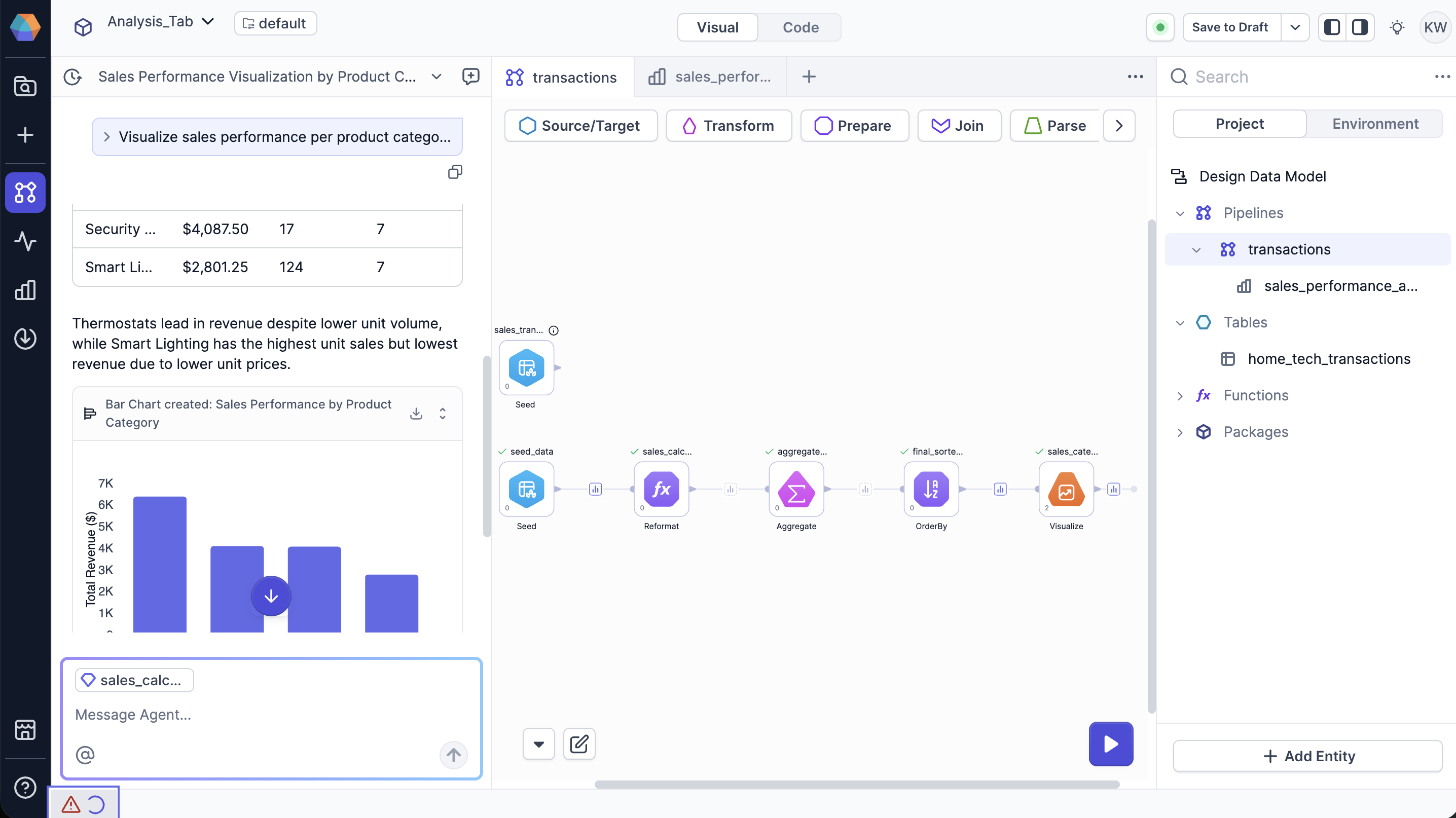
You’ll start with a sample dataset that contains information about home technology sales transactions. Then, you will prompt the Agent to create a pipeline that results in an insight about the data.Add source data
- Open the Source/Target gem category.
- Click Table. This adds a new Table gem to the canvas.
- Hover over the gem and click Open.
- Select + New Table.
- For Type and Format, choose Seed.
-
Name the seed
home_tech_transactions. - For the Seed path, choose seeds. Prophecy saves your seed file in this folder of the project repository.
- Click Next.
-
In the Properties tab, paste the following data.
- Click Next.
- Click Load Data to preview the data in tabular format.
- Click Save.
Generate transformation logic
In the Chat interface, ask the Agent to create a pipeline that results in a bar chart showing the total sales by product category.- Transforms the data to aggregate the total sales by product category.
- Creates a bar chart visualization of the data.
- Adds a Visualize gem to the canvas.
- Create a new analysis that links to the pipeline.
- Includes the bar chart which uses input data from the Visualize gem.
If you would like to create an analysis without the Agent, you have two options: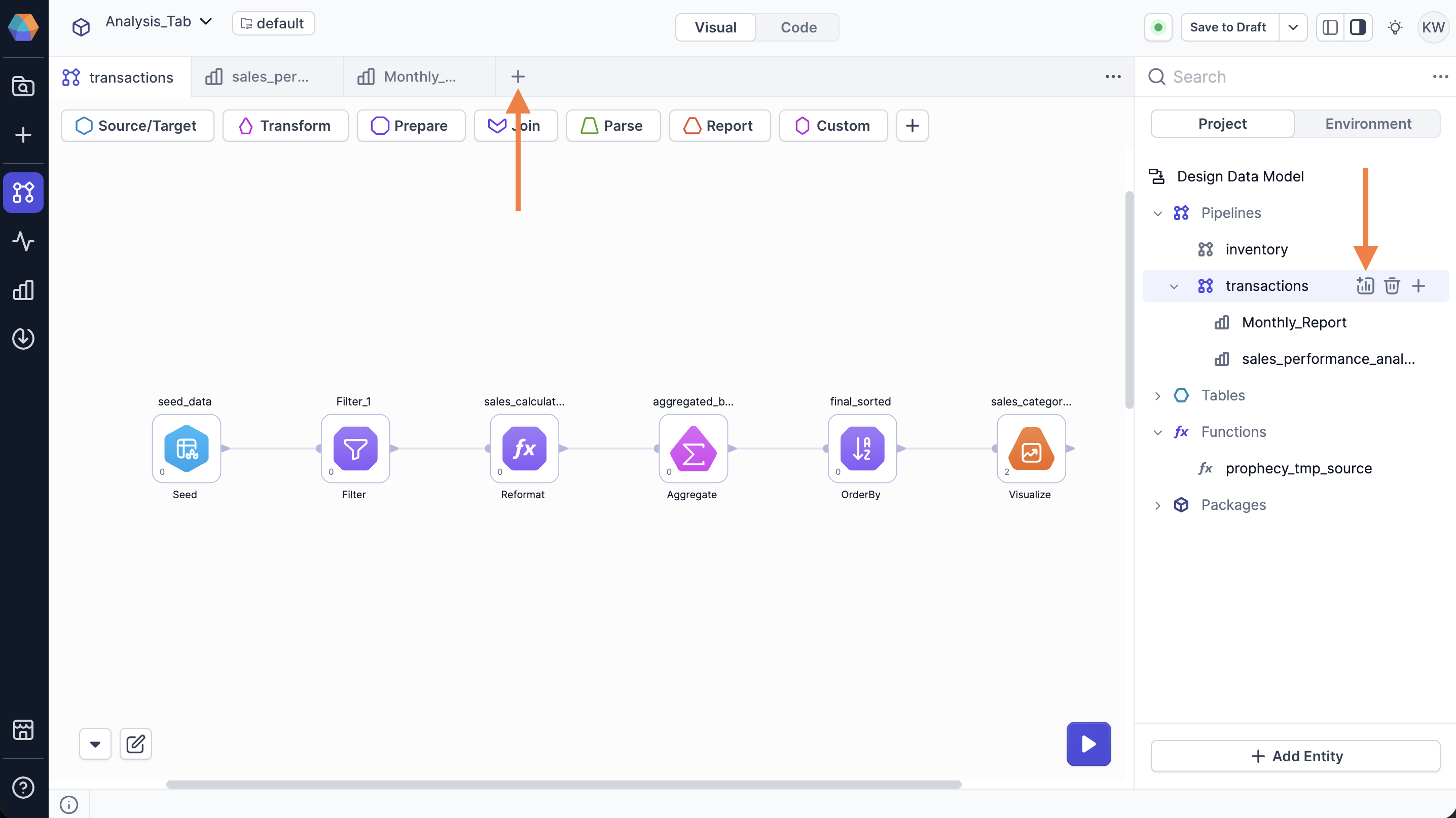
- Hover over the pipeline in the project browser and select the Create analysis icon.
- Click the + plus icon in the canvas header and select Create analysis.
Add interactive components
To add interactive components to the analysis, you’ll need to embed a pipeline parameter in the pipeline. Pipeline parameters enable dynamic behavior in pipelines by allowing values to be set at runtime. In this case, pipeline parameter values are set by the end user when they run the analysis.Create a pipeline parameter
In this section, you’ll define a pipeline parameter calledregion. The parameter will capture the region that the user selects, allowing the pipeline to filter transactions based on the region the user wants to see.
- Open the pipeline tied to the analysis.
- Click default in the project header to open the parameter settings.
- Open the Pipeline Parameters tab.
- In the default parameter set, click + Add Parameter.
- Name the parameter
region. - Set the parameter type to
String. - Click Select expression > Value.
- Enter
Northas the default value to be used during interactive pipeline runs. - Click Save.
Add a filter
Next, add a Filter gem to the pipeline. To make the filter condition dynamic, you’ll use the pipeline parameter in the gem.- Add a Filter gem directly after the Source gem and before the next gem (generated by the Agent).
- Open the Filter gem configuration.
-
For the filter condition:
- Click Select expression > Column and select the
Regioncolumn. - Click Select operator and select equals.
- Click Select expression > Configuration Variable and select the
regionparameter.
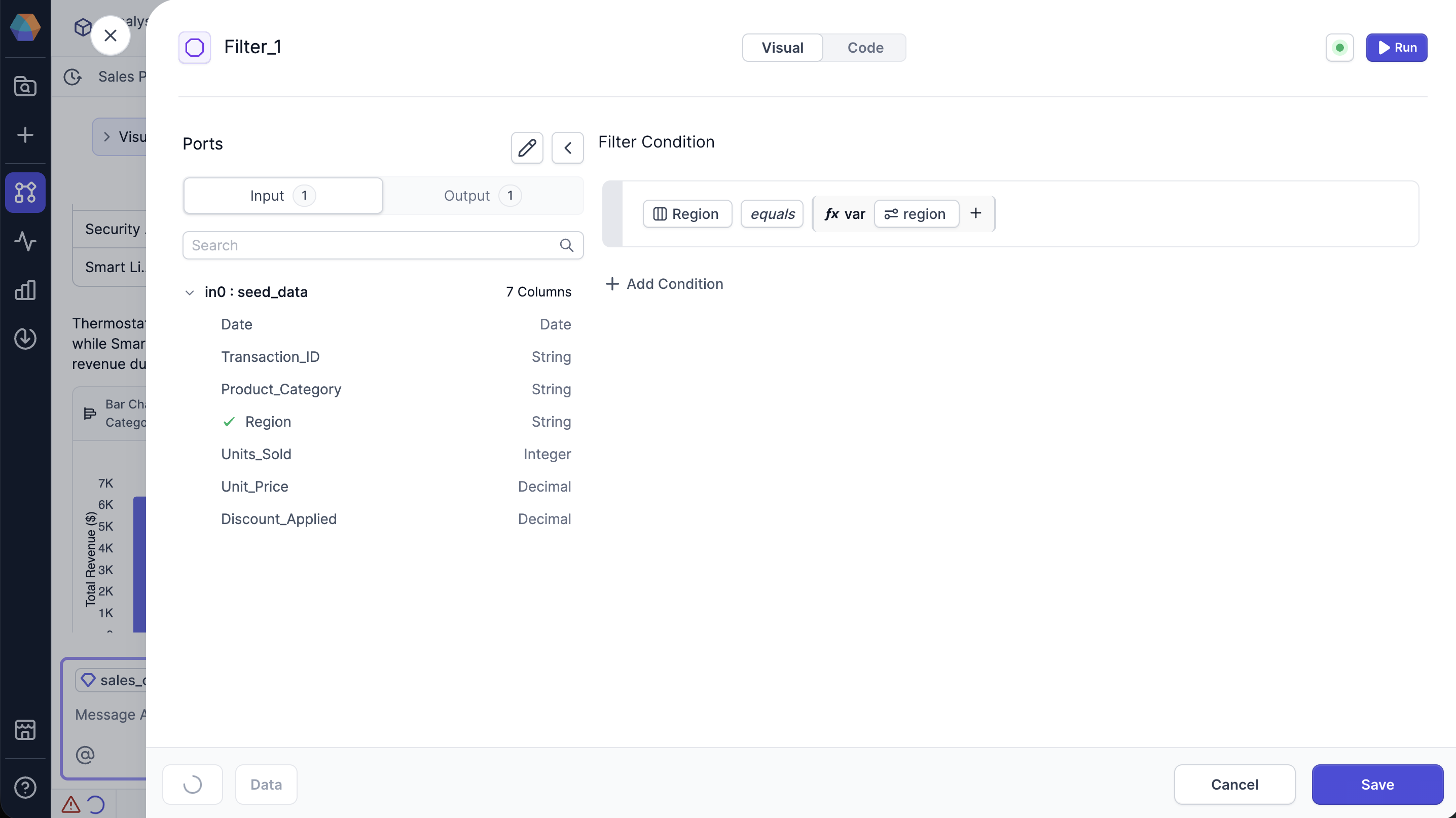
- Click Select expression > Column and select the
- Click Save.
Add a Text Input component
Add a Text Input component to allow the end user to enter the region they want to see.- Open the analysis dashboard that the Agent created.
- Click Edit.
- Open the Interactive dropdown and select Text Input.
- In the Inspect tab, for the Configuration field, select the
regionparameter. - For the Label, enter
Region. - Drag the Text Input component above the bar chart visualization.
Run the analysis
Let’s return to the analysis preview so we can test the new component.- From the analysis, click Back to Preview.
- In the Region field, enter
West. - Click the Run button.
- Review the bar chart to see the total sales by product category for the West region.
Share the dashboard
Access to analyses is controlled by Prophecy’s team-based permission model. If your team owns a project, you have full edit access. This means that you can build, edit, and delete analyses in the project. If a project is shared with your team, you cannot edit any pipeline’s or analysis’s structure. However, you can run analyses from the shared project. This ensures that your data engineering team can share pipelines they developed without exposing them to changes.To learn more, reference the documentation on team-based
access.