

A map chart option only appears when the dataset contains a column of geo points in WKT format, for example
POINT(-74.006 40.7128). Note that WKT orders coordinates as longitude, then latitude (this is the reverse of how coordinates are often read aloud).Marker map chart
A marker map chart uses pins to represent individual data points on a map. For example, you might use a marker map to plot store locations, delivery addresses, or sensor sites.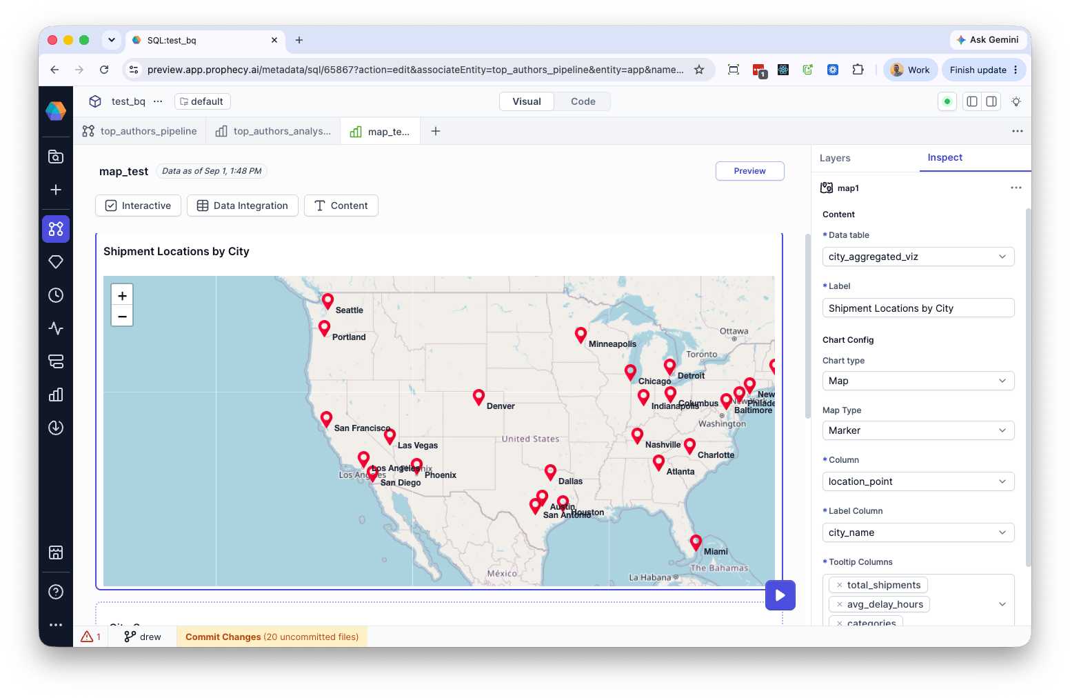
Rows with a malformed WKT string, or with latitude/longitude values outside the valid range (latitude: -90 to 90, longitude: -180 to 180), are silently excluded from the map rather than raising an error.
Displacement map chart
A displacement map chart draws lines between origin and destination points to show movement or flows between locations. For example, you might use a displacement map to plot shipping routes, flight paths, or migration between cities.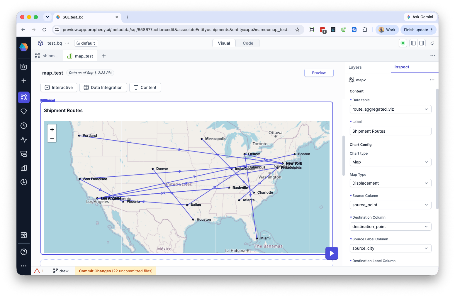
Displacement map is only available as a map type when the dataset has more than one column of WKT geo points.
Rows with a malformed WKT string, or with latitude/longitude values outside the valid range, are silently excluded from the map rather than raising an error.
Heat map chart
A heat map chart shows density or intensity across a geographic area, weighted by a numeric value at each point. For example, you might use a heat map to plot where customer activity or order volume concentrates geographically.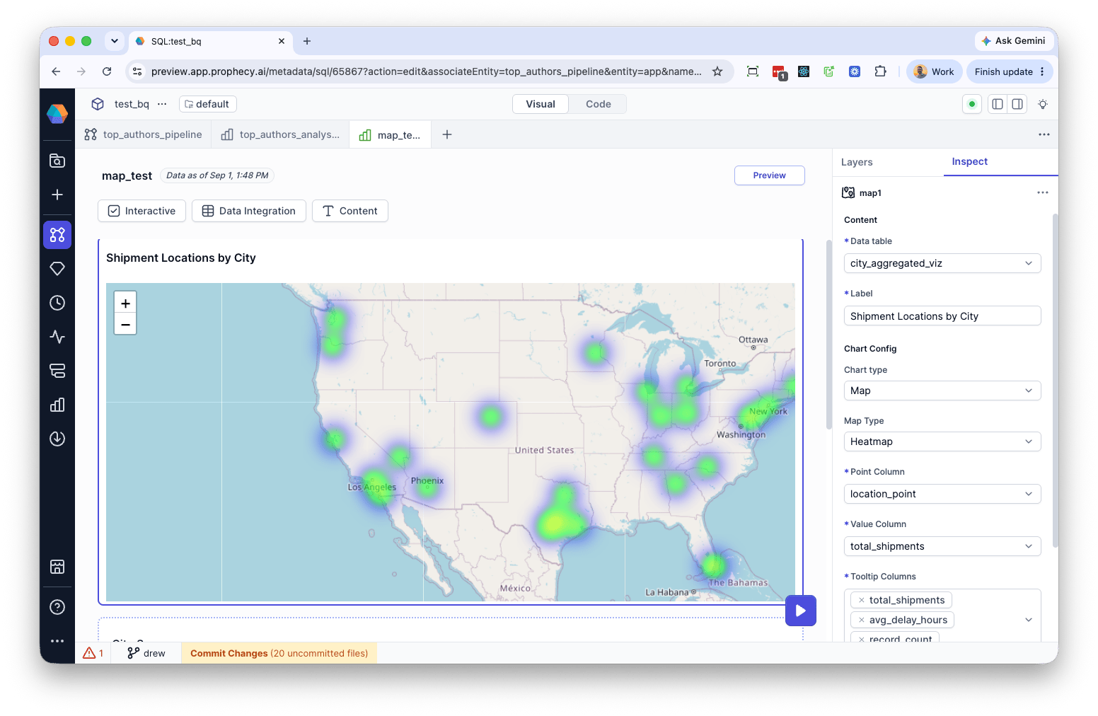
Radius is a fixed pixel size; it does not scale with zoom level. Zooming in or out changes the apparent size of each point’s blob relative to the map, so a radius that looks right at a city-level zoom may cover a much larger area at a closer zoom, or blur many points together at a world view. Radius also determines the clickable/hoverable area used to trigger a point’s tooltip.
Rows with a malformed WKT string, or with latitude/longitude values outside the valid range, are silently excluded from the heat layer rather than raising an error.